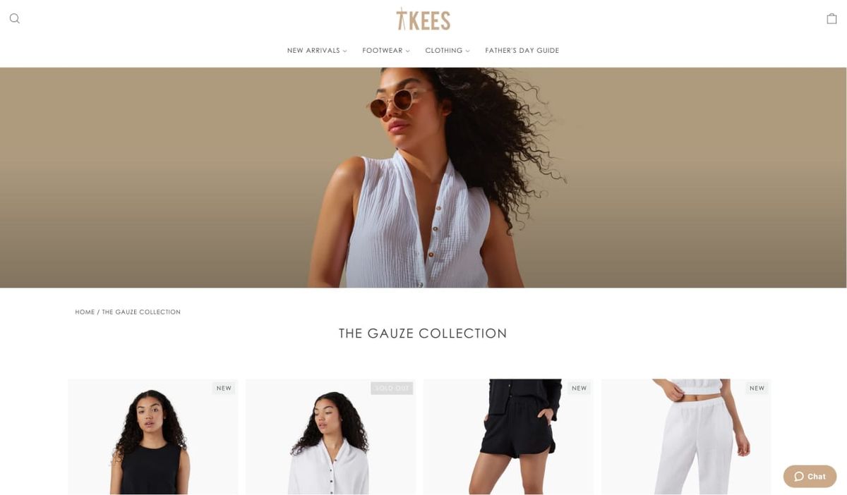
You've spent hours perfecting your product images and writing descriptions that sing, but your banner looks stretched, pixelated, or just plain wrong on different devices. When you browse successful Shopify Product Page Examples, you notice their banners look crisp and professional across desktop, mobile, and tablet screens. Getting banner dimensions right isn't just about aesthetics. It directly affects how visitors perceive your brand and whether they trust you enough to buy from you. This article walks you through the recommended Shopify banner sizes for every placement on your store, from homepage heroes to collection headers, and shows you what actually drives conversions based on real data.
PagePilot's AI page builder takes the guesswork out of banner creation by automatically generating optimized layouts that match the recommended Shopify banner sizes while maintaining visual quality across all devices.
Summary
- Shopify themes handle banner cropping unpredictably across devices, which explains why 79% of online shoppers won't return after a bad user experience. Desktop banners that look perfect often break on mobile when headlines get cut off or product images disappear at smaller screen widths.
- File size matters more than resolution for banner performance. A 1-second page load delay reduces page views by 11%, with mobile users experiencing the most significant impact. Banners exceeding 300 KB sacrifice mobile conversions for desktop visual perfection that most visitors won't notice, while WebP format compresses better than JPG without visible quality loss and directly improves Core Web Vitals scores.
- The safe zone principle solves responsive cropping problems by keeping critical elements in the center, 70% to 80% across the width of banner images. Shopify's Liquid templates aggressively crop edges based on screen width and theme settings, making it impossible to predict exact rendering across devices.
- A mobile-first banner strategy requires separate images because portrait orientation (3:4 or 4:5 ratios) fills mobile screens better than cropped landscape images. Mobile traffic dominates volume, even though desktop converts at higher rates, yet most stores optimize only for desktop by shrinking complex layouts to 375 pixels wide.
- Banners that ask visitors to choose between multiple actions create decision paralysis and reduce click-through rates. Stores that convert best: pick one action and design the entire banner to make that step obvious, with complete alignment between the headline message, product image, and call-to-action button.
PagePilot's AI page builder generates product and landing pages with conversion-focused hero sections that apply mobile-first safe zones, compression ratios, and responsive optimization automatically without requiring manual resizing or separate device uploads.
Why People Search for “Shopify Banner Size”
People search for "Shopify banner size" because their homepage looks wrong, and they know it's costing them sales. The banner either loads too slowly, cuts off important text on mobile, or just feels off when compared to professional stores. They're not looking for design theory. They're looking for a fix that stops visitors from leaving before they scroll. The problem starts with a mismatch between expectation and reality.
The Preview-to-Production Gap
You upload a banner image that looks perfect in Photoshop. Then you preview it on your store, and suddenly the headline is cropped, the product image is blurry, or the entire layout shifts awkwardly between desktop and mobile. You try resizing. You adjust the theme settings. Nothing quite works the way you expected.
This isn’t a minor annoyance. PageFly’s Shopify banner size guide notes that 79% of online shoppers won’t return to a website after a bad user experience. Your banner is the first thing they see—if it loads slowly, looks unprofessional, or fails to clearly communicate what your store sells, they’re gone.
The Real Frustration Isn't Technical
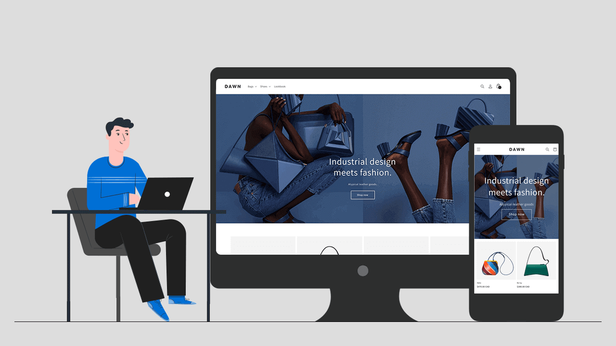
Store owners don't wake up wanting to learn image compression ratios or responsive design principles. They want their store to look trustworthy enough that people buy from it. But Shopify doesn't make this straightforward. Different themes handle banners differently. Dawn renders images one way.
Debut does something else entirely. A banner size that works perfectly in one theme breaks completely in another. You end up testing dimensions by trial and error, uploading the same image five times with slight variations, hoping something finally looks right.
The Dimensional Paradox
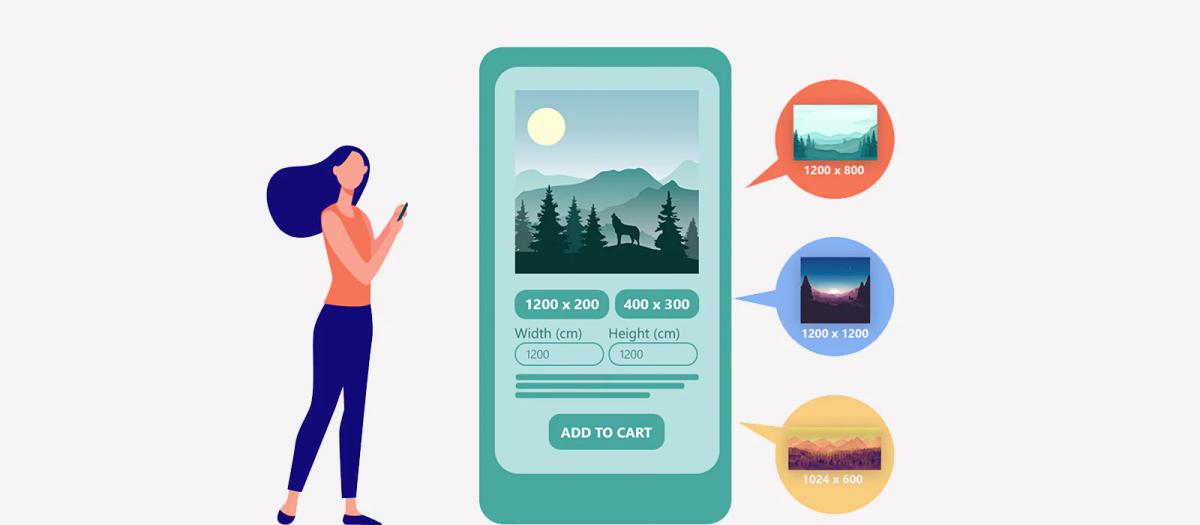
The advice online makes it worse. One blog says 1800 x 1000 pixels. Another recommends 2048 x 1152. A YouTube video insists on 1600 x 900. All of them claim to have the "official" answer, but none of them explain why their recommendation works or what happens if your banner doesn't fit that exact ratio.
What They're Actually Trying to Solve
The search isn't really about dimensions. It's about three specific outcomes:
- Speed: Large banner files slow down page load times. Visitors leave before the page finishes rendering. You lose sales before anyone even sees your products.
- Clarity: Text overlays need to stay readable across devices. If your headline gets cut off on mobile or your call-to-action button disappears, the banner fails at its only job: directing attention to the next step.
- Professionalism: Pixelated images or awkward cropping signal low quality. Shoppers make snap judgments. A sloppy banner suggests sloppy fulfillment, slow shipping, and poor customer service. Fair or not, that's the association.
The Trust-to-Transaction Bridge
The core tension is this: most guides treat banner sizing as a design problem when it's actually a conversion problem. Pixels matter only because they affect whether someone trusts you enough to keep browsing. When store owners search for banner sizes, they're really asking: how do I stop losing customers in the first three seconds?
The answer isn't just a number. It's understanding how banner dimensions interact with load speed, mobile rendering, and visual hierarchy. You need the image to load fast, display correctly across devices, and communicate value immediately.
Tools like PagePilot's AI page builder handle this automatically by generating layouts optimized for both visual quality and technical performance. Instead of manually resizing images and testing across devices, the system applies proven dimension ratios and compression settings that work across Shopify themes.
The Friction-Free Mandate
You focus on your message and products while the technical specifications that affect conversion get handled in the background. The search for "Shopify banner size" reveals something important about how e-commerce actually works. It's not about making things pretty. It's about removing friction fast enough that visitors stay long enough to become customers.
Most store owners assume the problem is picking the wrong dimensions. But the real issue runs deeper, and it starts with understanding what makes a banner size actually work instead of just technically fit.
Shopify Banner Size Recommendations (That Actually Work)
Sizes that work consistently across Shopify themes prioritize aspect ratio over exact pixel values. Start with 2048 x 1024 pixels for homepage heroes, maintain a 2:1 ratio for desktop, and always upload separate mobile versions at 1200 x 1600 pixels. These dimensions survive theme updates, render cleanly on retina displays, and compress efficiently without visible quality loss.
What matters more than memorizing numbers is understanding why these ratios perform. Shopify's responsive framework crops images dynamically based on screen size. If your banner doesn't match the theme's expected aspect ratio, the system makes cropping decisions for you, and those decisions usually cut off exactly what you wanted visitors to see first:
- Your headline
- Your product
- Your call to action
Homepage Hero Banners
Your homepage banner sets the tone for the entire first impression. The GemPages guide on Shopify image banner size recommends 2560 x 1344 pixels to maintain clarity on high-resolution displays while keeping file sizes low for faster load times.
Vertical Estate Optimization
For mobile, flip the orientation. Portrait banners (1200 x 1600 pixels) fill the screen vertically, keeping visitors engaged longer than landscape images, which are compressed into thin horizontal strips. Most store owners upload one image and hope it scales. It doesn't. Mobile users see a squashed, illegible version of your desktop banner, and they leave before the page finishes loading.
Keep focal points centered. Shopify themes crop edges aggressively on smaller screens. If your product image sits near the left or right border, it disappears on mobile. If your headline spans the full width, half of it gets cut. Build a safe zone in the center 70% of your image where all critical elements live.
Slideshow and Carousel Banners
Carousels introduce a second problem: motion. Visitors don't wait for slides to rotate. They see the first image, decide whether it's relevant, and either scroll or bounce. That first slide needs to work harder than any other banner on your site.
Use 1920 x 1080 pixels for desktop carousels. This matches the 16:9 ratio most themes expect and prevents awkward letterboxing or stretching. For mobile, drop to 1200 x 400 pixels to keep the banner short enough that products remain visible above the fold.
The Single-Message Loop
Carousels fail when store owners treat them like galleries. Three slides with three different messages create confusion, not clarity. If you use a carousel, keep the message consistent across slides and change only the visual proof point: different product angles, different use cases, same value proposition.
Collection and Category Banners
Collection banners frame intent. They tell visitors what they're browsing and why it matters. These banners should be shorter and more restrained than homepage heroes because the products themselves need to dominate the page.
Stick to 1400 x 400 pixels on desktop (a 7:2 ratio) and 800 x 600 pixels on mobile (4:3 ratio). The shorter height keeps your product grid immediately visible, reducing bounce rates. Shoppers came to browse a category, not admire a banner. Give them what they want fast.
The Visual Anchor Strategy
Avoid text-heavy designs here. Collection banners work best as visual anchors with minimal copy. A single category name and a subtle background image that reinforces the product type (outdoor gear, minimalist furniture, premium skincare) does more than a paragraph of marketing copy that nobody reads.
File Size and Format Discipline
Dimension recommendations mean little if your banner file is 2 MB and takes eight seconds to load. According to Ailee’s guide on optimal Shopify banner sizes, the recommended dimensions are 2400×1200 pixels but only when the file is properly compressed.
Target 300 KB or less for desktop banners, 180 KB for mobile. Use the WebP format when possible, as it compresses better than JPG without visible quality loss. Most Shopify themes now support WebP natively, and the file-size savings directly improve Core Web Vitals scores, which affect both SEO rankings and conversion rates.
The Transparency Trade-off
PNG files are used only when transparency is required, like logos overlaid on banners. For photographic images, PNG files run three to five times larger than JPG or WebP at equivalent visual quality. That extra weight kills mobile load times, and mobile traffic represents 60% to 70% of e-commerce visits.
The Safe Zone Principle
Every banner needs a safe zone to keep important elements visible across all devices. Draw an invisible box in the center, 70% to 80% of your image. Headlines, product shots, and call-to-action buttons live inside that box. Decorative elements and background visuals can extend to the edges, but anything you need visitors to see must stay centered.
Shopify's Liquid templates crop banners differently depending on screen width, theme settings, and section layout. You can't predict exactly how each device will render your image, but you can guarantee that the center stays intact. Design for that guarantee.
The Real-World Stress Test
Test on actual devices, not just browser resize tools. Desktop preview modes don't replicate how iOS Safari handles image rendering versus Android Chrome. Borrow phones, check tablets, and view your banners on different screen sizes before publishing. What looks perfect on your laptop often breaks on a phone held vertically in someone's hand while they're standing in line at a coffee shop.
Consistency Across Banners
Randomly switching aspect ratios across your site signals carelessness. If your homepage hero uses a 2:1 ratio, your collection banners should too. If your blog uses 16:9, keep that ratio consistent across all blog posts. Visitors don't consciously notice aspect ratio consistency, but they feel it. The site feels:
- More polished
- More intentional
- More trustworthy
The Ratio Inconsistency Tax
Most store owners upload images with whatever dimensions their designer sends, without checking the ratios. One banner is 1800 x 900, the next is 2000 x 1200, and another is 1600 x 800. Technically, all three work. Visually, the inconsistency creates subtle friction that compounds across the browsing experience.
Maintaining consistent ratios also simplifies future updates. You build a template library where every new banner fits the same dimensions, and you stop guessing whether an image will break your layout.
Automated Structural Alignment
Systems like AI page builder apply these ratio rules automatically, generating banners that match your theme's requirements without manual resizing or trial-and-error uploads. You focus on messaging while the technical specifications that affect rendering and performance get handled in the background.
Mobile-First Image Strategy
Desktop traffic might convert at higher rates, but mobile traffic dominates volume. If your banners only work well on desktop, you're optimizing for the minority of your visitors.
The Portrait Advantage
Upload separate mobile images whenever your theme supports it. Portrait orientation (3:4 or 4:5 ratios) fills mobile screens better than cropped landscape images. Text should be larger, simpler, and positioned higher in the frame because mobile users scroll faster and scan less carefully than desktop users.
The Scalability Fallacy
Mobile banners fail when they try to replicate desktop layouts at smaller sizes. You can't shrink a complex desktop banner down to 375 pixels wide and expect it to stay legible. Simplify the message, enlarge the focal point, and remove secondary elements that clutter the frame. Mobile banners should communicate one thing clearly, not three things poorly.
The banner size question isn't really about pixels. It's about whether your images load fast, display correctly, and guide visitors toward the next action without confusion. Get those three outcomes right, and the exact dimensions become a technical detail instead of a conversion obstacle.
But knowing the right size only solves half the problem. The other half is understanding what those banners need to accomplish once they load.
Related Reading
- Shopify Product Page Examples
- How to Make Your Shopify Store Look Professional
- How to Increase Conversion Rate Shopify
- Best Size for Shopify Product Images
- eCommerce Product Page Optimization
- Shopify Banner Size
- How to Create Multiple Product Pages in Shopify
- How to Change Favicon on Shopify
- How to Add Size Chart in Shopify
- How to Customize Shopify Checkout Page
What High-Performing Shopify Banners Actually Do
High-performing Shopify banners don't announce themselves. They guide attention toward a single action without requiring visitors to decode what matters or where to look next. The best banners answer three questions instantly: what you sell, why it matters, and what to do about it. Everything else is decoration.
The Traffic Director Mindset
The gap between a banner that converts and one that confuses comes down to discipline. Most store owners treat banners as creative projects when they're actually traffic directors. You're not building art. You're building a path from curiosity to click, and every visual element either shortens that path or adds friction.
They Communicate Value in Under Three Seconds
Visitors decide whether to stay or leave faster than you can finish reading this sentence. Your banner doesn't get time to build suspense or unfold a narrative. It gets a glance. That glance needs to answer the fundamental question every shopper asks: is this store relevant to what I want right now?
A banner for outdoor gear should show outdoor gear, not abstract lifestyle imagery that could mean anything. A skincare banner should make the product category obvious, not hide it behind clever copy that requires interpretation.
The First-Response Advantage
According to Shopify’s research on ecommerce sales statistics, 35-50% of sales go to the vendor that responds first. Speed matters in every interaction, including the visual one. Your banner is your first response to a visitor's search intent. If it takes too long to communicate relevance, someone else already won.
The Rule of Three
Text overlays fail when they try to say too much. A headline, a single supporting line, and a call to action. That's the structure. Anything beyond that competes for attention instead of directing it. Visitors don't read banners the way they read articles. They scan for signals that confirm they're in the right place, then move on.
They Use Contrast to Create an Obvious Hierarchy
Your eye moves through a banner in a predictable sequence if the designer respects visual weight. Headline first because it's the largest or highest contrast. Supporting image second because it anchors the context. Call to action third because it's visually distinct and positioned where the eye naturally lands after absorbing the first two elements.
This hierarchy breaks when everything screams for attention equally. Bold headline, bold subheading, bold button, bold background pattern. Nothing stands out because everything tries to. The result feels cluttered, even though the banner contains only three elements.
The Scannability Premium
High-performing banners create breathing room. Negative space isn't wasted space. It's the pause that lets each element register before the next one demands focus. A simple banner with one strong headline and a clean product shot outperforms a complex banner with five competing messages every time, not because simple is trendy, but because simple is scannable.
The Legibility Threshold
Color contrast drives this more than most store owners realize. Light text on light backgrounds disappears on certain devices or under bright screen conditions. Dark text on dark product photos becomes illegible. If you have to squint to read your headline in the banner preview, your visitors won't bother trying.
They Point to One Clear Next Step
Banners that ask visitors to choose between multiple actions create decision paralysis. Shop now, learn more, view collection, sign up for updates. Each option sounds reasonable in isolation, but together they split attention and reduce the likelihood that anyone clicks anything.
The Goal-Action Loop
The stores that convert best pick one action and design the entire banner around making that action obvious. If the goal is driving product views, the button says "Shop Now" and the banner image shows the product. If the goal is building an email list, the button says "Get 15% Off," and the banner mentions the discount in the headline. The message and the action align completely.
The Disconnect Trap
This sounds obvious, but most banners fail this test. The headline talks about quality. The image shows a lifestyle context. The button says something generic like "Explore." Nothing connects. The visitor absorbs three distinct ideas but doesn't know which to act on, so they scroll past without clicking.
Clickable Distinction
Call-to-action buttons need visual separation from the rest of the content. Different color, clear border, enough padding that they don't blend into the background. The button should be the only element on the banner that looks clickable. If your headline, product image, or decorative elements visually compete with the button, you're training visitors to ignore the thing you want them to click.
They Load Fast Across Devices
A beautiful banner that takes six seconds to render loses more sales than an average banner that appears instantly. Visitors don't wait. They bounce, and they don't come back. File size discipline matters more than resolution.
A 2048 x 1024 pixel banner saved at 90% JPG quality looks identical to the 100% version on a live store, but it loads 40% faster. Speed difference affects bounce rate, Core Web Vitals scores, and ultimately conversion rate.
The 300 KB Threshold
Mobile performance separates good banners from effective ones. Desktop users might tolerate a slight delay. Mobile users on slower connections don't. If your banner file exceeds 300 KB, you're sacrificing mobile conversions for desktop visual perfection that most visitors won't notice anyway.
Unified Asset Management
Many stores solve this by using separate mobile banners, but that creates a maintenance problem. Every promotion, every seasonal update, every product launch requires uploading and testing two different images.
Autonomous Responsive Scaling
Tools like PagePilot's AI page builder handle responsive optimization automatically, generating banners that adapt to screen size without requiring separate uploads. The system applies compression ratios and dimension adjustments to maintain visual quality while meeting performance thresholds, so you can focus on messaging rather than file management.
They Maintain Focus Under Pressure
Promotional banners tempt store owners to cram in extra information. The sale percentage, the discount code, the deadline, the included product categories, and the exclusions. Every addition reduces clarity.
The best sale banners communicate the offer and the urgency in the fewest possible words. "40% Off Sitewide. Ends Sunday." That's enough. Visitors who want details will click through. Visitors who need convincing won't be persuaded by fine print on a banner.
The Seasonal Signal
Seasonal banners face the same trap. Holiday imagery, festive colors, themed copy, multiple product categories. The banner becomes a collage instead of a message. One holiday reference in the headline or one seasonal product in the image does the work. Doubling down doesn't double the impact. It just splits attention.
The Singular Narrative Rule
The pattern holds across banner types. Product launch banners work when they show the product and name it. Collection banners work when they show one representative item and name the category. Brand story banners work when they communicate one brand attribute, not the entire mission statement.
They Respect the Fold
Above-the-fold space is the most valuable real estate on your site. Your banner either uses it well or wastes it. Tall banners push product grids, collection links, and trust signals below the visible area. Visitors see a large image and nothing else. If that image doesn't immediately compel them to scroll, they leave.
The First-Glance Utility
The banner consumed all the attention without delivering enough value to justify the space it took. Shorter banners leave room for other conversion elements. A visitor sees the banner, absorbs the message, and also sees the first row of products or the key navigation options without scrolling. More information processed at first glance means more reasons to stay.
Contextual Proportionality
This doesn't mean every banner should be short. It means the banner height should match the message's importance and the page's purpose. Homepage heroes can afford more height because they're establishing brand context. Collection pages need shorter banners because the products matter more than the framing.
The Performance-Strategy Nexus
The technical side matters, but the strategic side drives results. Banners perform when they make one thing clear, make it fast, and make it easy to act on. Everything else is just pixels. But even perfectly sized, lightning-fast banners fail when they violate principles most store owners don't realize exist.
Related Reading
- How To Add A Pop Up On Shopify
- Shopify Variants vs Options
- Shopify Websites Examples
- Best Shopify Themes For Conversion
- How To Add Frequently Bought Together On Shopify
- Shopify Variants Vs Options
- Shopify Websites Examples
- How To Add A Size Chart In Shopify
- How To Choose A Shopify Theme
- Product Recommendations Shopify
- Shopify Order Confirmation Page
Where Most Stores Get Shopify Banners Wrong
A great-looking banner can still hurt conversions if it creates hidden user experience problems. The data shows just how costly that can be for online stores. Here's where things commonly go off the rails:
Oversized Banners That Push Content Down
Large banners may look impressive, but they can dramatically slow down your homepage, especially on mobile. Research shows that slow-loading pages have a major negative impact on conversions.
The One-Second Penalty
According to Marketing LTB’s website speed statistics report, a 1-second delay can reduce page views by 11%, with slower mobile performance particularly harming conversion rates. When oversized hero banners are the first thing a visitor has to load, the page feels sluggish. Customers may never scroll far enough to engage with products or calls to action. They bounce before your store has a chance to make its case.
Text Embedded in Images That Break on Mobile
Many stores embed headlines or CTAs directly into banner images. This looks fine on desktop. But on phones, responsive behavior can crop or distort the text, making key information unreadable or misplaced.
The Theme-Constraint Trap
Shopify community discussions reveal that this problem surfaces constantly. Store owners using the Dawn theme report banners getting cropped on mobile, requiring CSS fixes just to get text visible on smaller screens. Another common complaint is that the slideshow and image sections look terrible on mobile versions, with no clear solution in the theme documentation.
That confusion makes it harder for shoppers to quickly understand the offer. Hesitation increases. Click-through rates drop.
Generic Stock or Supplier Visuals
Using generic images from suppliers might save time, but it doesn't help your store stand out. Stock or repeated imagery fails to communicate your unique brand story. Pages feel impersonal and interchangeable.
Visitors subconsciously compare experiences. When visuals don't signal distinct value, trust declines, and bounce rates rise. You become just another store selling the same products with the same pictures everyone else uses.
Slow-Loading Hero Sections
Speed matters more than ever. Studies show that faster load times lead to better user engagement and higher conversion rates, while slow pages increase abandonment and reduce overall satisfaction.
Even small delays in rendering a banner or homepage content can cost a measurable portion of your traffic before they ever see your products. The banner becomes a barrier instead of an invitation.
The High-Res Mirage
Most stores upload high-resolution images without compression, assuming visual quality matters more than load speed. That assumption costs sales every single day. A visitor on a slower mobile connection sees a blank space where your banner should be, waits two seconds, then leaves. You never get a second chance to make that first impression.
The Maintenance Trap
Banners require updates. New promotions, seasonal changes, product launches. Each update means resizing images, testing across devices, checking mobile crops, verifying load times, and hoping nothing breaks.
Store owners handle this manually because their themes don't automate responsive optimization. They upload an image, preview it on the desktop, check their phone, notice the headline got cut off, resize, re-upload, check again. The cycle repeats until something looks acceptable, not optimal.
Automated Responsive Intelligence
Solutions like PagePilot's AI page builder handle responsive optimization automatically, generating banners that adapt to screen size without requiring separate uploads or manual testing. The system applies compression ratios and dimension adjustments that maintain visual quality while hitting performance thresholds.
You focus on messaging while technical specifications get handled in the background, eliminating the resize-test-repeat cycle that turns simple banner updates into hour-long projects.
The Result
When banners aren't sized and structured with performance and clarity in mind, several things happen simultaneously:
- Visitors feel confused before they even scroll. The message doesn't land cleanly, or the layout looks broken, or the page loads too slowly to hold attention.
- Engagement drops as users wait or decide it's not worth the effort. They came to browse products, not troubleshoot visual problems or interpret cropped headlines.
- Missed opportunities stack up silently. Not with outright errors, but with friction that erodes trust and slows decision-making. Each visitor who bounces represents revenue that never materializes, all because a banner failed at its only job: removing obstacles between curiosity and action.
The Holistic Conversion Gap
A banner's purpose isn't to decorate your homepage. It's about quickly communicating what matters and getting shoppers moving. When sizing, text placement, and loading behavior aren't considered together, even professional designs can quietly hurt conversions. But fixing these problems manually still leaves you guessing whether your solution actually works across every device and connection speed.
How PagePilot Helps You Get Shopify Banners Right (Fast)
Most banner problems don't stem from a lack of design skill. They stem from the gap between knowing what works and actually shipping it. You understand that oversized images slow your site, that cropped text loses mobile visitors, and that generic visuals fail to differentiate your store.
But fixing those issues means resizing files, rewriting overlays, adjusting CSS for responsive behavior, testing across devices, and hoping your theme cooperates. That friction keeps banners stuck at "good enough" even when you know they're costing conversions.
The Structural Advantage
PagePilot closes that gap by generating product and landing pages with conversion-focused hero sections already built into the structure. You're not starting from a blank theme template or wrestling with image dimensions.
The system applies proven layout principles that balance visual impact with technical performance, so banners load quickly, render correctly across screen sizes, and communicate a single clear message without manual optimization.
Eliminates Mobile Rendering Guesswork
Mobile cropping happens because themes handle responsive images unpredictably. Text that looks centered on a desktop gets cut off at 375 pixels wide. Product shots positioned near edges disappear entirely. You upload, preview, adjust, re-upload, and the cycle repeats until something looks acceptable on your phone.
The Safe-Zone Blueprint
PagePilot automatically structures hero sections with mobile-first safe zones. Text elements stay within the center 70% of the frame, where cropping won't reach them. Layouts adapt fluidly without requiring separate mobile uploads or CSS overrides. You focus on the message while the system ensures it stays readable across devices.
Solves the File Size Versus Quality Tradeoff
Large banner files create a choice nobody wants to make: sacrifice visual quality or accept slow load times. Most stores upload high-resolution images without compression, assuming clarity matters more than speed. Then they wonder why bounce rates spike on mobile.
The system optimizes file sizes during generation, applying compression ratios that maintain visual fidelity while hitting performance thresholds. Banners stay under 300 KB without visible quality loss, which directly improves Core Web Vitals scores and reduces the delay between page request and visual rendering. Faster banners mean more visitors who stay long enough to scroll.
Removes the Generic Stock Photo Problem
Supplier images make your store look identical to every other dropshipper selling the same products. Stock photos communicate nothing specific about your brand or why someone should buy from you instead of the next search result. But sourcing unique visuals means hiring photographers, commissioning custom graphics, or spending hours hunting through asset libraries.
The Visual Distinction Engine
PagePilot's AI upgrades and differentiates product imagery during page generation. The system adapts visuals to match your positioning without requiring original photography or design work. Your banners stop looking interchangeable, which builds trust faster than recycled supplier photos ever could.
With support for [30+ languages](https://pagepilot.ai/), the platform also ensures your visual messaging translates effectively across international markets without losing clarity or impact.
Enables Iteration Without Theme Rebuilds
Testing different banner approaches often means editing your live theme, breaking something in the process, or creating duplicate theme versions just to compare layouts. That overhead makes experimentation impractical, so most stores stick with their first attempt regardless of performance.
The Zero-Risk Sandbox
You can generate alternative page layouts with different hero structures, test messaging variations, and compare results without touching your Shopify theme. Want to try a shorter banner that leaves products visible above the fold? Generate a version. Curious whether a benefit-focused headline outperforms a product-focused one?
Test both. The barrier between idea and implementation drops low enough that optimization becomes routine instead of risky.
Maintains Consistency Across Updates
Seasonal promotions, product launches, and category expansions all require banner updates. Manually maintaining consistent aspect ratios, file sizes, and visual hierarchy across dozens of pages turns simple updates into multi-hour projects.
One banner uses a 2:1 ratio, another ends up at 16:9 because someone grabbed a different template, and suddenly your store feels visually inconsistent in ways visitors notice subconsciously.
Systemic Design Consistency
The platform applies the same structural principles across every generated page. Ratios stay consistent, safe zones remain intact, and compression settings don't vary randomly. You build a library of pages that feel cohesive without manually enforcing design standards every time something changes.
Frictionless Implementation Velocity
The real advantage isn't any single feature. It's removing the friction between recognizing what works and actually implementing it. When banners are fast to generate, easy to adjust, and automatically optimized for performance, you stop debating whether a change is worth the effort.
You test, measure, and move toward what drives clicks, rather than settling for what's easiest to upload. But speed and technical correctness only matter if you're ready to see whether your banners actually convert better than what you're running now.
Start a FREE Trial and Generate 3 Product Pages with Our AI Page Builder Today
At this point, the pattern should be clear. Banner size isn't decoration. It's a tool. And when used correctly, it helps customers understand what to do next more quickly. When banner sizing is wrong, stores guess. They rely on theme defaults. They copy competitors. And they hope the design looks good enough. But good-looking banners don't automatically move visitors forward.
The banners that convert are the ones built around clarity, speed, and direction, not just aesthetics. If you want Shopify banners that actually support conversions instead of just filling space, the fastest way to get there is to test better pages, not debate dimensions.
The Risk-Free Prototype
With PagePilot, you can start a free trial today and generate up to 3 high-converting product pages using our AI page builder. No credit card required. That lets you test stronger banner layouts without touching your theme, use optimized visuals instead of generic images, launch cleaner hero sections that work on mobile and desktop, and optimize smarter without redesigning your store.
You focus on what to say while the technical specifications that affect conversion get handled automatically.
Related Reading
- Pagefly Alternatives
- Shopify Electronics Store
- Best Trust Badges For Shopify
- Shopify Beauty Stores
- Best One Product Shopify Theme
- Shopify T-shirt Store Examples
- High Converting Product Pages
- Shopify Contact Us Page Example
- Best Shopify Theme For Print On Demand