You've spent hours perfecting your product pages, studying the best Shopify product page examples to understand what converts browsers into buyers. But here's what most store owners miss: even the most compelling product page can't save a checkout experience that feels clunky, generic, or disconnected from your brand. This article walks you through practical ways to customize your Shopify checkout page, from adjusting colors and fonts to adding custom fields, trust badges, and upsell elements that reduce cart abandonment and boost revenue.
PagePilot's AI page builder helps you build custom checkout experiences and landing pages that align with your brand identity, letting you focus on strategy rather than technical implementation while maintaining the professional polish your customers expect.
Summary
- Shopify restricts checkout customization to protect security, performance, and compliance standards across millions of stores. Standard plans (Basic, Shopify, and Advanced) allow only surface-level changes like logo uploads, color adjustments, and copy edits, while structural modifications like rearranging steps or adding custom content blocks remain locked.
- Research from Baymard Institute shows that 70% of checkout customizations focus on trust signals and layout changes, yet most standard plans don't support those modifications. The gap between what merchants want to test (testimonials above payment forms, guarantee messages between steps, repositioned trust elements) and what the platform allows creates frustration that's often misdirected.
- According to Baymard Institute, while 43% of cart abandonments stem from browsing behavior, the remaining cases trace back to fixable friction points like unexpected costs appearing too late, mandatory account creation, unresolved trust concerns, or technical performance issues.
- Envive's 2026 research on online shopping conversion found that many checkout abandonments occur because users remain uncertain about the product itself, price breakdowns, delivery expectations, or fit. ThriveCart's analysis reveals even starker numbers: 53% of returns are due to fit issues, and 70% are linked to sizing problems.
- Checkout conversion improves when customers arrive confident, not when checkout looks different. The biggest gains come from product pages that answer questions early, trust signals placed where doubt surfaces, and clarity around sizing, shipping, and value before someone clicks "Continue to Checkout."
PagePilot's AI page builder addresses this by generating conversion-ready product pages that answer questions and establish trust before checkout loads, shifting focus from patching the final transaction step to building confidence earlier in the customer journey.
What Shopify Actually Allows You to Customize at Checkout

Shopify gives you control over branding and messaging at checkout, but not structure or flow. You can upload your logo, adjust colors and typography, edit copy and labels, and customize the order status page. On most plans, you can't rearrange steps, add custom content blocks, or move trust elements around the page.
Visual Alignment vs. Behavioral Control
Those changes require Shopify Plus, and even there, guardrails are in place to protect security and performance. This matters because many store owners assume that checkout customization equates to conversion optimization. It doesn't. Shopify enables visual consistency, not behavioral intervention.
Why Shopify Locks Down Checkout
Shopify restricts checkout customization for three reasons:
- Security
- Performance
- Compliance
Payment data must stay protected. Checkout needs to load fast regardless of traffic spikes. Every merchant must comply with PCI standards without exception.
Reliability Through Standardized Infrastructure
These aren't arbitrary limitations. They're the tradeoff Shopify makes to keep checkout reliable across millions of stores. When you give up layout flexibility, you gain infrastructure that handles fraud prevention, encryption, and regulatory updates without requiring your attention or technical expertise.
The result is a checkout experience that feels rigid compared to the rest of your store, but that rigidity is what keeps it secure and consistent.
What You Can Actually Change (Basic, Shopify, Advanced Plans)
On standard Shopify plans, customization happens through settings, not design tools. You're adjusting surface elements, not rebuilding the experience.
Logo and Branding
Upload your logo so checkout visually connects to your storefront. This small touch reduces the jarring transition customers experience when moving from browsing to buying.
Colors and Typography
Customize background colors, button styles, and text formatting to align with your brand. You're creating visual continuity, not redesigning the interface. The structure remains the same, but the palette aligns with your identity.
Checkout Language and Copy
Edit labels, helper text, and instructional messaging. This is where you reduce confusion or adjust tone. If your audience responds better to casual language than formal prompts, you can make that shift. If a field label creates hesitation, you can clarify it.
Order Status Page Elements
Customize messaging shown after purchase. This includes confirmation text, next steps, and any post-purchase instructions. It's your last chance to reinforce brand voice and set expectations for delivery or follow-up. These changes help checkout feel less generic. They don't, however, change how customers move through the process or where trust signals appear.
What Remains Off-Limits
You cannot rearrange checkout steps. You cannot add custom sections or content blocks. You cannot redesign the layout or move trust elements to different positions on the page.
Structural Limitations of Standard Plans
If you want to insert a testimonial above the payment form, or move shipping options below billing details, or add a custom guarantee message between steps, those options don't exist on:
- Basic
- Shopify
- Advanced plans
This is where frustration builds. Store owners see high abandonment and assume the fix is structural, something like reordering fields or adding reassurance elements mid-flow.
The Disconnect Between Merchant Needs and Platform Access
According to Nebulab’s research on Shopify customization, 70% of checkout customizations focus on trust signals and layout adjustments, yet most standard Shopify plans do not support these modifications.
The gap between what merchants want to test and what the platform allows creates a belief that checkout is broken. It's not broken. It's just not the variable most worth optimizing.
The Real Limitation Isn't Technical
The limitation isn't that Shopify restricts checkout. The limitation is that most abandonment happens before checkout even loads. Customers leave because product pages didn't answer their questions. Because the sizing information felt vague. Because trust signals were missing or unconvincing. Because the value proposition didn't justify the price.
The Fragility of Late-Stage Intent
Checkout is where confidence gets tested, not where it gets built. If someone reaches checkout uncertain, no amount of color customization or copy tweaking will close the sale. They're already hesitating, and checkout just exposes it.
This is why checkout redesigns so often fail to move the needle. The hesitation started earlier. The friction accumulated across product pages, reviews, shipping details, and unanswered objections. By the time someone hits checkout, the decision is mostly made.
Where Optimization Actually Happens
If checkout performance feels off, the fix usually lives upstream. Clear product descriptions. Visible trust badges. Transparent shipping costs. Size guides that reduce uncertainty. Reviews are placed where doubt surfaces.
Converting Intent Into Actionable Confidence
These elements build confidence before checkout. They answer questions before customers have to ask. They reduce the cognitive load of deciding whether to buy. When those pieces are in place, checkout becomes a formality. Customers move through it quickly because they've already decided. The branding you add through logo, colors, and copy reinforces that decision, but it doesn't create it.
Streamlining Success via AI Optimization
For store owners who want to move faster without wrestling with design constraints or hiring specialists, tools like PagePilot's AI page builder help create optimized product pages that address hesitation before it reaches checkout. The focus shifts from fixing the transaction to building confidence earlier in the journey, where it actually matters.
The Belief Shift That Changes Results
Most checkout optimization starts with the wrong question. Instead of asking "How do I customize checkout to reduce abandonment?" the better question is "What friction exists before checkout that I haven't addressed?"
Prioritizing Substance Over Surface-Level Aesthetics
That shift moves focus from layout tweaks to experience design. From cosmetic changes to structural improvements. From testing button colors to testing whether customers understand what they're buying and why it's worth the price.
Shopify's checkout restrictions aren't the problem. They're a forcing function that pushes you toward the work that actually drives conversions. But knowing what's possible on your specific plan still matters, because expectations shape strategy.
Related Reading
- Shopify Product Page Examples
- How to Make Your Shopify Store Look Professional
- How to Increase Conversion Rate Shopify
- Best Size for Shopify Product Images
- eCommerce Product Page Optimization
- Shopify Banner Size
- How to Create Multiple Product Pages in Shopify
- How to Change Favicon on Shopify
- How to Add Size Chart in Shopify
- How to Customize Shopify Checkout Page
Shopify Checkout Customization by Plan (What’s Possible)
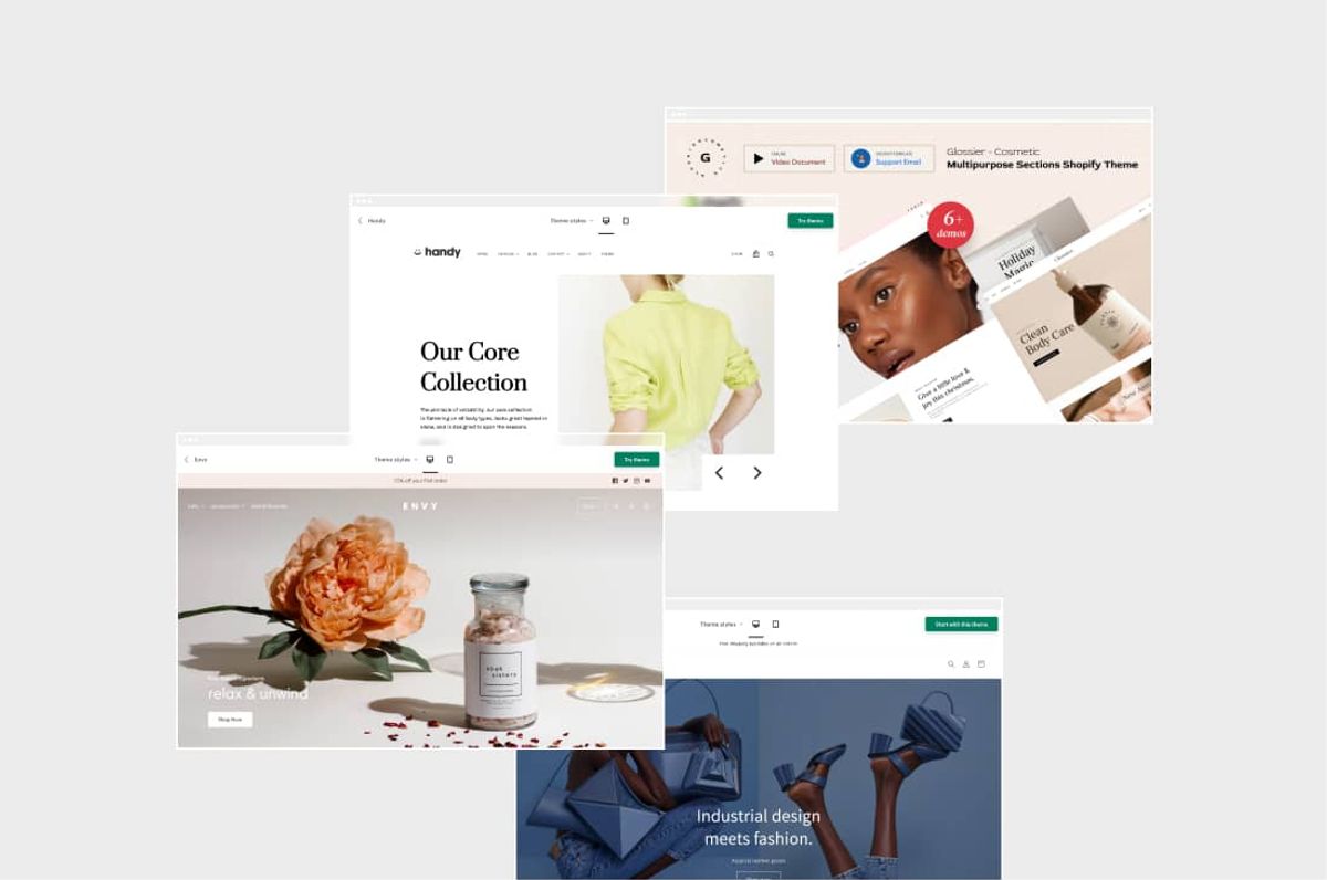
Your plan determines what's actually customizable at checkout. Basic, Shopify, and Advanced plans lock you into Shopify's default structure and offer only surface-level branding adjustments. Shopify Plus opens deeper extensibility, but even then, you're working within guardrails designed to protect performance and security.
The gap between what merchants want to change and what the platform allows creates most of the frustration around checkout optimization.
Basic, Shopify, and Advanced Plans: Surface Changes Only
On standard plans, you're adjusting appearance, not architecture. You can upload your logo, select brand colors, and choose typography so checkout doesn't feel generic. You can edit field labels and helper text to reduce confusion or match your tone.
You can customize the order confirmation page with post-purchase messaging that reinforces next steps or delivery expectations.
The Finality of the Shopify Grid
You cannot rearrange sections, add custom content blocks, or insert trust elements between checkout steps. You can't move the shipping selector below the billing form. You can't add a testimonial above the payment button. You can't inject a guarantee statement mid-flow to address hesitation.
Apps extend functionality but operate within strict boundaries. They can modify logic or messaging in limited areas, but they can't redesign layout or restructure the flow. The checkout experience remains fundamentally unchanged.
The Frustration of Technical Constraints
This creates a specific kind of friction. Store owners see abandonment rates and assume the solution is to rearrange elements or add reassurance at critical decision points. The platform doesn't allow it. The mismatch between what feels necessary and what's technically possible leaves many merchants feeling stuck.
Shopify Plus: More Control, Still Controlled
You gain access to custom UI extensions that let you add conditional content, logic, and messaging in specific checkout areas. You can use Functions and Scripts to customize discount behavior, shipping rules, and payment options more deeply than standard plans allow. You can build more sophisticated experiences that respond to customer data or cart conditions.
Even here, the structure isn't fully redesignable. Shopify maintains performance and security guardrails that limit how much you can alter the core flow. You're working with more flexibility, but still within a controlled environment.
The Frustration of Technical Constraints
For most stores, Plus-level customization addresses edge cases, not fundamental conversion problems. If your product pages aren't building confidence, if sizing information feels vague, if trust signals are missing or poorly placed, checkout extensibility won't fix those gaps. It gives you more tools to refine an already solid experience, not to rescue a broken one.
One-Page Checkout: Faster, Not More Flexible
Shopify rolled out One-Page Checkout as the default experience across all plans in September 2023. Previously, checkout spread across three separate pages for information, shipping, and payment. Now, customers enter all details on a single page.
The change improves speed and reduces friction. Fewer page loads mean faster completion for customers who've already decided to buy. Merchants can toggle between one-page and three-page formats in the admin if needed, but the one-page version is optimized for conversion by default.
Many store owners assumed one-page checkout would open new customization possibilities. It didn't. It made the existing flow faster, which matters, but it didn't change what's editable.
The Capability Gap Most Merchants Hit
The real limitation isn't technical capability. The belief is that checkout layout is where optimization should start. Checkout is the final step, where confidence is confirmed. If customers arrive uncertain about fit, value, trust, or delivery expectations, no amount of checkout tweaking will close the sale. They're already hesitating. Checkout just exposes it.
The Visibility Trap of Cart Abandonment
Teams often report that they want to add trust badges, testimonials, or guarantee messaging directly into checkout flow because that's where abandonment becomes visible. The instinct makes sense. The timing doesn't. By the time someone reaches checkout, the decision is mostly made.
The friction accumulated earlier, on product pages, in reviews, through unclear shipping details, or from unanswered objections.
Rapid Scalability via AI-Driven Design
For store owners who want to move faster without hiring designers or wrestling with technical constraints, tools like PagePilot's AI page builder help create optimized product pages that address hesitation before it reaches checkout. The focus shifts from fixing the transaction to building confidence earlier in the journey, where structural changes actually move conversion rates.
Where Plan Limitations Actually Matter
Understanding what's possible on your plan matters for setting realistic expectations, not for solving abandonment. If you're on a Basic or Shopify plan, don't waste time redesigning checkout. Focus on product page clarity, trust signal placement, and shipping transparency. Those elements build the confidence that underpins checkout.
The Reality of Enterprise-Grade Customization
If you're on Plus, leverage extensibility for edge cases such as custom discount logic, conditional messaging based on cart value, or dynamic shipping rules. Don't expect it to compensate for weak product pages or unclear value propositions. The difference between plans is real. The impact of those differences on conversion is smaller than most merchants assume.
But knowing where those limits exist helps you stop fighting the platform and start addressing the friction that actually drives customers away.
Why Most Checkout Customization Efforts Fail
Most checkout customization efforts fail because they try to solve a confidence problem when it becomes visible, rather than where it originates. Merchants see a spike in checkout abandonment and assume the issue is resolved. It doesn't.
The hesitation customers carry into checkout was created earlier, on product pages that didn't answer questions, through unclear shipping expectations, or by missing trust signals that were never addressed.
The Illusion of the Checkout Bottleneck
When conversion rates drop, checkout becomes the obvious target. It's where the numbers fall apart, so it feels logical to redesign it. But the data tells a different story. Abandonment is rarely about checkout design alone. It's about unresolved friction that accumulates across the entire journey before someone ever clicks "Continue to Checkout."
The Real Friction Points
According to Baymard Institute research on cart abandonment rates, 43% of users abandon their carts because they are “just browsing,” while the remaining abandonments are largely driven by fixable friction points that often begin well before the checkout page loads.
Extra costs appear too late. Shipping fees, taxes, or handling charges that weren't visible on product pages create sticker shock at checkout. The price has suddenly fallen short of expectations. Customers feel misled, even if the information was technically available somewhere on the site.
Prioritizing User Autonomy Over Data Acquisition
Mandatory account creation forces a commitment before purchase. Asking someone to register before they've decided to buy adds unnecessary steps. It indicates that the transaction serves the store's data-collection needs, not the customer's speed or convenience.
Trust and security concerns surface when confidence wasn't built earlier. If product pages lack reviews, clear return policies, or visible security badges, customers arrive at checkout already skeptical. Entering payment details on a site that hasn't established credibility feels risky.
The Psychological Impact of Information Architecture
Checkout complexity stems from poor information architecture. Long forms, unclear field labels, or confusing validation errors slow momentum. According to Persado’s analysis of shopping cart abandonment, citing Baymard Institute research, the ideal checkout flow contains only 12 to 14 form elements, yet most online stores exceed this number often without realizing the added friction it creates.
Technical performance issues kill conversions silently. Errors, crashes, or load times exceeding three seconds create frustration that overrides purchase intent. Customers assume the site is unreliable and leave before completing payment.
Where the Problem Actually Starts
Here's what happens in practice. Checkout drop-off gets blamed on checkout design. Stores tweak colors, buttons, or layouts. But the shopper already arrived, unsure. That hesitation usually comes from upstream problems. Size confusion that wasn't resolved on the product page.
Unclear value or pricing transparency. Weak trust signals earlier in the journey. By the time a shopper reaches checkout, they're not deciding whether to buy. They're deciding whether they feel confident enough to finish.
The Echo of Unresolved Doubt
A common pattern emerges when teams analyze session recordings. Customers who abandon at checkout often spent time scrolling back to product pages, re-reading descriptions, or checking reviews one more time. They're seeking reassurance they didn't receive the first time. The friction isn't in checkout. It's in the unanswered questions they carried forward.
The Upstream Fix
Checkout friction is usually created upstream. When product pages answer questions clearly, set expectations early, and build trust before checkout, most abandonment problems resolve without touching checkout.
Clear product descriptions eliminate guesswork. If someone has to wonder whether a product will meet their specific needs, they'll hesitate at checkout. Specificity builds confidence. Vague language creates doubt.
Strategic Placement of Trust Signals
Visible trust badges placed where doubt surfaces matter more than checkout redesigns. Reviews, return policies, and security signals work best when they appear at decision points, not as afterthoughts buried in footers.
Displaying shipping costs upfront prevents sticker shock. If someone knows the total before adding items to their cart, they're far less likely to abandon the cart when that number appears at checkout.
Size guides that reduce uncertainty keep customers moving forward. Unresolved fit questions on product pages become deal-breakers at checkout. The moment to address them is before someone clicks "Add to Cart."
Proactive Conversion Through AI Architecture
For store owners who want to move faster without hiring designers or wrestling with technical constraints, tools like PagePilot's AI page builder help create optimized product pages that address hesitation before it reaches checkout. The focus shifts from fixing the transaction to building confidence earlier in the journey, where structural changes actually move conversion rates.
The Belief Shift That Changes Results
Most checkout optimization starts with the wrong question. Instead of asking "How do I customize checkout to reduce abandonment?" the better question is "What friction exists before checkout that I haven't addressed?"
That shift moves focus from layout tweaks to experience design. From cosmetic changes to structural improvements. From testing button colors to testing whether customers understand what they're buying and why it's worth the price.
The Vulnerability of Final Intent
Checkout is where confidence gets tested, not where it gets built. If someone reaches checkout uncertain, no amount of color customization or copy tweaking will close the sale. They're already hesitating, and checkout just exposes it.
The Upstream Origin of Checkout Friction
The core insight worth internalizing is this: checkout friction is usually created upstream. When you solve the problems customers carry into checkout, abandonment rates drop without redesigning a single checkout element. But there's a harder truth most merchants miss about where conversion really lives.
Related Reading
- How To Add A Pop Up On Shopify
- Shopify Variants vs Options
- Shopify Websites Examples
- Best Shopify Themes For Conversion
- How To Add Frequently Bought Together On Shopify
- Shopify Variants Vs Options
- How To Add A Size Chart In Shopify
- Best Shopify Themes For Conversion
- How To Choose A Shopify Theme
- Product Recommendations Shopify
- Shopify Order Confirmation Page
What Actually Improves Checkout Conversion (Without Touching Checkout)
Checkout conversion improves when customers arrive confident, not when checkout looks different. The biggest gains come from product pages that answer questions early, trust signals placed where doubt surfaces, and clarity around sizing, shipping, and value before someone clicks "Continue to Checkout." Redesigning checkout treats symptoms. Fixing what happens before checkout treats causes.
Clear Product Pages Reduce Checkout Hesitation
Product pages that answer "What is this?" and "Is this right for me?" early reduce the mental friction that shows up later. When key information is unclear, shoppers carry doubt into checkout, where it turns into abandonment. They scroll back to product descriptions, re-read specifications, or check reviews one more time because the first pass didn't build enough confidence.
The Conversion Power of Precision
Specificity builds confidence. Vague language creates doubt. If someone has to wonder whether a product will meet their specific needs, they'll hesitate at checkout. Clear descriptions eliminate guesswork. Transparent pricing prevents sticker shock. Visible specifications answer technical questions before they become deal-breakers.
The Finality of the Product Page Decision
According to Envive’s research on online shopping conversion lift, many checkout abandonments occur when shoppers remain uncertain about the product itself, the full price breakdown, delivery expectations, or whether the item truly fits their needs. The decision to buy should be made on the product page. Checkout should be the next step.
Strong Trust Signals Work Before Checkout
Trust concerns arise before checkout, driven by product pages, image quality, reviews, and brand consistency. If trust isn't established upstream, adding badges or reassurance at checkout comes too late. Customers who are skeptical about entering payment details rarely complete the transaction, regardless of how secure the checkout interface appears.
The Proactive Trust Architecture
Reviews placed where doubt surfaces matter more than checkout redesigns. Displaying return policies early reduces purchase anxiety. Security signals work best when they appear at decision points, not as afterthoughts buried in footers. The moment to address trust is before someone invests time adding items to their cart.
Trust isn't built through checkout badges. It's built on consistent signals throughout the entire journey that tell customers the brand is reliable, transparent, and worth the risk of entering payment information.
Size Clarity Directly Impacts Conversion and Returns
Sizing is one of the biggest confidence blockers, especially in the apparel industry. When sizing is unclear, shoppers hesitate, delay, or abandon. When size guidance is clear at the moment of selection, confidence increases, and checkout completion follows naturally.
The High Cost of Ambiguity
The data is stark. According to ThriveCart’s analysis of checkout conversion tactics, industry data show that 53% of product returns are driven by fit issues, and around 70% are linked to sizing problems, underscoring how product clarity and sizing guidance directly impact conversion and post-purchase outcomes.
These numbers reveal a conversion problem disguised as a returns problem. Customers who are unsure about the fit either abandon the purchase before checkout or complete it with low confidence, planning to return if it doesn't work out.
Eliminating the Fitment Hurdle
Size guides that reduce uncertainty keep customers moving forward. Unresolved fit questions on product pages become deal-breakers at checkout. The moment to address them is before someone clicks "Add to Cart," not after they've entered shipping information and started questioning whether they chose the right size.
Clean Layouts Reduce Cognitive Load
Pages with too many competing elements, inconsistent layouts, or cluttered sections make it harder for shoppers to process information and make a purchase. Cognitive load increases when customers have to search for answers. Decision fatigue sets in when too many options or distractions compete for attention.
The Efficiency of Visual Clarity
Cleaner layouts help customers decide faster, so by the time they reach checkout, the decision is already made. Information hierarchy matters. Visual consistency matters. Every element on a product page should either answer a question, build confidence, or move someone closer to purchase. Anything else adds friction.
The goal isn't minimalism for its own sake. The goal is clarity. When customers can quickly understand what they're buying, why it's worth the price, and whether it fits their needs, hesitation drops. Checkout becomes the natural next step, not a moment of second-guessing.
Fast Load Times Matter More Than Checkout Design
Performance is another upstream factor. Slow product pages mean fewer confident buyers ever reach checkout. If pages take longer than three seconds to load, abandonment increases sharply, often before checkout.
Speed signals reliability. Slow load times create doubt about the site's trustworthiness and whether the transaction will process correctly. Customers assume technical issues on product pages will carry over to checkout, so they leave before testing that assumption.
The Psychological Weight of Performance
Fast load times aren't just about convenience. They're about confidence. A site that responds instantly feels professional, secure, and capable of handling transactions. A site that lags feels unreliable, even if the checkout itself is perfectly functional.
The Core Pattern
When customers arrive at checkout, they're clear on what they're buying, confident in the size or fit, comfortable with the brand, and unburdened by unanswered questions; they rarely abandon. That's why the biggest checkout conversion wins usually come from improving product pages, trust, clarity, and speed, not from touching Shopify's checkout at all.
The Blueprint of High-Performing Funnels
The pattern is consistent across industries. High-converting stores don't have radically different checkout designs. They have product pages that answer questions early, trust signals placed where doubt surfaces, and clarity around sizing, shipping, and value before someone clicks "Continue to Checkout."
The Diagnostic Power of the Payment Screen
Checkout is where confidence gets tested, not where it gets built. If someone reaches checkout uncertain, no amount of color customization or copy tweaking will close the sale. They're already hesitating, and checkout just exposes it. But there's one tool most store owners overlook that solves this problem faster than anything else.
How PagePilot Helps You Optimize Before Checkout (Where It Matters)
PagePilot generates conversion-ready product pages that answer questions early, not at the last minute. Instead of relying on checkout to address hesitation, it helps remove it before it appears. The focus shifts from patching the final step to building confidence from the first impression.
Trust is Built Upfront
Product pages are structured to look complete, consistent, and credible from the moment they load. When trust is established earlier, shoppers don't pause later to second-guess entering payment details. The visual consistency and professional layout signal reliability before someone invests time adding items to their cart.
The Compounding Cost of Skepticism
This matters because skepticism formed on product pages doesn't disappear at checkout. It compounds. A shopper who is uncertain about a brand's credibility on the product page will hesitate twice as long before providing credit card information. The moment to establish trust is before they decide to buy, not when they're finalizing payment.
Clarity Comes Before Commitment
Key information is clearly communicated: what the product is, who it's for, the pricing context, and expectations. Shoppers aren't carrying unresolved questions into checkout. The decision to buy should be made on the product page. Checkout should be the next step.
When someone has to scroll back to reread descriptions or check specifications one more time, it's a signal that the product page didn't do its job. The friction isn't in checkout. It's in the unanswered questions they carried forward. Clear pages eliminate that back-and-forth entirely.
Sizing and Fit Are Handled at the Decision Point
Size guidance is placed where shoppers choose variants, not buried or tacked on. That reduces uncertainty and prevents hesitation from surfacing during checkout. According to PagePilot, its system has received over 1,000 ratings from store owners who needed faster ways to address fit questions before they became conversion blockers.
The Dual Cost of Fit Uncertainty
The pattern is consistent. Customers who are unsure about the fit either abandon their cart before checkout or complete the purchase with low confidence, planning to return if it doesn't work out. Both outcomes hurt. One loses the sale immediately. The other creates a return that costs more than the original transaction. Addressing fit at the variant selection stage prevents both.
Layouts Support Decisions, Not Distraction
Pages are built with a clean hierarchy and focused flow, reducing cognitive load and helping shoppers move confidently toward purchase. Every element either answers a question, builds confidence, or moves someone closer to purchase. Anything else adds friction.
The Economics of Cognitive Ease
Cognitive load increases when customers have to search for answers. Decision fatigue sets in when too many options or distractions compete for attention. Cleaner layouts help customers decide faster, so by the time they reach checkout, the decision is already made.
The goal isn't minimalism for its own sake. The goal is clarity. When customers can quickly understand what they're buying, why it's worth the price, and whether it fits their needs, hesitation drops. Checkout becomes the natural next step, not a moment of second-guessing.
The Result is Simple But Powerful
Fewer questions reach checkout. Fewer doubts surface at the payment step. Less hesitation means fewer drop-offs. When shoppers arrive at checkout already confident, Shopify's built-in checkout does exactly what it's designed to do: close the sale.
The "Mirage" of Checkout Abandonment
This is the shift most store owners miss. They see abandonment at checkout and assume the fix lives there. It doesn't. The hesitation was created earlier, on product pages that didn't answer questions, through unclear shipping expectations, or by missing trust signals that were never addressed.
The "Upstream" Implementation Challenge
You don't need to hack checkout. You need to prepare buyers better. When confidence is built upstream, checkout performance improves without touching a single checkout element. The friction that shows up at checkout was created earlier. Solve it there, and the rest takes care of itself. But knowing this and actually implementing it are two different challenges.
Start a FREE Trial with PagePilot and Improve Checkout Conversion Without Fighting Shopify
The smarter move isn't redesigning what Shopify intentionally locked down. It addresses friction before checkout. When product pages answer questions early, when trust is built through clear information and visible credibility signals, and when sizing confusion is resolved at the decision point, checkout becomes what it's supposed to be: a formality that closes an already made decision.
Start a free PagePilot trial and generate up to three high-converting product pages without entering a credit card. Build the confidence upstream that checkout depends on. Stop fighting platform restrictions and start removing the hesitation that creates abandonment in the first place.
Related Reading
• Best One Product Shopify Theme
• Best Trust Badges For Shopify
• Shopify T-shirt Store Examples
• Pagefly Alternatives
• Shopify Beauty Stores
• Shopify Contact Us Page Example
• Shopify Electronics Store
• Best Shopify Theme For Print On Demand
• High Converting Product Pages

