Picture this: a customer lands on your store, loves your product, but clicks away because they're unsure if it will fit. When you study successful Shopify product page examples, you'll notice one common thread among high-converting stores: they all display clear, accessible size information. This guide walks you through adding a size chart to your Shopify store in a way that builds confidence and removes friction from the buying decision.
While adding a size chart manually involves editing theme code or installing third-party apps, PagePilot's AI page builder simplifies the entire process. You can create product pages with built-in size charts that match your brand aesthetic and display sizing information exactly where shoppers need it, without touching a single line of code or worrying about slowing down your site.
Summary
- Size confusion drives nearly one in four product returns, with research showing that 23% of returns happen not because customers disliked the product, but because they guessed wrong on sizing. When shoppers can't confidently answer "Will this fit?" they either abandon their cart or purchase with built-in doubt, leading to inevitable returns.
- Placement determines whether a size chart helps or hurts conversion. A chart buried three clicks away or hidden below the fold might technically exist, but shoppers won't see it when they're staring at the size dropdown trying to decide between medium and large.
- Generic size charts create more problems than they solve when sizing varies between product categories. Using a single chart for all products (tops, dresses, bottoms) misleads shoppers rather than helping them, especially when sizing standards differ across suppliers or brands.
- Mobile usability directly impacts whether size charts reduce or increase friction. Large tables and static images often become unreadable on smartphones without zooming and horizontal scrolling, interactions most shoppers skip entirely.
- Testing new products quickly requires clean data, but sizing confusion muddies results. When sizing friction quietly kills 15% of potential sales, you're not measuring whether the product works; you're measuring product performance plus sizing noise tangled together.
PagePilot's AI page builder generates product pages with size charts positioned near variant selectors, so sizing guidance appears at the moment of decision rather than being added as an afterthought that requires manual formatting across every product.
Why Size Confusion Hurts Conversion and Returns
When a shopper pauses over a size dropdown, that hesitation costs you money. Sizing uncertainty doesn't just slow decisions. It kills them. Shoppers who can't confidently answer "Will this fit?" either abandon the cart or buy with doubt already baked in, which means returns become inevitable.
The Cost of Guessing
According to research by Neuroscience Marketing, 23% of product returns are attributed to size confusion. That's nearly one in four items returned not because the product disappointed, but because the shopper guessed wrong. And guessing is exactly what happens when sizing information is:
- Vague
- Buried
- Generic
Friction Disguised as Support
The belief that adding any size chart solves this problem is where most stores get stuck. A size chart that lives three clicks away, or one that uses confusing measurements without context, doesn't reduce uncertainty. It creates the illusion of helpfulness while leaving shoppers to decode information on their own. That's friction disguised as support.
What Happens When Sizing Clarity is Missing
Shoppers don't just leave when they're confused. They stall. They compare. They open competitor tabs. They screenshot your product to ask friends. Every second of hesitation increases the chance they'll never come back.
Even when they do purchase, uncertainty follows them through checkout. If the fit is wrong, the return process begins, and you're paying for shipping, restocking, and the time it takes to process that return. Worse, the shopper's trust erodes. They remember the experience as risky, not smooth.
The Hidden Cost of Silence
Returns aren't just an operational headache. They're a signal that your product page didn't do its job. When sizing questions go unanswered at the moment of decision, the cost shows up later in logistics, customer support, and lost repeat purchases.
Where the Breakdown Happens
The problem isn't that shoppers don't care about sizing. It's that most size charts fail at the exact moment they're needed most. Here's what typically goes wrong:
- The chart is hard to find. Buried in a tab, hidden in the footer, or linked in tiny text below the fold. Shoppers shouldn't have to hunt for sizing information while making a purchase decision.
- The information is overwhelming. Dense tables with ten measurements and no guidance on which ones matter. Shoppers don't want to measure themselves in five places. They want to know if a medium will fit.
- It's not product-specific. A generic size chart for your entire store doesn't help when one brand runs small, and another runs large. Shoppers need clarity for the exact item they're looking at, not a one-size-fits-all reference.
- It's disconnected from the buying moment. If sizing information appears only after someone clicks away from the product image or size selector, you've already introduced doubt. Clarity needs to live where the decision happens.
Most Shopify stores add a size chart because it feels like the responsible thing to do. But if it's implemented poorly, it becomes another obstacle instead of a conversion tool.
Why Speed Matters When Testing New Products
For dropshippers and stores launching new products quickly, sizing clarity isn't just about reducing returns. It's about testing faster and scaling smarter. When you're validating a new product, every conversion matters. If sizing confusion is quietly killing 15% of your potential sales, you're not getting clean data on whether the product actually works.
You're measuring product performance plus sizing friction, and those two things shouldn't be tangled together. Stores that treat size charts as a conversion element, not an afterthought, see faster feedback loops. Shoppers decide quicker. Returns drop. The product either proves itself or doesn't, without sizing noise muddying the results.
Speed Without Sacrifice
Tools like PagePilot let you build product pages with integrated size charts in under two minutes, so sizing clarity doesn't slow down your ability to test and launch. You're not choosing between speed and conversion optimization. You get both, without needing a developer or spending hours formatting tables in your theme editor.
The Hidden Cost of "Come Back Later"
When a shopper tells themselves they'll return to your store after measuring themselves or checking another site, they almost never do. That mental bookmark rarely converts. Life moves on. The tab closes. The moment passes. What felt like a warm lead becomes a lost opportunity, and you'll never know how many potential customers you lost to hesitation.
Confidence Over Comparison
Sizing clarity isn't about being helpful after the fact. It's about removing the reason someone would need to leave in the first place. When the information is clear, accessible, and specific, decisions happen in the moment. Confidence replaces doubt. Checkout replaces comparison shopping.
Related Reading
- Shopify Product Page Examples
- How to Make Your Shopify Store Look Professional
- How to Increase Conversion Rate Shopify
- Best Size for Shopify Product Images
- eCommerce Product Page Optimization
- Shopify Banner Size
- How to Create Multiple Product Pages in Shopify
- How to Change Favicon on Shopify
- How to Add Size Chart in Shopify
- How to Customize Shopify Checkout Page
What a Size Chart in Shopify Actually Is
A size chart in Shopify is supporting information, not the main product description. Its job isn't to sell the product. It's to remove doubt when a shopper is deciding which size to choose. When the information is clear and accessible, decisions happen faster. When it's buried or confusing, it quietly works against conversion.
Shopify doesn't enforce a single, built-in way to add size charts. There's no default size chart field or placement. Instead, how a size chart appears depends on your theme, product type, and how you present sizing information. That's why size charts appear in different forms across stores:
- Inline tables
- Tabs
- Pop-ups
- Images
- Dynamic fields
The method you use matters less than when and how clearly the information appears. At its core, a size chart exists to support confidence. When it's easy to find and easy to understand, it does its job. When it's not, it becomes another obstacle between a shopper and the checkout line.
Why Placement and Format Matter More Than You Think
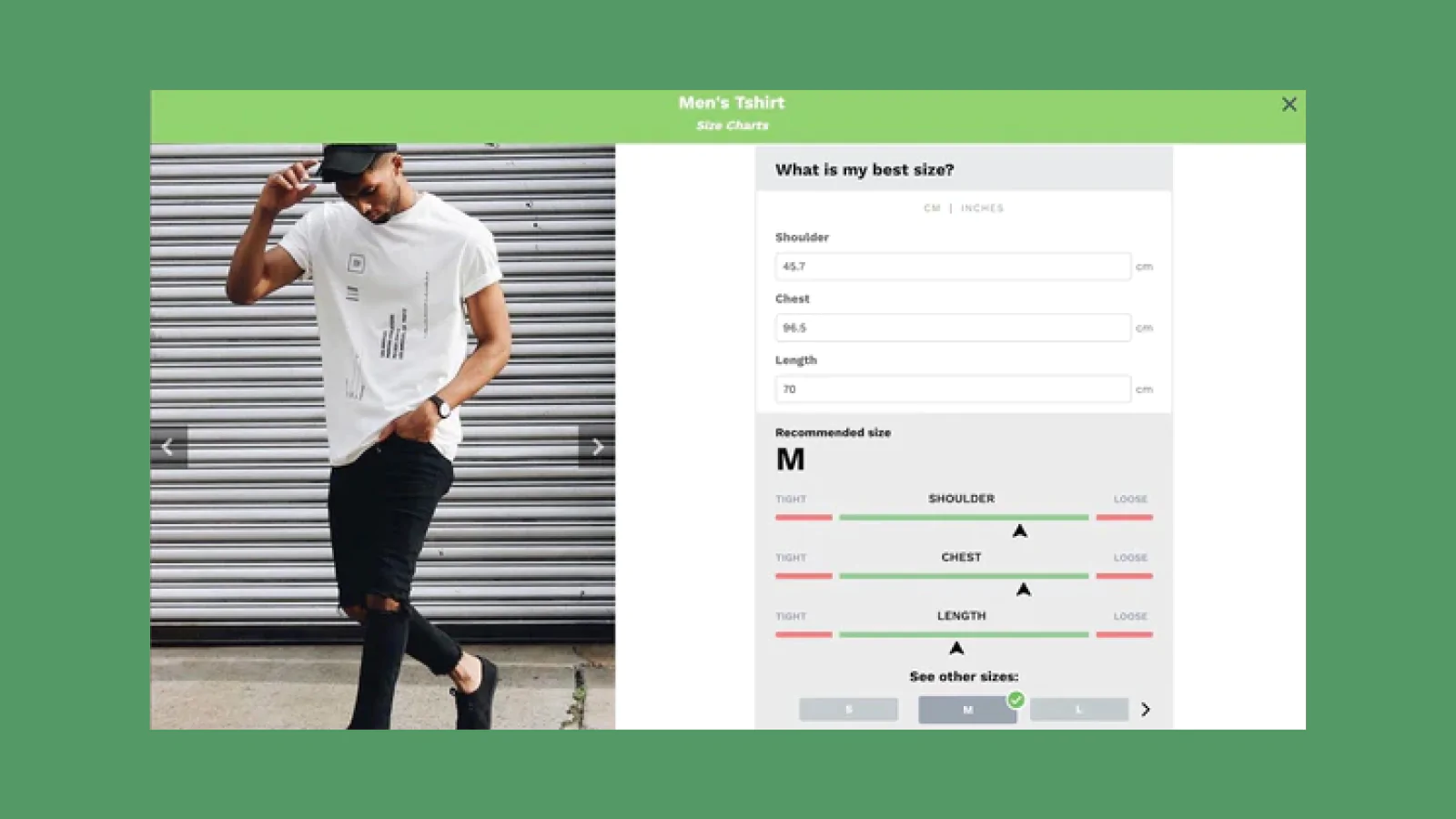
The same size chart can behave very differently depending on where it appears on your product page. A chart tucked inside a collapsed accordion below the fold might technically be present, but shoppers won't see it when they're staring at the size dropdown, trying to decide between medium and large.
Placement should align with the decision moment. If someone is hovering over the size options, they need sizing information, not after they scroll past reviews and shipping details. The best size charts appear at the right moment, right when doubt starts to creep in.
Clarity Over Complexity
Format matters just as much. A dense table with twelve measurements and no guidance on which ones actually matter creates more confusion than clarity. Shoppers don't want to measure their inseam, chest, waist, hips, and shoulder width just to buy a T-shirt. They want to know if a medium will fit, and they want that answer in seconds, not minutes.
The Technical Reality Most Merchants Miss
Many stores assume that installing a size chart app solves the problem. It doesn't. Apps provide the structure, but they don't automatically make sizing information helpful or contextually relevant. They needed size charts to update dynamically when customers selected different garment styles from a dropdown menu.
Standard product options apps couldn't handle it. The solution required custom frontend logic using Variants, Metafields, and lightweight JavaScript to swap size chart images based on the selected style. What seemed like a simple feature request turned into a development task because Shopify's native functionality doesn't support dynamic size chart swapping out of the box.
The Custom Logic Gap
This gap between expectation and reality frustrates store owners who assume size charts are plug-and-play. They're not. How size charts appear is entirely dependent on theme capabilities and custom implementation choices. That's not a Shopify flaw. It's flexibility. But flexibility without clarity leads to inconsistent experiences across stores.
When Speed and Clarity Collide
For dropshippers testing new products quickly, size charts can become a bottleneck if they require custom development or extensive formatting. Every minute spent wrestling with theme code or trying to make a size chart display properly is time not spent testing the next product or optimizing ad spend.
Tools like PagePilot let you build product pages with integrated size charts in under two minutes, so sizing clarity doesn't slow down your ability to launch. You're not choosing between speed and conversion optimization. The size chart appears where it should, is clearly formatted, and doesn't require a developer or hours in your theme editor. That's the difference between treating size charts as a technical task and treating them as a conversion element.
What Shoppers Actually See Versus What You Think They See
You might have a beautifully formatted size chart with clear measurements and helpful fit guidance. But if it's hidden behind a small text link labeled "Size Guide" in 10-point font, most shoppers will never find it.
The Visibility Gap
The disconnect between what merchants implement and what shoppers experience is where conversion leaks happen. You know the size chart exists because you built the page. Shoppers don't know it exists unless it's obvious, accessible, and positioned where their eyes naturally land when they're making a size decision.
The Power of Proximity
This isn't about making size charts flashy. It's about making them functional at the exact moment they're needed. A size chart that requires three clicks to access might as well not exist. A size chart that appears in a modal when someone hovers over the size selector does its job without interrupting the buying flow.
The goal isn't just to have a size chart. It's to have one that actually reduces hesitation and moves shoppers toward checkout with confidence. But knowing what a size chart is doesn't tell you how to add one that actually works.
How to Add a Size Chart in Shopify (3 Practical Methods)
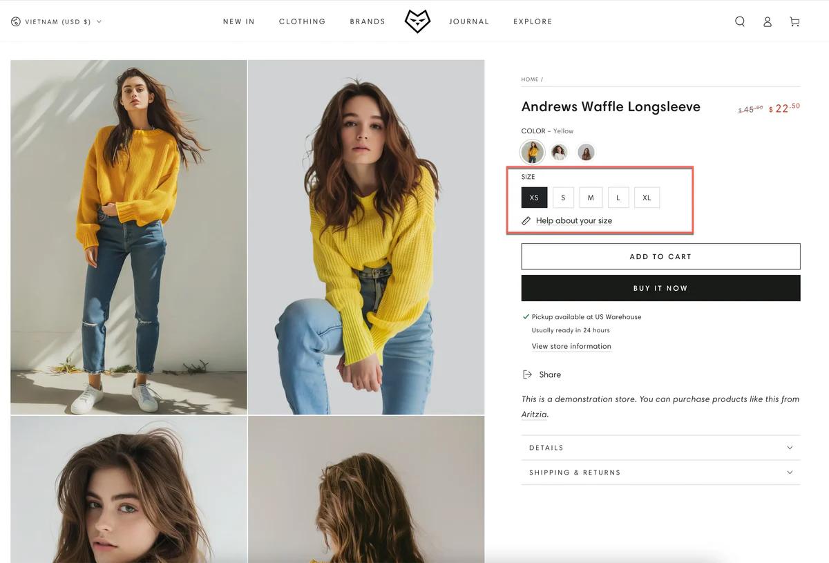
There isn't one correct way to add a size chart in Shopify. The right method depends on how many products you sell, how often sizes change, and how important sizing is to the buying decision. Below are the three practical methods Shopify store owners actually use, along with when each one makes sense.
1. Add a Size Chart Using Product Descriptions or Tabs
You can add a size chart directly inside the product description, or place it in a collapsible tab or an accordion on the product page. This is the simplest approach and doesn't require theme changes. The size chart can be an image, a table, or formatted text. Tabs or accordions keep the page cleaner than a long description.
Step-by-Step:
- Go to Products > select a product > edit the product description.
- Insert a size chart image or a table with measurements.
- Format spacing and headings for readability.
- (Optional) Place the chart inside a tab or accordion if your theme supports it.
Best for:
- Small catalogs
- One-off or unique products
- Stores that are just getting started
Limitations:
- Manual updates for each product
- Easy to forget or misalign across products
- It doesn't scale well as your catalog grows
The Maintenance Nightmare
One store owner rebuilding their Shopify site discovered this friction firsthand. When they needed size charts to update dynamically based on garment style selections, the product description method couldn't handle it. What seemed like a simple update became a maintenance nightmare across dozens of products.
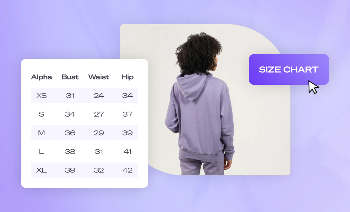
2. Add a Size Chart as a Theme Section or Popup (Most Popular)
You add a reusable size chart section or a pop-up that's triggered near the size selector, often via a "Size Guide" link. This keeps the product page clean while making sizing easy to access at the exact decision point. Shoppers see size help when they need it. The page stays focused on the product. One chart can serve many products.
Step-by-Step:
- Go to Online Store > Themes > Customize
- Navigate to a product page.
- Add or enable a Size Chart section or pop-up.
- Link it near the variant or size selector.
- Save and test on desktop and mobile.
Best for:
- Apparel and footwear stores
- Products with consistent sizing
Limitations:
Requires theme setup or customization.
Less flexible if products use different sizing systems.
According to StarApps’ research on Shopify sizing, 30% of online shoppers return items due to incorrect sizing, underscoring the impact of clear size charts on return rates. A pop-up that shows generic measurements without product-specific context doesn't solve the underlying problem. It just moves the confusion from invisible to visible.
3. Use Metafields for Scalable Size Charts
You store size chart data in Shopify metafields and display it dynamically on product pages. This is the most scalable and flexible option. Size charts are stored once and reused. Each product can have its own sizing data. Ideal for large catalogs or multiple-size systems.
Step-by-Step:
- Go to Settings > Custom data > Products
- Create a metafield for size charts.
- Assign size chart data to each product.
- Render the metafield on product pages using theme customization or a compatible app.
- Test display placement near size selection.
Best for:
- Large catalogs
- Multiple sizing standards (men's, women's, international)
- Stores are serious about reducing returns at scale.
Limitations:
- More setup upfront.
- Requires theme or app support
- Slightly higher technical complexity
The merchant who needed a dynamic size chart swapping based on dropdown selections ended up using this method. Custom frontend logic with Variants, Metafields, and lightweight JavaScript solved what standard apps couldn't. The tradeoff was clear: invest time once in a proper structure, or spend time forever managing individual product pages.
The Takeaway
All three methods work, but they solve different problems. If you need something quick, use descriptions or tabs. If you want cleaner pages, use a section or a pop-up. If you want scalability: use metafields.
For dropshippers testing products quickly, speed matters as much as clarity. Every hour spent wrestling with theme code or formatting tables is time not spent validating the next product.
Speed Without Bottlenecks
Tools like PagePilot let you build product pages with integrated size charts in under two minutes. The chart appears where it should, is clearly formatted, and doesn't require a developer. You're not choosing between speed and conversion optimization. You get both, so sizing clarity doesn't bottleneck your ability to launch and test.
The key isn't just adding a size chart. It's making sure sizing help appears at the moment a shopper is deciding, clearly, consistently, and without friction. But even when you add a size chart the right way, certain mistakes still kill conversions.
Common Size Chart Mistakes That Hurt Conversions

Adding a size chart can help customers shop with confidence, but only if it's done in a way that removes friction instead of adding it. Poorly implemented size charts often do more harm than good because they introduce confusion at a critical moment in the buying decision.
According to research from Owle Studio, 67% of users abandon their carts due to sizing uncertainty, underscoring the importance of clear size guidance to improve conversions. That number doesn't shrink just because a size chart exists somewhere on your product page.
Charts Hidden Too Far Down the Page
If a size chart is buried at the bottom of a product page or tucked behind multiple clicks, customers may never see it, especially on mobile. Mobile shoppers browse quickly and expect key information up front. When sizing information is hard to find, shoppers hesitate or abandon their purchases.
Customers who can't quickly find sizing guidance are more likely to second-guess their purchase, delay a purchase, or leave the site altogether. The chart might be perfectly accurate, but if it's invisible at the moment of decision, it's functionally useless.
Overly Complex Tables
Static size charts often include long rows and columns of numbers: bust, waist, hip, inseam, garment vs. body measurements. Most shoppers don't want to pull out a tape measure or compare multiple figures before buying. Every added moment of effort increases cognitive load and reduces conversions.
Why it hurts: Too much data becomes noise rather than helpful guidance, slowing decision-making and increasing friction. A shopper staring at twelve measurements doesn't feel more confident. They feel overwhelmed, and overwhelmed shoppers leave.
Generic Sizing That Doesn't Match the Product
Many stores use a single chart for all products, even when sizing varies widely across categories (tops, dresses, bottoms). Because sizing standards aren't universal, generic charts can mislead shoppers rather than help them.
When size charts don't align with how a product actually fits, shoppers make guesses. Those guesses often lead to incorrect purchases and higher return rates downstream. The shopper ordered a medium based on your chart, but your supplier's medium fits like a small. Trust erodes, returns spike, and the size chart becomes part of the problem instead of the solution.
Desktop-Only Charts That Break on Mobile
Mobile traffic now accounts for a dominant share of eCommerce visits, and mobile usability directly influences conversion rates. On smartphones, large tables and static images often become unreadable without zooming and horizontal scrolling. Most shoppers skip those interactions entirely.
The Mobile Friction Trap
Why it hurts: If customers can't see or interact with your size chart on their phone, they're more likely to guess, hesitate, or leave, especially when sizing is a key part of the buying decision. Mobile shoppers won't switch to a desktop just to decode your size chart. They'll switch to a competitor whose sizing information is clearer.
What All These Mistakes Have in Common
They introduce friction at the moment shoppers most need clarity. Instead of helping customers decide quickly and confidently, poorly presented size charts force them to work harder to interpret the information, slowing decision-making and lowering conversions. The intent was right. The execution created doubt instead of removing it.
That's why one of the core principles of effective size chart design is simple: clarity beats completeness. Give shoppers what they need, when they need it, in a format that's easy to understand and easy to use. That's what actually reduces hesitation, supports trust, and improves both conversion and return rates.
Decoupling Friction from Performance
For dropshippers testing products quickly, every conversion point matters. If sizing confusion is quietly killing 15% of your potential sales, you're not getting clean data on whether the product actually works. You're measuring product performance plus sizing friction, and those two things shouldn't be tangled together.
Rapid Deployment, Zero Friction
Tools like PagePilot let you build product pages with integrated size charts that appear contextually near the size selector, formatted for both desktop and mobile, in under two minutes. You're not choosing between speed and clarity. Sizing help shows up where it should, without slowing down your ability to launch and test.
The "Later" That Never Happens
The hidden cost of "come back later" thinking applies here, too. When a shopper tells themselves they'll return to your store after measuring themselves or checking another site, they almost never do. That mental bookmark rarely converts. Life moves on. The tab closes. The moment passes.
What felt like a warm lead becomes a lost opportunity, and you'll never know how many potential customers you lost to hesitation. Sizing clarity isn't about being helpful after the fact. It's about removing the reason someone would need to leave in the first place.
But fixing these mistakes is only half the equation. The other half is building size charts that actually guide decisions rather than just display data.
Related Reading
- How To Add A Pop Up On Shopify
- Shopify Variants vs Options
- Shopify Websites Examples
- Best Shopify Themes For Conversion
- How To Add Frequently Bought Together On Shopify
- Shopify Variants Vs Options
- Shopify Websites Examples
- How To Add A Size Chart In Shopify
- How To Choose A Shopify Theme
- Product Recommendations Shopify
- Shopify Order Confirmation Page
How PagePilot Helps You Handle Size Charts the Right Way

Most size-chart problems don't stem from bad intent. They come from adding sizing as an afterthought, after the page is already built, after the layout is locked, and after conversion issues start showing up.
This is where PagePilot changes the approach. PagePilot generates complete product pages, not just copy or visuals. That means sizing clarity is considered part of the page layout itself, not bolted on later as a separate element.
Sizing Guidance Appears Near the Buying Decision
Instead of burying size charts at the bottom of the page or hiding them behind multiple clicks, PagePilot structures product pages so size guidance sits close to where shoppers choose variants. That's when sizing questions actually matter, and when clarity has the biggest impact on confidence.
The placement isn't random. It's positioned where doubt typically surfaces: right when someone hovers over the size dropdown, wondering if medium or large makes more sense. The information shows up in that moment, not three scrolls later.
Size Charts Aren't Added as an Afterthought
Because PagePilot builds pages as a system, size information is treated like any other conversion-critical element. It's placed intentionally, formatted for readability, and designed to support (not interrupt) the buying flow.
Native Structural Integration
You're not wrestling with theme code, trying to make a table fit inside a collapsible tab. You're not uploading size chart images one product at a time, hoping they render correctly on mobile. The page structure accounts for sizing from the beginning, so it integrates naturally instead of awkwardly.
Consistency Scales Automatically
When you generate multiple product pages, sizing guidance follows the same logic across pages. You're not manually re-adding charts, adjusting placement, or fixing mobile layouts product by product.
Doubling Testing Velocity
One store testing new products weekly used to spend 20 minutes per product page just formatting size information to match their existing pages. With PagePilot, that step disappeared. Size charts appeared in the same place, formatted the same way, every time. Testing velocity doubled because page creation stopped being a bottleneck.
That consistency matters beyond time savings. Shoppers who browse multiple products see sizing information in the same spot every time. They learn where to look. Confidence builds across the shopping experience, not just on individual product pages.
The Bigger Takeaway is This
Size charts are another example of why systems beat manual fixes. When pages are built one by one, details like sizing get missed, buried, or handled inconsistently. When pages are built as a system, clarity becomes repeatable, and conversion improvements scale instead of resetting with every new product.
Scalable Global Clarity
PagePilot supports 30+ languages, which means sizing clarity doesn't just work for one market. If you're testing products across regions or expanding internationally, size charts adapt without requiring separate manual builds for each language. The structure stays consistent. The clarity travels.
Systemic Conversion Design
The pattern here applies beyond size charts. Any conversion element that requires thoughtful placement, clear formatting, and consistent presentation benefits from being built into the page system rather than added afterward. Product benefits, shipping details, and trust signals all work better when they're part of the structure, not fighting against it.
But knowing how to build size charts the right way still leaves one question: what happens when you actually implement this on a live store?
Related Reading
• Best Trust Badges For Shopify
• Best One Product Shopify Theme
• Pagefly Alternatives
• Shopify Electronics Store
• Shopify Contact Us Page Example
• High Converting Product Pages
• Best Shopify Theme For Print On Demand
• Shopify T-shirt Store Examples
• Shopify Beauty Stores
Start a FREE Trial With Our AI Page Builder and Reduce Returns Without Adding Friction
The shift should be clear by now. Size charts matter, but only when they're part of the page system, not something you patch in after the fact. When sizing is handled manually (added to some pages, buried on others, formatted differently across products), it creates friction instead of clarity. That friction shows up as hesitation, abandoned carts, and costly returns.
The Structural Solution
Reducing returns doesn't require more rules or more work. It requires a better structure. That's exactly what PagePilot is built to provide. If you want to build product pages that reduce size confusion and improve conversion (without manually fixing sizing details on every product), start a free PagePilot trial today.
Zero-Risk Optimization
You can generate up to 3 high-converting product pages for free, with no credit card required. You'll be able to present sizing guidance where it actually helps decisions, keep pages clean and mobile-friendly, and test and scale products without reworking layouts.
Start your free PagePilot trial today and scale smarter from the start, reducing returns without adding friction to the buying experience.