
You've spent hours building your Shopify store, but something feels off. The traffic arrives, people browse, yet the cart stays empty. The difference between stores that convert and those that don't often comes down to design choices you can see and study. This article Shopify product page examples breaks down real Shopify website examples that turn visitors into customers, showing you exactly what works in store layouts, navigation, and especially in Shopify product page examples that drive sales.
Learning from successful stores is one thing, but implementing those lessons quickly is another challenge entirely. PagePilot's AI page builder helps you apply what you discover from these high-converting Shopify website examples without needing design experience or coding skills. The tool analyzes proven ecommerce patterns and lets you build pages that mirror the strategies used by top-performing Shopify stores, turning inspiration into action.
Summary
- Most Shopify store galleries showcase brands operating with six-figure ad budgets and established customer bases, creating an advantage gap that new founders cannot replicate. When a well-funded store converts at 1.8 percent with 100,000 monthly visitors, it generates 1,800 orders. A new founder with 500 monthly visitors at the same conversion rate gets nine orders.
- The elements that separate a 1.4 percent conversion rate from a 3.2 percent conversion rate are rarely the ones highlighted in design showcases, according to Littledata's 2024 benchmarking data. Trust signals like clear return policies, specific product specifications, and customer photos showing real usage contexts drive purchasing decisions independently of brand recognition or advertising spend.
- Industry analyses show that 80 to 95 percent of new Shopify stores fail within the first two years, often because founders focus on replicating aesthetic elements rather than conversion mechanics. The opportunity cost is brutal. Every day spent perfecting design details instead of testing your offer is a day without data about whether people actually want to buy your product.
- Cart abandonment averages 69.82 percent according to Baymard Institute, meaning most visitors who add products never complete checkout. Poor product page messaging contributes directly to this loss. When visitors reach the cart but remain uncertain whether the product delivers on its promise, they abandon.
- Supplier photos appearing across dozens of competitor sites kill credibility because visitors recognize the visual duplication. When someone sees the same image on five different stores, your page reads as a generic reseller rather than a trusted source.
AI page builder addresses this by generating conversion-structured product pages in under two minutes, applying benefit-focused copywriting frameworks and proven page architectures that let you test positioning and offer strength instead of learning page construction skills.
Most Shopify Website Examples Teach the Wrong Lessons
Turning inspiration into implementation works only when you study stores built under constraints similar to yours. But that shift requires looking past the surface, and most Shopify store galleries make that nearly impossible.
The Advantage Gap Nobody Mentions
The brands featured in most best Shopify stores roundups operate in a different economic reality. They launch with established customer bases who already trust the brand name. They run six-figure monthly ad budgets that can absorb mediocre conversion rates through sheer traffic volume.
When a store like that converts at 1.8 percent, it still generates substantial revenue because 100,000 monthly visitors at 1.8 percent produces 1,800 orders.
Efficiency First
A new founder testing a product idea with 500 visitors per month cannot play that game. At a 1.8 percent conversion, you get nine orders. The math doesn't support expensive custom development, professional photography shoots, or brand awareness campaigns.
You need every structural element of your product page working efficiently because you cannot compensate for poor conversion with volume.
What High-Budget Design Actually Hides
Polished stores with custom animations and sophisticated branding look impressive, but they often obscure the conversion mechanics that actually matter. A beautifully designed hero section means nothing if the product benefit isn't immediately clear. Custom scrolling effects add visual interest but rarely address whether a first-time visitor understands the product's problem within three seconds.
The elements that separate a 1.4 percent conversion rate from a 3.2 percent conversion rate, according to Littledata's 2024 benchmarking data, are rarely the ones highlighted in design showcases. Trust signals drive purchasing decisions. These include:
- Clear return policies
- Specific product specifications
- Customer photos of real usage contexts
Conversion Components
These components work independently of brand recognition or advertising spend. A founder working with limited traffic needs pages structured around these conversion-focused elements, not aesthetic inspiration borrowed from brands operating under completely different constraints.
The Real Cost of Copying the Wrong Models
Spending three weeks building a visually impressive product page modeled after a well-funded brand delays the only activity that actually matters for new stores: testing whether people want to buy your product.
Every day spent perfecting design details instead of getting your offer in front of real customers is a day without data. You cannot optimize what you have not launched.
Rapid Deployment
AI page builder addresses this by generating conversion-structured product pages in under two minutes, letting you move from product idea to live testing before you've finished reading most design inspiration articles.
The tool automatically applies proven layout frameworks, so you are testing your actual offer and messaging rather than wondering whether your page structure is costing you sales.
Conversion Strategy
The stores worth studying are not the ones with the biggest design budgets. They are the ones that clearly demonstrate how layout, messaging hierarchy, and trust elements work together to convert cold traffic into customers.
But recognizing which stores actually teach useful lessons requires knowing what separates a genuine conversion strategy from expensive decoration.
Why Most ‘Best Shopify Websites’ Lists Are Misleading
Lists of the best Shopify websites are everywhere. But for most ecommerce founders, they are surprisingly unhelpful. These articles usually highlight:
- Large direct-to-consumer brands
- Stores with heavily customized Shopify themes
- Companies with large marketing budgets
At first glance, these examples appear to be the ideal templates for building a successful store:
- The designs are polished
- The product photography is professional
- The branding is highly refined
Resource Validation
The problem is that these examples hide the real constraints most founders face. New ecommerce operators rarely have the resources behind the brands featured in these lists. Most founders need to:
- Test products quickly
- Launch pages fast
- Iterate messaging and positioning
- Validate demand before investing heavily in design
Studying a multimillion-dollar brand's Shopify store does not help solve those problems.
The Traffic Volume Illusion
When companies operate at scale, traffic volume and brand recognition often drive performance more than the specific layout of an individual product page. A founder searching for Shopify inspiration lands on a list featuring brands like:
- Gymshark
- Allbirds
Their websites look impressive and highly polished. But those stores benefit from advantages that most new ecommerce founders cannot replicate:
- Millions of dollars in advertising spend
- Strong brand recognition,
- Dedicated design and development teams
- Extensive professional product photography
Conversion Mechanics
Even if a founder copied the visual structure of those pages exactly, they would still lack the underlying advantages that make those stores successful. When you cannot compensate for poor conversion with volume, every structural element of your product page must work efficiently.
Industry analyses cited in Branvas show that 80% to 95% of new Shopify stores fail within the first two years, often because founders focus on replicating aesthetic elements rather than conversion mechanics.
The Speed Penalty Nobody Calculates
Most founders underestimate how much time they lose chasing inspiration from the wrong sources. You spend hours analyzing a beautifully designed store, then days trying to recreate similar visual elements in your own theme. By the time you finish, you have invested weeks into a page that has never faced real customer feedback.
The opportunity cost is brutal: every day spent perfecting design details instead of testing your offer is a day without data about whether people actually want to buy your product.
Rapid Iteration
Tools like AI page builder generate conversion-structured product pages in under two minutes, applying proven layout frameworks automatically. This shifts your focus from page construction to what actually matters: testing whether your messaging resonates and your offer converts.
You are testing your actual product and positioning rather than wondering whether your page structure is costing you sales.
What Successful Testing Actually Requires
Instead of studying famous Shopify stores, founders should focus on something else entirely. They should analyze product pages designed to convert cold traffic, where the page must persuade visitors who have never heard of the brand.
The elements that drive purchasing decisions work independently of brand recognition or advertising spend. These include:
- Clear return policies
- Specific product specifications
- Customer photos showing real usage contexts
Market Validation
These components are rarely highlighted in design showcases because they are not visually impressive, but they are what separate stores that convert from stores that just look good.
An article citing general startup failure statistics reveals that 35% of startup failures are due to lack of market demand, not poor design. The faster you can test whether demand exists, the faster you can either iterate or move on.
Critical Validation
Copying high-budget design delays critical validation. But knowing which stores actually teach useful lessons requires understanding what conversion elements matter when you have no brand recognition and limited traffic.
Related Reading
- Shopify Product Page Examples
- How to Make Your Shopify Store Look Professional
- How to Increase Conversion Rate Shopify
- Best Size for Shopify Product Images
- eCommerce Product Page Optimization
- Shopify Banner Size
- How to Create Multiple Product Pages in Shopify
- How to Change Favicon on Shopify
- How to Add Size Chart in Shopify
- How to Customize Shopify Checkout Page
The Types of Shopify Examples That Actually Matter
The stores worth studying are not the ones with the most impressive design budgets. They are the ones built to convert visitors who arrive with:
- Zero brand awareness
- No prior relationship
- Often, a healthy dose of skepticism
These pages must persuade through structure, not reputation.
Sales Conversation
This distinction reshapes everything. When Shopify powers over 5.8M live stores, most of those sites compete for the same cold traffic. The product page becomes the entire sales conversation, compressed into seconds.
What matters is not whether the page looks polished, but whether it answers the visitor's unspoken questions before they leave.
Product Positioning That Eliminates Confusion
The first screen should immediately resolve three doubts: what this product does, who benefits from it, and why it differs from alternatives. If a visitor scrolls past the hero section, still unsure whether this product solves their specific problem, the page has already failed.
Strong examples communicate the core benefit at a single glance. Weak ones bury the value proposition beneath branding, forcing visitors to hunt for meaning they will rarely bother to find.
Information Hierarchy
This is not about clever copywriting. It is about information hierarchy. The visitor arrived because they have a problem. The page either confirms it can solve that problem within three seconds, or the visitor moves on. No amount of aesthetic refinement compensates for unclear positioning.
Visual Proof That Demonstrates Outcomes
Generic product images convey nothing about results. The stores that convert cold traffic show the product in context:
- Real usage scenarios
- Before-and-after comparisons
- Feature callouts that connect directly to benefits
These visuals do the work of explanation without requiring the visitor to read paragraphs of text. When someone sees a photo of the product solving a problem they recognize, trust forms faster than any written claim could build it.
Visual Skepticism
Most founders underestimate the amount of skepticism their pages face. A visitor landing from a Facebook ad or Google search has no reason to believe your product works. Lifestyle images showing real people using the product in recognizable situations bypass that skepticism.
The visual says, "This is what success looks like," and the visitor either sees themselves in that image or they do not.
Objection Handling Built Into the Structure
High-converting pages anticipate doubt and address it proactively. Common concerns (Does this actually work? How is it different? What if it does not fit?) positioned where doubt naturally peaks get answered through:
- Dedicated sections
- Guarantees
- FAQs
These elements function as invisible salespeople, catching objections before they become reasons to leave.
Friction Reduction
The difference between a 1.4 percent conversion rate and a 3.2 percent conversion rate often lies in these friction-reducing details.
A clear return policy, specific product dimensions, or a comparison chart showing how this product differs from cheaper alternatives can each independently lift conversions. Together, they transform a page from a product listing into a persuasive argument.
Social Proof From Real Customers
Visitors trust other customers more than they trust you. The following reduce uncertainty faster than any brand claim:
- Reviews
- Testimonials
- User-generated photos
- Usage stats
When someone sees evidence that hundreds of other people bought this product and felt satisfied, the psychological barrier to purchasing drops. This works independently of traffic volume or brand recognition, which is why it matters so much for new stores operating without either advantage.
Psychological Frameworks
AI page builder structures pages around these conversion elements automatically, applying the same psychological frameworks that high-performing stores use to transform skeptical visitors into buyers.
The tool generates layouts with:
- Positioning clarity
- Built-in visual storytelling sections
- Objection-handling components
- Social proof placement
Offer Testing
You are testing your actual offer rather than wondering whether your page structure is quietly killing sales.
But knowing these principles and recognizing them in action are entirely different skills.
Related Reading
- Shopify Variants vs Options
- Product Recommendations Shopify
- How To Add Frequently Bought Together On Shopify
- Shopify Variants Vs Options
- How To Add Size Chart In Shopify
- Best Shopify Themes For Conversion
- How To Change Favicon On Shopify
- Shopify Order Confirmation Page
- How To Choose A Shopify Theme
- How To Customize Shopify Checkout Page
12 Shopify Website Examples for Inspiration
Looking at real Shopify stores helps only when you extract conversion patterns instead of copying aesthetics. The stores below represent different niches and price points, but they share structural elements that work independently of brand recognition:
- Clear positioning
- Visual proof of outcomes
- Objection handling
- Customer validation
These are the mechanics that convert cold traffic.
1. Gymshark
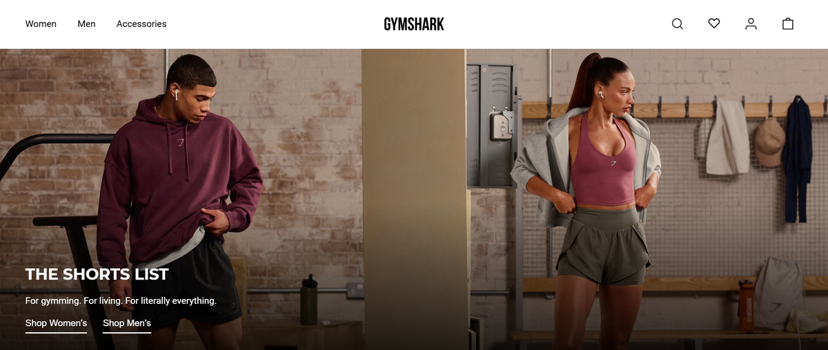
Fitness apparel built on user-generated content. The brand embeds customer workout videos and athlete testimonials directly into product pages, showing the clothing in actual training contexts rather than studio shots.
This approach works because visitors see real performance, not marketing claims. The conversion lift comes from social proof that answers the unspoken question: Does this actually hold up during intense movement?
2. Allbirds
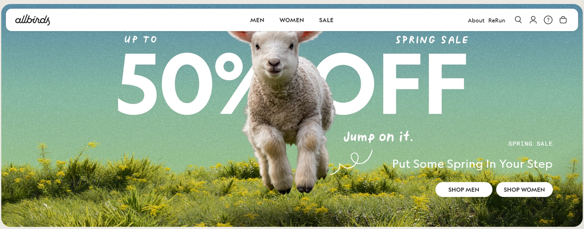
Sustainable footwear that leads with material transparency. Product pages detail the exact inputs (merino wool, sugarcane foam, eucalyptus fiber) and environmental impact metrics for each shoe.
This specificity builds trust with sustainability-focused buyers who want proof, not promises. The pages answer objections before they form by showing precisely how the product delivers on its environmental claims.
3. Pura Vida Bracelets
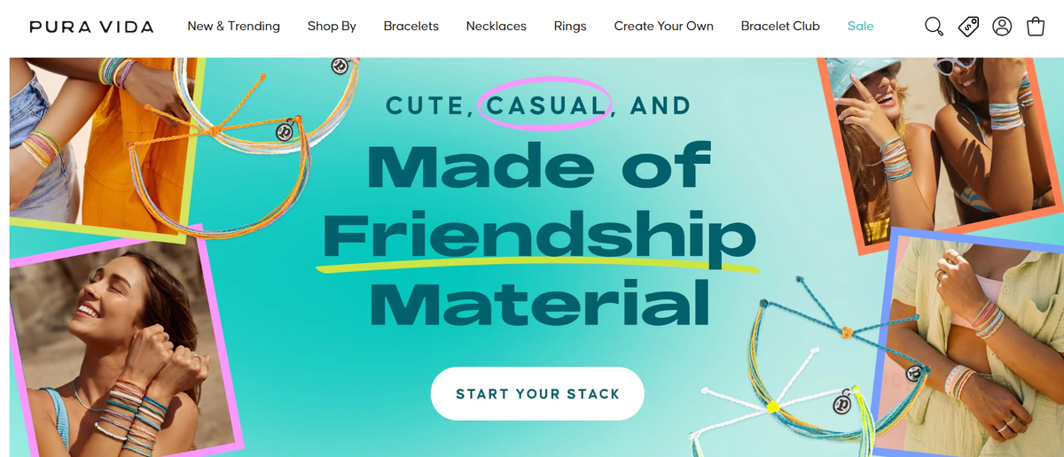
Lifestyle accessories leveraging subscription commerce. Beyond individual purchases, the brand promotes monthly bracelet clubs that deliver new designs regularly. This model increases customer lifetime value while creating anticipation around each release.
The conversion strategy shifts from one-time transactions to ongoing relationships, which changes how the entire funnel operates.
4. Bombas
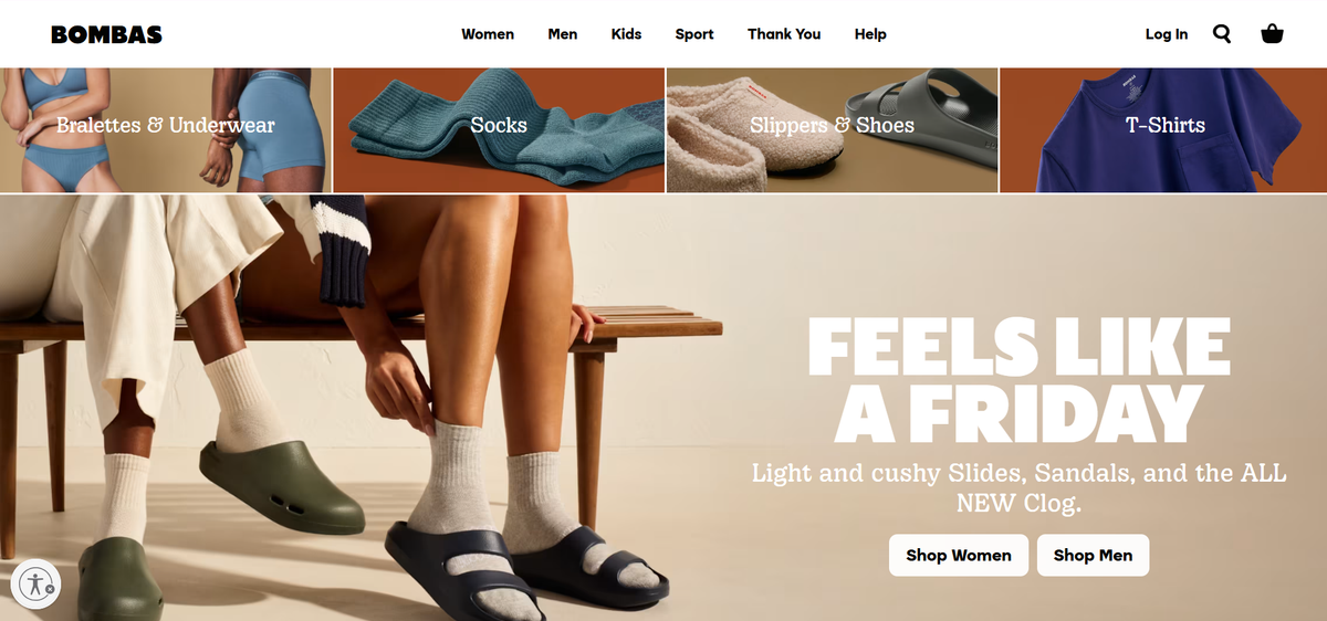
Socks and apparel using mission-driven messaging as a primary conversion driver. The "one purchased equals one donated" model appears throughout product pages, connecting each purchase to social impact.
This emotional motivation works because it transforms a commodity purchase (socks) into a values-aligned decision. The page structure makes the charitable component as prominent as product features.
5. Spigen
Phone accessories demonstrating the power of intuitive navigation. Because the catalog spans hundreds of device models and case styles, the site emphasizes filtering systems that let visitors locate compatible products within seconds.
This reduces friction for buyers who know exactly what device they own but face decision paralysis when confronted with too many options. Clear categorization converts browsers into buyers faster than persuasive copy ever could.
6. WP Standard
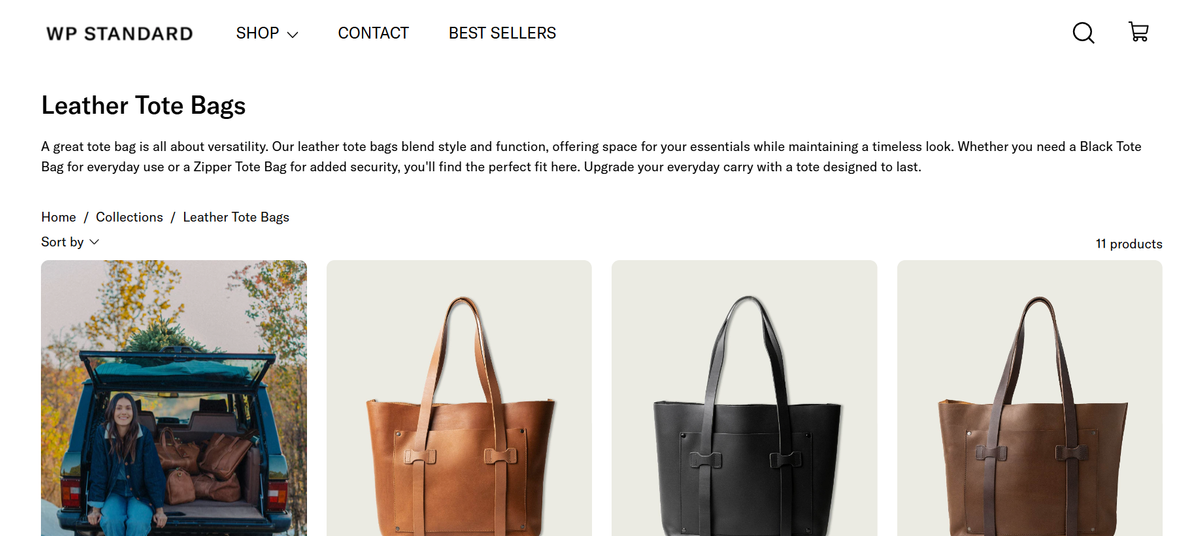
Leather goods elevating everyday items through narratives of craftsmanship. Instead of listing features, product pages explain:
- Heritage
- Material sourcing
- Construction methods
This storytelling approach repositions a wallet or belt from a functional purchase into a premium lifestyle choice. The conversion mechanic relies on perceived value created through narrative depth rather than price competition.
Scalable Structure
According to research compiled by Eastside Co, 27 major companies and established brands operate on Shopify, demonstrating that the platform supports both scrappy startups and scaled operations. But studying giants like Kylie Cosmetics (which leverages celebrity influence and scarcity-driven product drops) teaches limited lessons when you lack an existing audience.
The structural elements that matter, like clear product categorization or mission-driven messaging, work at any scale. Traffic volume and brand recognition simply amplify what already converts.
7. Teddy Fresh
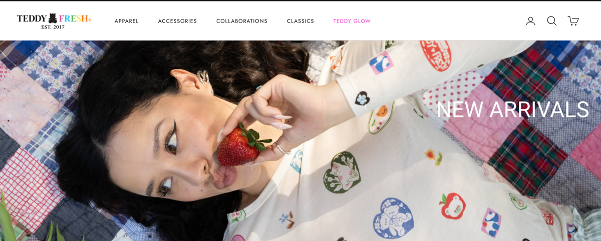
Streetwear differentiated by bold visual identity. The store organizes collections around seasonal themes and distinct color palettes, turning product browsing into visual exploration.
This approach works when the brand aesthetic itself becomes a primary purchase driver. Visitors buy into the look as much as the individual items, which changes how product pages need to communicate value.
8. Jolie Noire
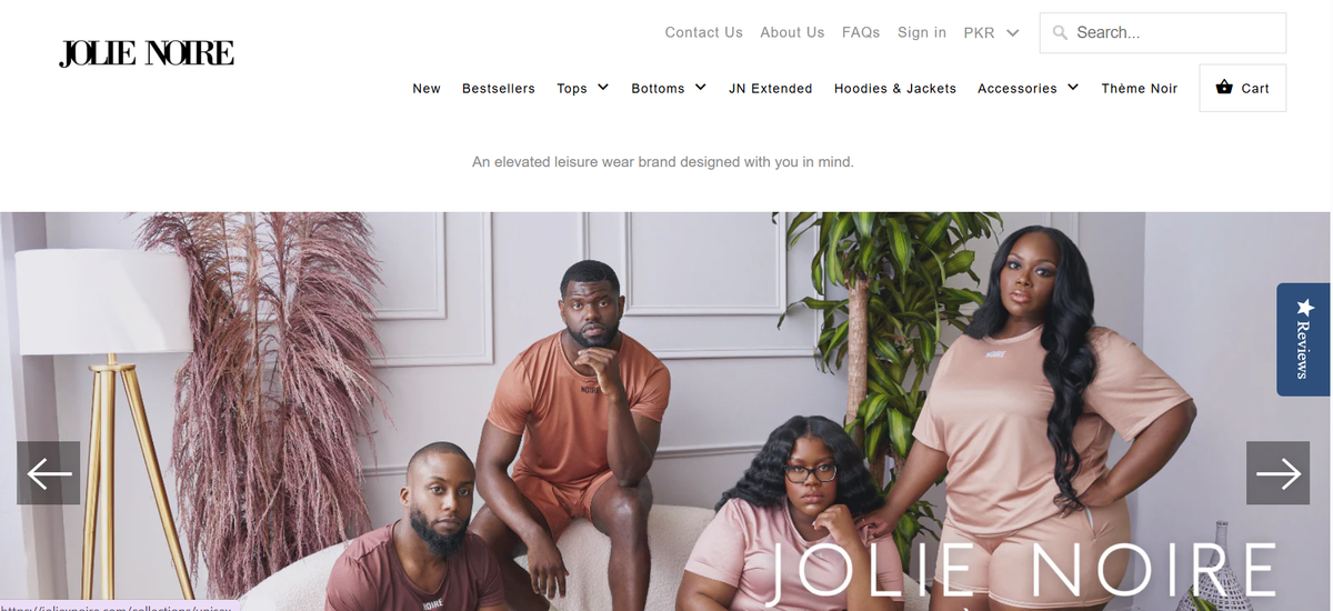
Fashion emphasizing cultural identity and empowering messaging. Lifestyle imagery dominates product pages, communicating brand energy and personality before describing fabric or fit. This strategy converts visitors who connect with the brand's values and visual language, filtering for customers who see the clothing as self-expression rather than just apparel.
9. Rothy's
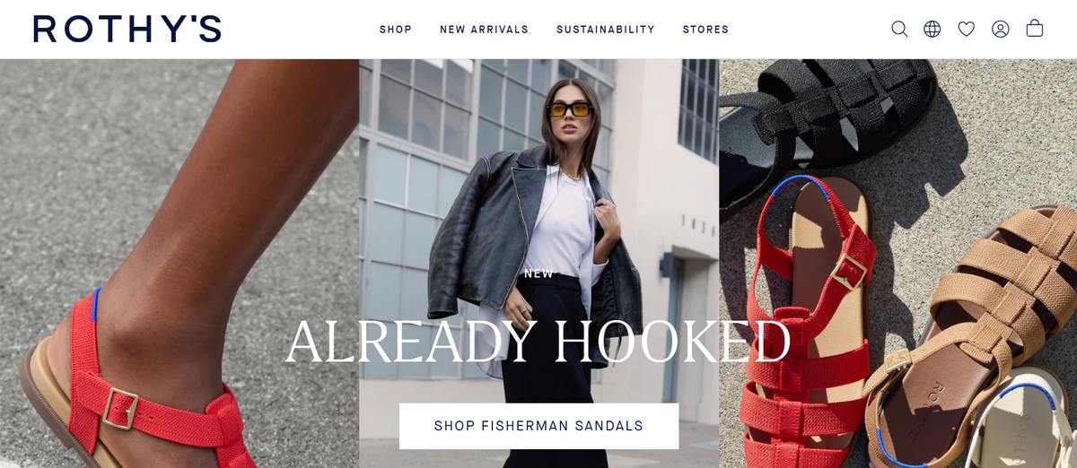
Sustainable fashion highlighting material innovation. Product pages explain how footwear and accessories are constructed from recycled plastic bottles, detailing both the:
- Environmental process
- Style benefits
This dual focus appeals to conscious consumers who refuse to compromise aesthetics for sustainability. The pages prove you can have both, which removes a common objection that keeps eco-focused buyers from converting.
10. Chubbies
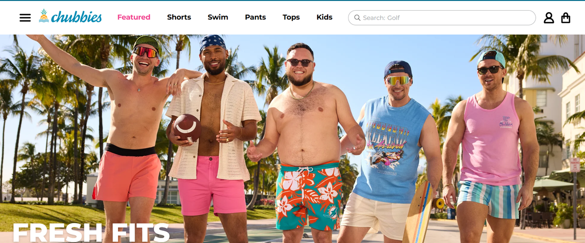
Casual menswear built around community and humor. Product descriptions use conversational, irreverent copy that reinforces brand personality while explaining fit and features.
This tone filters for customers who connect with the brand's vibe, creating a self-selecting audience more likely to convert and return. The copy itself becomes a conversion tool by:
- Attracting the right buyers
- Repelling mismatched ones
11. Hiut Denim
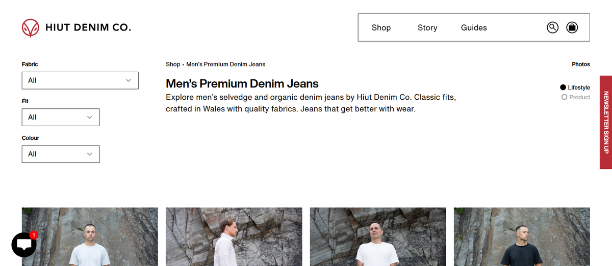
Premium jeans emphasizing manufacturing heritage and craftsmanship. Product pages detail the Welsh town where jeans are made, the specific denim mills supplying fabric, and the construction techniques used.
This transparency builds trust among buyers willing to pay a premium for quality and story. The conversion strategy relies on educating visitors about what justifies the cost rather than competing on price.
12. MVMT

Watches and accessories with clean layouts and minimal-friction checkout. Product pages focus on:
- Large product images
- Clear pricing
- Streamlined add-to-cart flows
This approach works for straightforward purchases where visitors already:
- Understand the product category
- Need minimal persuasion
Simplified Steps
The conversion optimization happens through reducing steps rather than adding persuasive elements.
Shopify's own curated collection features 50 successful stores across categories, but the list skews toward brands with established audiences and substantial marketing budgets.
Conversion Patterns
The conversion patterns that matter (positioning clarity, visual proof, objection handling, social proof) appear in these examples. Still, they are often buried beneath custom development and high-budget photography that most founders cannot replicate quickly.
But seeing these patterns in finished stores still leaves the hardest problem unsolved.
The Real Bottleneck: Turning Shopify Inspiration Into Product Pages

Translating what you see in successful stores into a working product page reveals friction most founders don't anticipate. The gap between recognizing a strong conversion pattern and implementing it on your own site stretches across multiple skill domains:
- Copywriting that communicates value
- Page architecture that guides purchasing decisions
- Visual assets that build trust
- Content adaptation that transforms generic supplier material into something defensible
Each requirement introduces delay, and collectively they turn what should be a two-hour task into a multi-day project.
Writing Copy That Actually Sells
Most founders start with supplier descriptions because they're readily available. These descriptions list features (material composition, dimensions, included components) without addressing the visitor's underlying question: why does this solve my specific problem better than alternatives?
Rewriting product copy requires understanding benefit-driven messaging, which means identifying the emotional outcome a customer seeks and connecting product attributes directly to that result.
Benefit Translation
A water bottle isn't just "double-walled stainless steel." It's "keeps coffee hot through your entire commute without burning your hand." That translation from specification to benefit takes time and skill that most founders haven't developed yet.
According to Baymard Institute, the average cart abandonment rate reaches 69.82 percent, meaning most visitors who add products never complete checkout. Poor product page messaging contributes directly to this loss.
Doubt Resolution
When a visitor reaches the cart but remains uncertain whether the product delivers on its promise, they abandon. The copy failed to resolve doubt early enough in the journey.
Structuring Pages for Decision-Making
Even after studying high-converting stores, recreating their information hierarchy proves harder than expected. You notice that successful stores place customer reviews above the fold, but you're unsure whether that works, given their:
- Specific audience
- Product category
- Existing brand trust
Psychological Logic
Another store leads with a comparison chart, while a third emphasizes lifestyle imagery. Without understanding the psychological reasoning behind these choices, you're left guessing which structure fits your:
- Product
- Traffic source
Testing multiple layouts means building multiple versions, which multiplies the time investment before you've validated whether anyone wants to buy.
Creating Visuals That Differentiate
Supplier photos appear on dozens of competitor sites selling identical products. When a visitor sees the same image across multiple stores, your page reads as a reseller rather than a trusted source.
Differentiation requires either original photography (expensive and time-consuming) or creative ways to present existing images, such as:
- Lifestyle mockups
- Feature callouts
- Usage demonstrations
Market Validation
Both paths demand skills most founders lack initially. You end up spending days learning image editing tools or hiring freelancers, all before testing whether the product itself has market demand.
Adapting Borrowed Content Into Something Unique
Research from Growth Suite outlines an 8-category framework for analyzing product performance, but applying analytical frameworks to your specific situation still requires judgment calls that slow execution.
Most product ideas originate from competitor research or supplier catalogs, which means the starting content is never original. Transforming that material into a page that feels distinct requires:
- Repositioning the product (emphasizing different benefits)
- Restructuring information (changing what appears first)
- Rewriting descriptions (using different language and examples)
Execution Speed
This creative adaptation work resists shortcuts because it demands strategic thinking about how to stand out in a crowded category.
Founders need a way to compress this execution gap from days into minutes, moving from competitor insight to a testable product page before doubt and distraction derail momentum.
Automated Translation
AI page builder generates conversion-structured pages in under two minutes by automating the translation from product link to persuasive layout, applying benefit-focused copywriting frameworks and proven page architectures without requiring manual implementation.
The tool handles the structural decisions (information hierarchy, section placement, messaging flow) so you can test your actual offer rather than learning page-building skills.
Purchasing Logic
But speed alone doesn't guarantee conversions if the underlying framework ignores how visitors actually make purchasing decisions.
How PagePilot Helps You Turn Shopify Examples Into High-Conversion Pages

You paste a competitor or supplier URL. Within two minutes, you have a structured product page ready to test. PagePilot analyzes the source link and generates a complete Shopify page with:
- Benefit-focused copy
- Trust elements
- Conversion-optimized layout
The manual reconstruction process disappears entirely. The reconstruction process includes:
- Rewriting descriptions
- Choosing sections
- Organizing information flow
Competitive Advantage
This compression matters most when you're validating product ideas rather than perfecting established winners. Every hour spent building pages manually is an hour you're not collecting real customer data.
According to PagePilot.ai, the platform supports 30+ languages, which means you can test international markets without hiring translators or learning new copywriting frameworks for each region. Speed becomes your competitive advantage when others are still formatting their first draft.
Turning Competitor Research Into Working Pages
Most founders analyze successful stores, screenshot layouts, and then face a blank Shopify editor, wondering how to recreate what they saw. PagePilot eliminates that translation step.
The AI identifies structural patterns:
- How benefits are positioned
- Where social proof appears
- Which objections get addressed first
Architecture Adaptation
It also automatically applies those frameworks to your product. You're not copying a competitor's exact page. You're:
- Extracting their conversion architecture
- Adapting it to your offer
This matters because the gap between recognizing a strong pattern and implementing it correctly stretches across multiple skill domains. You need to understand:
- Information hierarchy (what visitors need to see first)
- Psychological triggers (which trust signals reduce friction)
- Messaging clarity (how to communicate value without confusion)
Structural Confidence
PagePilot handles those structural decisions, so you're testing positioning and offer strength rather than wondering whether your page layout is costing you sales.
Solving the Visual Differentiation Problem
Supplier photos appear across hundreds of competitor stores selling identical products. When visitors see the same image on five different sites, your page reads as:
- Generic and untrustworthy.
PagePilot's AI Product Image feature generates unique visuals that communicate the same product information without the visual duplication that kills credibility. Your store stops looking like every other reseller in the search results.
Automated Customization
PagePilot AI Blog outlines 7 Simple Steps for customization, but the real advantage is that most customization happens automatically during generation. You're not following a tutorial to adjust each section manually.
The tool applies proven page structures, then lets you refine specific elements based on your product's unique selling angle. These elements include:
- Headline emphasis
- Feature prioritization
- Guarantee placement
Customization becomes iteration rather than construction.
From Idea to Live Testing in Minutes
The workflow compresses to three actions:
- Paste URL
- Review generated page
- Publish
This speed shift changes how you approach product testing entirely. Instead of committing days to building a single page before seeing any customer response, you can generate multiple variations, testing different positioning angles in the time it used to take to write one product description.
Data-Driven Insight
You learn what resonates by watching real conversion data, not by guessing which messaging framework might work better.
Platforms like AI page builder remove the execution bottleneck that keeps most founders stuck in analysis mode, translating competitor insights into testable pages before momentum fades or doubt creeps in. The tool doesn't make strategic decisions about which products to sell or how to position them.
Market Feedback
It handles the structural implementation, so those strategic questions get answered through market feedback rather than prolonged internal debate.
But generating pages quickly only creates value if those pages actually convert visitors into customers.
Related Reading
- Shopify T-shirt Stor
- Shopify Electronics Store
- Shopify Beauty Stores
- Shopify Contact Us Page Example
- Best Shopify Theme For Print On Demand
- Pagefly Alternatives
- Best Trust Badges For Shopify
Start a Free Trial and Generate 3 Product Pages With Our Ai Page Builder Today
If you're studying Shopify website examples, the real goal isn't inspiration. It's launching product pages you can actually test. The stores you analyzed matter only when they translate into live pages collecting real customer data, and that requires moving from observation to execution before momentum fades.
With PagePilot, you paste a competitor or supplier URL and generate a structured product page ready for Shopify in under two minutes. You can start a free trial and generate three product pages with no credit card required, which means you can immediately test a product idea using the same conversion-focused structures you see in successful Shopify stores.
Execution Compression
The difference between studying high-performing pages and running your own isn't technical skill or design budget. It's about compressing the gap between recognizing what works and getting it live in front of real visitors.
Most founders spend weeks:
- Perfecting their first product page
- Analyzing examples
- Rewriting copy
- Adjusting layouts
- Second-guessing positioning decisions
Relentless Testing
By the time they publish, they've invested so much effort that failure feels devastating rather than informative. Testing three different products or positioning angles in the same timeframe changes the entire risk profile. You're gathering market feedback on multiple hypotheses instead of betting everything on a single untested page.
The stores featured in best-of lists didn't succeed because they launched perfect pages. While cutting losers fast, they:
- Succeeded because they tested relentlessly
- Identified what converted
- Doubled down on winners
Testing Velocity
You cannot replicate that advantage by copying their final design. You replicate it by matching their testing velocity, and that requires infrastructure that generates pages faster than doubt can paralyze execution. Speed becomes the competitive edge when others are still formatting their first draft.


