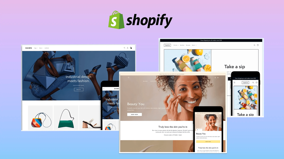
The beauty industry thrives on visual appeal, yet most Shopify beauty stores struggle to convert browsers into buyers. You've likely seen countless cosmetics brands, skincare lines, and makeup retailers with stunning products but underwhelming sales, and the culprit is often a product page that fails to persuade. When examining Shopify product page examples from successful beauty retailers, patterns emerge: certain layouts, copy strategies, and design choices consistently drive purchases while others leave money on the table. This article reveals what separates high-converting Shopify beauty stores from the rest and shows you the exact elements that turn casual visitors into loyal customers.
Once you understand what works, the next challenge becomes implementation. PagePilot's AI page builder helps you apply these proven strategies to your own beauty store without needing design expertise or coding knowledge. The tool analyzes top-performing beauty product pages and generates layouts optimized for your specific products, whether you're selling luxury serums, organic lipsticks, or cruelty-free foundations.
Summary
- Most beauty stores rely on generic Shopify themes designed for usability, not persuasion, which creates a critical gap in conversion performance. Research from Google shows users form an opinion about a website in as little as 50 milliseconds, meaning if the value isn't immediately clear, visitors default to leaving rather than exploring further.
- Displaying reviews can increase conversion rates by up to 270%, according to data from the Spiegel Research Center, especially for lower-awareness products. Most stores bury reviews or disconnect them from product claims, losing this impact entirely. Customers need to see proof as soon as they're evaluating a claim, not after they've already decided to leave.
- Beauty traffic is overwhelmingly mobile, with 79% of consumers using smartphones to research products according to Capital One Shopping, yet most themes sacrifice content depth to fit smaller screens. This creates a false choice between mobile speed and the detailed information that customers need to make purchase decisions.
- The average ecommerce conversion rate is 1.56%, according to IRP Commerce data from February 2026, meaning the vast majority of visitors leave without buying. In beauty, where products are subjective and trust-driven, that gap widens further when pages fail to answer core customer questions about skin-type compatibility, expected results, and brand credibility.
- High-converting beauty stores achieve 3% conversion rates by integrating social proof directly into content flow rather than treating it as a separate section. When a page claims specific results like reducing dark spots in two weeks, customer photos and testimonials appear immediately below, reinforcing promises at the exact moment doubt would surface.
AI page builder addresses this by generating conversion-optimized layouts in under 60 seconds, analyzing top-performing beauty product pages, and incorporating proven tactics such as strategic social proof placement and benefit-driven headlines, thereby removing the need for expensive dependencies on designers and copywriters.
Most Beauty Stores Look Good but Don’t Convert
Most beauty stores are built to impress, not to convert. The assumption is simple. If the site looks premium, customers will buy. So brands invest heavily in visual design, branding, and packaging. The result is a store that feels polished, editorial, and on-brand. But that does not translate into sales.
Conversion Gap in Ecommerce
The gap between traffic and conversion is significant. According to IRP Commerce, the average ecommerce conversion rate decreased by 0.91% from 1.57% to 1.56% in February 2026, meaning the vast majority of visitors leave without buying. In beauty, where products are subjective and trust-driven, that gap can be even wider.
The issue is not a lack of demand. Beauty is one of the largest and fastest-growing ecommerce categories globally. The issue is how products are presented.
Trust and Product Presentation
A visually strong homepage does not answer the questions customers actually have:
- Will this work for my skin type?
- What results should I expect?
- Can I trust this brand?
Research from Nielsen shows that 66% of consumers trust user-generated content more than branded content, which highlights a key disconnect. Many beauty stores prioritize polished visuals but underinvest in the kind of proof that actually drives decisions.
The Real Problem Isn't Design
Most stores optimize for how the brand looks, not for how customers decide. Without clear benefits, visible proof, and a structured path to purchase, even high-quality products struggle to convert.
Visitors browse, scroll, and leave, not because they are uninterested, but because they are unconvinced. Clarity is often missing. Studies from the Baymard Institute consistently show that unclear product information and poor page structure are among the top reasons users abandon purchases.
AI-Driven Conversion Optimization
This is where solutions like PagePilot change the equation. Instead of manually building pages around aesthetic preferences, AI-powered tools analyze top-performing beauty product pages and generate layouts optimized for your specific products in under 60 seconds.
The system incorporates conversion tactics used by leading beauty brands, from social proof placement to benefit-driven headlines, removing the guesswork and expensive dependencies on designers or copywriters while you focus on testing products that actually sell.
Related Reading
- Shopify Product Page Examples
- How to Make Your Shopify Store Look Professional
- How to Increase Conversion Rate Shopify
- Best Size for Shopify Product Images
- eCommerce Product Page Optimization
- Shopify Banner Size
- How to Create Multiple Product Pages in Shopify
- How to Change Favicon on Shopify
- How to Add Size Chart in Shopify
- How to Customize Shopify Checkout Page
What High-Converting Shopify Beauty Stores Do Differently
High-converting stores don't just look better. They make the buying decision easier by structuring every element around customer doubt.
Where most stores prioritize aesthetics, top performers prioritize clarity, proof, and guidance. The difference isn't about design talent or budget. It's about understanding that beauty customers need to believe the product will work for them before they'll buy.
Clarity Above the Fold
The first screen matters more than anything else. Top stores immediately communicate what the product does, who it's for, and what result to expect. This isn't about clever headlines or brand storytelling. It's about answering the customer's core question within three seconds: "Is this relevant to me?"
According to Datarize, the average Shopify conversion rate is 1.4%, meaning most visitors leave without quickly understanding the value. High-converting stores address this by leading with outcome-driven language rather than product features. "Reduces dark spots in 14 days" beats "Advanced brightening serum" every time.
Ingredients Translated Into Outcomes
Beauty buyers are increasingly ingredient-aware, but that doesn't mean they want chemistry lessons. The stores that convert well don't just list niacinamide or hyaluronic acid. They explain, in practical terms, what those ingredients actually do for the skin.
"Hyaluronic acid holds 1000x its weight in water, keeping skin plump and hydrated throughout the day" gives context that a simple ingredient list never will. This shift from technical specification to tangible benefit removes the research burden from customers. They don't need to Google every ingredient. The page does that work for them.
Proof That Feels Real
This is where the biggest gap appears between stores that convert and stores that don't. Top performers invest heavily in before-and-after visuals, customer photos, and real-world results. According to the Craftberry article on Shopify Beauty Stores, the beauty and personal care e-commerce market is projected to reach $716.6 billion by 2025, but growth alone doesn't guarantee individual store success.
What separates winners is visible proof. User-generated content, unfiltered customer photos, and video testimonials create trust that branded imagery can't match. Customers aren't buying the product itself. They're buying the outcome they believe it will deliver, and proof makes that belief tangible.
Simplified Choice Architecture
Many underperforming stores overwhelm visitors with too many variations or unclear product hierarchies. High-converting stores reduce that friction by guiding users toward the right product. This happens through curated bundles, brief quizzes, or clear categorization by skin concern rather than product type.
When a customer lands on a page, they shouldn't need to decode which serum is right for their skin. The store should make that obvious through structure, not force them to read every product description. Reduce uncertainty, make results visible, and guide decisions rather than leaving users to figure it out on their own.
15 Shopify Beauty Stores That Actually Convert
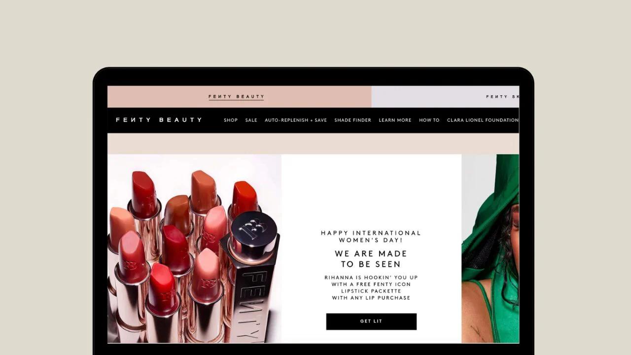
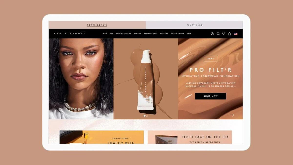
1. Fenty Beauty
Fenty Beauty built its conversion engine to solve the shade-matching problem that plagues online makeup purchases. The site uses a shade-finder quiz that asks targeted questions about skin tone, undertone, and coverage preference, then narrows 50+ foundation options down to three recommended matches. This removes the guesswork that typically causes hesitation or returns.
Confidence-Boosting Product Pages
Product pages reinforce confidence through real model swatches across different skin tones, showing exactly how each shade looks on actual skin rather than relying on product shots alone. User-generated content from TikTok and Instagram sits prominently on every page, creating social proof that feels authentic rather than curated.
Live chat support answers shade questions in real time, and bundle offers encourage multi-product purchases by pairing foundations with complementary items. The structure doesn't just sell makeup. It removes the doubt that stops people from buying makeup online.
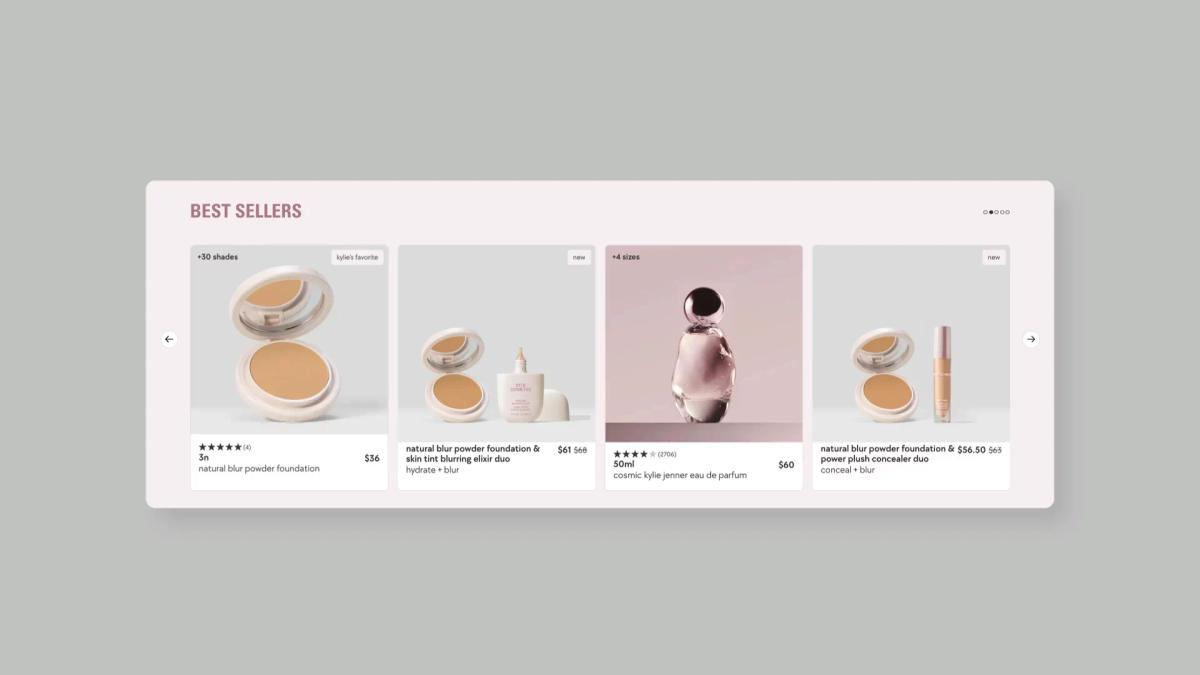
2. Kylie Cosmetics
Kylie Cosmetics converts through urgency and scarcity, structuring product pages around limited-edition drops and countdown timers that create FOMO. The brand releases products in waves, often tied to collaborations or seasonal themes, and its pages display real-time inventory levels, pushing customers to act quickly.
Visual-First Conversion Design
The visual approach is bold and simple. Product imagery dominates the page with minimal copy, letting the product speak for itself. Bundle-first offers appear immediately, encouraging customers to buy sets rather than individual items, which increases average order value.
Instagram shoppable posts link directly to product pages, creating a seamless path from social discovery to checkout. The entire experience is designed to compress decision time, turning interest into purchase before doubt can creep in.
3. The Ordinary
The Ordinary's product pages convert by translating complex skincare science into clear, actionable guidance. Each page lists ingredient percentages up front, explains what those ingredients do in plain language, and provides specific usage instructions to remove confusion about how to incorporate products into a routine.
Minimalist, Guided Shopping Experience
The minimalist design reduces cognitive load. There are no distracting elements, just the information customers need to make an informed choice. Bundles and regimen-based recommendations appear prominently, guiding users toward complete solutions rather than leaving them to piece together their own routine.
This structure works because it respects the customer's intelligence while removing the research burden. Instead of forcing users to Google every ingredient, the page does that translation work for them, which builds trust and speeds up decisions.
4. Glossier
Glossier's product pages feel like an extension of its community rather than a traditional ecommerce experience. User-generated content galleries dominate the layout, showing real customers using products in everyday settings rather than professional models in studio lighting. Customer reviews appear early on the page, often with photos that demonstrate actual results.
Simple, Relatable, and Trust-Driven Structure
The structure emphasizes simplicity and relatability. Products are easy to understand, with straightforward names and clear benefit statements. Subscription refill options encourage repeat purchases by making reordering frictionless.
The brand's visual identity supports conversion, but social proof closes the sale. When customers see people who look like them getting results, the perceived risk drops significantly.
5. Drunk Elephant
Drunk Elephant blends clinical credibility with accessible storytelling. Product pages combine ingredient breakdowns with before-and-after visuals that demonstrate effectiveness over time. The brand positions itself as "clean clinical," meaning it explains the science without overwhelming customers.
Guided, Trust-Building Product Experience
Quizzes guide users toward products that suit their specific skin concerns, reducing the paralysis caused by too many options. Bundles are structured around complete routines, increasing order value while simplifying the decision process.
Educational content appears throughout, explaining why certain ingredients work together and what results to expect. This approach works because it builds trust through transparency. Customers don't need to wonder what's in the product or whether it will work. The page answers those questions directly.
6. Rhode
Rhode keeps its product range intentionally tight, which makes decision-making faster. Product pages are built around hero videos that show the "glowy" skin finish the brand is known for, giving customers a clear visual of the outcome they're buying.
Urgency and Focused Visual Storytelling
Scarcity tactics like waitlist popups and limited availability create urgency without feeling manipulative. The simplicity of the product line means customers aren't comparing ten different serums.
They're deciding whether this specific product meets their needs. Visuals reinforce the outcome at every step, from homepage to checkout, creating a consistent narrative around what the product delivers.
7. Olaplex
Olaplex converts by proving results visually. Product pages use before-and-after sliders that let customers compare hair condition over time, which is critical in a category where effectiveness is everything. The structure supports both individual purchases and system-based bundles designed around complete hair repair routines.
Professional Endorsement and Credibility
Professional credibility matters here. The brand's association with salons and stylists adds a layer of trust that consumer reviews alone can't provide.
Product pages highlight this connection, positioning Olaplex as a professional-grade solution available for home use. The combination of visual proof and expert endorsement reduces doubt in a way that product descriptions never could.
8. Rare Beauty
Rare Beauty combines product and purpose, weaving mental health messaging into the product experience. Product pages include storytelling around self-acceptance and emotional well-being, creating a connection that goes beyond cosmetics. This emotional layer differentiates the brand in a crowded market.
The experience is omnichannel, integrating tools such as the Shop App for smoother checkout and faster repeat purchases. Reviews and tutorials reinforce usability, making products feel accessible rather than intimidating. The structure doesn't just sell makeup. It invites customers into a community that values self-expression over perfection.
9. ColourPop Cosmetics
ColourPop thrives on speed and variety. Product pages are built around frequent drops, collaborations, and extensive shade swatches that reduce uncertainty. The swatch carousels let customers quickly see every shade option, which is essential when offering 30+ colors in a single product line.
Limited-edition collections create urgency, while low price points remove financial risk. The combination encourages multi-item purchases. Customers don't agonize over a single lipstick choice when it costs less than lunch. The structure supports impulse buying while still providing enough visual information to make informed choices.
10. Pixi Beauty
Pixi Beauty emphasizes glow-focused results through visual storytelling. Product pages feature hero sections that highlight skin outcomes, making benefits immediately clear. The brand's positioning around "glow" is specific enough to attract a targeted audience but broad enough to apply across multiple products.
Subscription kits and bundles simplify purchasing decisions, encouraging repeat purchases and higher-order values. The structure guides customers toward complete routines rather than one-off purchases, thereby increasing lifetime value and solving customers' problems more effectively.
11. ILIA Beauty
ILIA focuses on clean beauty that combines skincare and makeup. Product pages are minimalist but informative, emphasizing skin benefits alongside cosmetic effects. The structure reduces cognitive load by presenting only essential information, making it easier for customers to understand what each product does and how it fits into their routine.
The clean design reinforces the brand's positioning around simplicity and transparency. Customers aren't overwhelmed with options or information. They see what the product does, how to use it, and what results to expect. That clarity drives decisions.
12. Kosas
Kosas blends beauty and skincare messaging, highlighting ingredient transparency and skin benefits on every product page. Clean design and strong visuals support the brand's positioning as a skin-benefiting color cosmetics brand. Badges and claims reinforce trust, while storytelling connects products to outcomes rather than just features.
The structure makes it easy for customers to understand not just what they're buying, but why it's better for their skin. That dual benefit (color plus skincare) justifies premium pricing and builds loyalty.
13. Miss A Cosmetics
Miss A converts through pricing and volume. Product pages emphasize ultra-low price points and bundle deals, encouraging bulk purchases. TikTok virality drives traffic, while the structure makes it easy to add multiple items quickly.
The entire experience is optimized for speed. Customers aren't deliberating over a $1 eyeliner. They're adding five of them to their cart in different colors. The low risk and high variety create a shopping experience that feels more like discovery than decision-making.
14. Truly Beauty
Truly Beauty stands out through tone. Product pages use humorous, unconventional copy that differentiates the brand in a market saturated with clinical or aspirational messaging. The playful approach makes the experience memorable and shareable.
Subscriptions and bundles increase retention, while the tone keeps customers engaged. The structure doesn't just sell skincare. It creates a brand experience that people want to talk about, which drives word-of-mouth and repeat purchases.
15. Youth To The People
Youth To The People builds trust through ingredient storytelling and sustainability messaging. Product pages highlight superfood components such as kale and green tea, linking them to specific skin benefits. Certifications and eco-focused messaging reinforce credibility, while visuals support the brand's health-driven positioning.
The structure appeals to customers who care about what goes on their skin and where it comes from. By making those values visible and transparent, the brand reduces doubt and builds loyalty among a specific audience segment.
What Their Product Pages Have in Common
Once you step back from individual brands, a clear pattern emerges. High-converting beauty stores may differ in aesthetic and positioning, but their product pages are built on the same foundation. They are not designed to impress. They are designed to reduce hesitation and guide the customer toward a decision.
Lifestyle and Results-Driven Visuals
Top-performing beauty stores do not rely on product-only imagery. Their pages combine lifestyle visuals with clear, outcome-focused results. Customers see real people using the product, close-up results on skin or hair, and often before-and-after comparisons that make the transformation tangible.
This approach works because beauty is inherently visual and outcome-driven. Customers are not buying a formula. They are buying a result they can picture.
Social Proof Integrated Into the Page Flow
In high-converting stores, social proof is not treated as a separate section. It is embedded throughout the page. Customer photos appear alongside product descriptions. Testimonials are placed next to key benefits.
User-generated content is woven into the scrolling experience, reinforcing claims as they are introduced. This structure changes how trust is built. Instead of asking the customer to scroll down and verify credibility, the page continuously reinforces it.
Clear, Benefit-Driven Copy
Strong product pages do not just describe what a product is. They explain what it does and who it is for. Rather than listing ingredients or features in isolation, they translate them into outcomes.
Customers immediately understand how the product fits into their routine and what results they can expect. This clarity reduces friction. The customer does not need to interpret technical details or connect the dots themselves.
Mobile-First Design
Most beauty shopping happens on mobile, and top stores design for that reality from the start. According to Capital One Shopping, 79% of consumers use their smartphones to research products while shopping in physical stores, indicating that the mobile experience directly influences purchase decisions across channels.
Their pages are structured for fast, intuitive navigation. Content is broken into scannable sections, visuals load quickly, and key actions like add-to-cart remain easily accessible throughout the experience. This ensures that momentum is not lost.
Why This Structure Converts
Each of these elements serves a specific purpose. Visuals build belief, social proof builds trust, copy creates clarity, and mobile design reduces friction. Individually, they improve the experience. Together, they create a guided path to purchase. That is the real difference between stores that look good and stores that convert.
Related Reading
- Shopify Variants vs Options
- Product Recommendations Shopify
- How To Add Frequently Bought Together On Shopify
- Shopify Variants Vs Options
- How To Add Size Chart In Shopify
- Best Shopify Themes For Conversion
- How To Change Favicon On Shopify
- Shopify Order Confirmation Page
- How To Choose A Shopify Theme
- How To Customize Shopify Checkout Page
Why Most Shopify Beauty Stores Still Underperform
If high-converting beauty stores follow a clear structure, then underperformance is not random. It is predictable. Most stores are not failing because of poor products. They are failing because their pages are not built to support how customers actually make decisions.
Overreliance on Generic Shopify Themes
Many brands launch using standard Shopify themes and stop at surface-level customization. These themes are designed for usability, not persuasion. They create stores that look polished but lack a structured path to purchase.
Research from Google shows users form an opinion about a website in as little as 50 milliseconds. If the value is not immediately clear, users default to leaving rather than exploring further. A generic layout does not communicate value quickly enough.
Short Product Pages That Assume Too Much
Many beauty stores rely on short descriptions, assuming customers will figure the rest out. But beauty purchases are not low-consideration decisions. Customers actively look for proof that the product works, relevance to their skin or hair type, and confidence that it is worth the price. When that information is missing, hesitation increases. Pages built to display rather than guide leave customers scrolling without finding the answers they need to commit.
Disconnected Trust Signals
Most stores have reviews, testimonials, or user-generated content. The issue is not availability; it is placement. Trust is highly influential in beauty purchasing decisions. Data from the Spiegel Research Center shows that displaying reviews can increase conversion rates by up to 270%, especially for lower-awareness products.
But when reviews are buried or disconnected from product claims, that impact is lost. Customers need to see proof at the moment they are evaluating a claim, not after they have already decided to leave.
Lack of Clear Differentiation
Beauty is one of the most saturated ecommerce categories. Many brands use similar language, similar visuals, and similar promises. When product pages do not clearly communicate what makes the product different, who it is specifically for, and why it works, they blend into the market.
This creates decision fatigue. Without differentiation, more choice leads to fewer conversions. Customers arrive with intent, but leave without clarity. They scroll through polished visuals but do not find enough evidence to trust the product, structure to guide their decision, or differentiation to justify the purchase.
How PagePilot Helps Build High-Converting Beauty Product Pages
PagePilot shifts the entire process from manual design guesswork to conversion-driven structure. Instead of spending days building pages around aesthetic preferences, the platform generates layouts in under 60 seconds by analyzing what actually drives purchases in beauty ecommerce. The focus moves from "does this look premium?" to "will this guide the customer to buy?"
Long-Form Pages That Tell a Story
Beauty customers don't convert after reading three bullet points. They need context, proof, and a clear path from problem to solution. PagePilot enables brands to build pages that guide visitors through a complete narrative, including what the product does, who benefits most, how it works, and what results to expect. This mirrors how top beauty brands structure their pages, treating each product as a story rather than a catalog entry.
The difference shows up in time on page and scroll depth. When customers engage with content that answers their questions sequentially, hesitation drops. They're not hunting for information or filling gaps with Google searches. The page does that work for them.
Social Proof That Supports Every Claim
Most stores treat reviews as a separate section at the bottom of the page. PagePilot integrates user-generated content, testimonials, and before-and-after visuals directly into the flow. When a page claims "reduces dark spots in two weeks," customer photos appear immediately below, reinforcing the promise at the exact moment doubt would surface.
This structure changes how trust is built. Instead of asking visitors to scroll down and verify credibility later, the page continuously validates claims as they're introduced. According to PagePilot's own data, pages built this way achieve a 3% conversion rate, significantly above industry averages. The platform positions proof where it matters most, turning skepticism into confidence without forcing customers to hunt for validation.
Mobile-First Without Sacrificing Depth
Beauty traffic is overwhelmingly mobile, but most themes sacrifice content to fit smaller screens. PagePilot structures pages to be scannable and fast-loading on mobile while maintaining the depth needed to drive decisions. Sections are broken into digestible blocks, visuals load progressively, and key actions remain accessible throughout the scroll.
This matters because mobile users are no less serious about purchasing. They just need information presented differently. When a page respects that reality, mobile conversion rates stop lagging behind desktop.
Conversion Patterns Built In
PagePilot doesn't start from a blank canvas. It incorporates proven structures, like clear value propositions above the fold, benefits reinforced with visuals, objections addressed before they become exit points, and frictionless paths to purchase. These aren't optional features to configure. They're embedded in the platform's page-building process.
Store owners testing new products can launch optimized pages in under 5 minutes, rather than waiting weeks for designers and copywriters. The AI handles the structure that traditionally required expertise, letting brands focus on product selection and testing velocity. Speed matters in beauty ecommerce, where trends shift fast, and early movers capture disproportionate attention.
Related Reading
- Shopify T-shirt Stor
- Shopify Electronics Store
- Shopify Beauty Stores
- Shopify Contact Us Page Example
- Best Shopify Theme For Print On Demand
- Pagefly Alternatives
- Best Trust Badges For Shopify
Start a FREE Trial and Generate 3 Product Pages With Our AI Page Builder today
The stores that convert aren't waiting for perfect design or endless rounds of copywriting revisions. They're testing products fast, learning what works, and scaling what converts. The barrier isn't creativity or budget anymore. It's speed to market, and that's exactly where most beauty stores lose momentum.
Rapid, AI-Optimized Product Page Creation
PagePilot removes that barrier completely. Generate three product pages in the time it used to take to brief a designer. Test different products, see what resonates with your audience, and iterate based on actual customer behavior instead of assumptions.
The AI structures each page around proven conversion patterns, so you don't have to guess which layout will work. You're launching with the tactics that already drive results in beauty ecommerce. Start your free trial today. Build pages that convert, not just pages that look good.