Your Shopify store might have stunning product pages that convert browsers into buyers, but what happens when those customers need help? A broken contact form, unclear messaging, or a poorly designed contact page can undo all the work you've put into perfecting your Shopify product page examples. The truth is, your contact us page isn't just a formality. It's where trust gets built or broken, where questions turn into sales, and where frustrated visitors either find solutions or abandon your store entirely. If you're looking at successful Shopify contact us page examples to understand what actually converts, you need more than inspiration. You need a way to implement those best practices without spending weeks coding or hiring expensive developers. PagePilot's AI page builder lets you create high-performing contact pages in minutes, using proven templates and smart design elements that encourage customers to reach out.
Summary
- Most Shopify stores fail because they treat contact pages as formalities rather than trust checkpoints. Research shows 44% of visitors abandon websites when they can't find clear contact information. High-intent buyers visit contact pages before purchasing to verify the business is legitimate, reachable, and accountable.
- Response-time expectations eliminate the most common source of anxiety on contact pages. Stating "We reply within 24 hours" or "Average response time: 6 hours" gives customers concrete expectations instead of forcing them to guess whether their message will disappear.
- Multiple contact options reduce resistance by giving customers control over how they reach out. Some prefer email for written records, others want live chat for immediate answers. Forcing everyone through a single form feels like the business is hiding behind automation.
- Small legitimacy signals carry disproportionate weight for stores without brand recognition. A business address, even just a city and state, makes operations feel grounded in a real location. Links to FAQ pages or return policies show common issues have been addressed.
- The FAQ-first contact page structure solves problems before requiring customer outreach. Leading with sections like "Where's my order?" with direct tracking links, or "How do returns work?" with clear explanations, respects customers' time. Research indicates that 90% of customers expect to find contact information on websites.
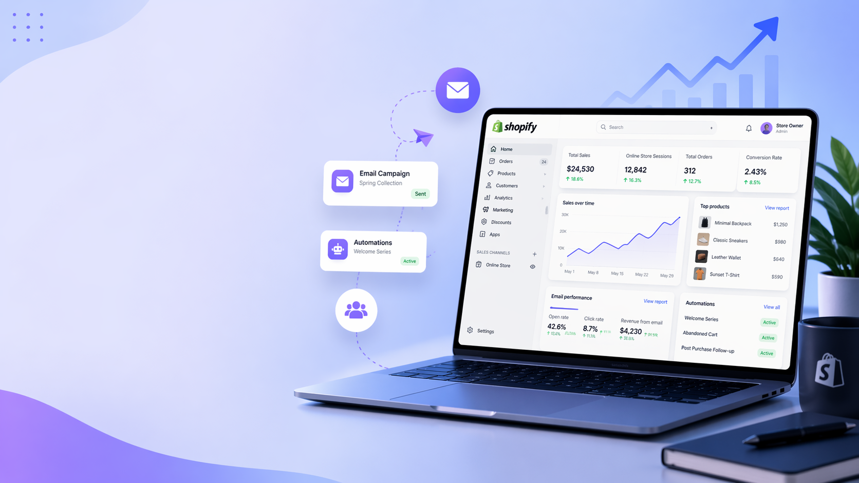
AI page builder generates structured contact pages with trust elements, response expectations, and clear messaging in minutes, removing the implementation barrier that keeps most stores from developing these pages.
Why Most Shopify Contact Pages Fail to Build Trust

Most Shopify stores treat the contact page as a formality. A basic form, maybe an email address, and nothing else. The assumption is that customers only visit this page when something goes wrong.
High-Intent Trust Checkpoints
In reality, high-intent buyers use the contact page before they ever click "Buy." It is a trust checkpoint. When someone is considering a purchase, especially from a store they have never heard of, they look for signals that the business is real, reachable, and accountable. The contact page is one of the fastest ways to verify that.
When the page feels empty or generic, it creates doubt immediately. Visitors start asking themselves:
- Is this store legitimate?
- Will anyone respond if something goes wrong?
- How easy is it to get help after I pay?
Those doubts directly affect conversion behavior.
Empirical Trust Standards
This is backed by broader eCommerce trust research. A Baymard Institute study found that 19% of US online shoppers have abandoned a checkout in the past quarter because they did not trust the site with their credit card information. Missing or weak trust signals, including clear contact information, are a key contributor to that hesitation.
Google's own guidance aligns with this. In its Search Quality Evaluator Guidelines, Google explicitly states that websites handling money should provide clear and accessible customer service information, including contact details, because users need a way to resolve issues if something goes wrong.
Foundational Trust Architecture
The implication is simple. If a shopper cannot quickly find clear, credible contact information, trust drops at the exact moment they are deciding whether to buy. And unlike product page tweaks or pricing tests, this is not a marginal issue. It is foundational. A weak contact page does not just fail to support customers. It signals risk.
When a purchase feels risky, even slightly, conversion drops. And that risk compounds when you realize that, according to Branvas, 95% of new Shopify stores fail. The stores that survive understand something critical: every page, including contact, either builds confidence or erodes it. There is no neutral ground.
But the real reason this keeps happening goes deeper than most people realize.
Related Reading
- Shopify Product Page Examples
- How to Make Your Shopify Store Look Professional
- How to Increase Conversion Rate Shopify
- Best Size for Shopify Product Images
- eCommerce Product Page Optimization
- Shopify Banner Size
- How to Create Multiple Product Pages in Shopify
- How to Change Favicon on Shopify
- How to Add Size Chart in Shopify
- How to Customize Shopify Checkout Page
The Hidden Role of a Contact Page in Conversion

The contact page sits in your conversion funnel, whether you realize it or not. Buyers visit it before they commit, especially when they have never heard of your store. They are not looking for help yet. They are looking for proof that someone real exists behind the checkout button.
According to LinkedIn research on conversion optimization, 44% of visitors leave a website if they can't find contact information. That is nearly half your traffic making a snap judgment based on whether you seem reachable.
Frictionless Trust Indicators
For dropshipping stores without brand recognition, this judgment happens fast.
- No phone number? Feels like a shell company.
- Generic form with no context? Feels like messages disappear into a void.
- Missing response time expectations? Creates uncertainty about whether anyone will actually help if something goes wrong.
These doubts do not announce themselves. Customers rarely stop and think, "I don't trust this contact page." They just feel uneasy and delay the purchase, or they leave entirely.
Subtle Friction Compounds Quickly
A missing phone number reduces perceived accountability because it suggests the business does not want direct conversations. No stated response time creates anxiety about how long someone might wait for support after paying. A bare-bones form with no personality signals that no one is truly behind the operation, just automation or indifference.
Even when your product page is optimized and pricing is competitive, these gaps introduce hesitation at the final decision stage. The customer is ready to buy, but something feels off. They cannot articulate it, so they abandon the cart or promise themselves they will come back later. Most never do.
The Advantage of Speed and Clarity
When you are testing multiple products quickly, which is the only reliable path to finding winners, you cannot afford to lose conversions on trust signals. Tools like AI page builder generate optimized product pages in 60 seconds, but speed only matters if the surrounding infrastructure, including contact pages, reinforces credibility. A fast launch with weak trust signals just scales doubt faster.
The stores that survive the 95% failure rate understand this. Every page either builds confidence or erodes it. The contact page is not a formality. It is a filter that decides whether hesitant buyers move forward or disappear.
So what actually belongs on a contact page that converts?
What High-Converting Shopify Contact Pages Actually Include

The difference between a contact page that converts and one that creates doubt comes down to whether it removes uncertainty before anyone clicks the form. High-performing pages answer the hesitation questions upfront: Will someone respond? How fast? Is this business real? When those answers are visible immediately, trust builds without friction.
It is not about aesthetics or clever copy. It is about clarity at the exact moment doubt appears.
Clear Response Expectations
Telling visitors exactly when they will hear back eliminates the most common anxiety point. "We reply within 24 hours" or "Average response time: 6 hours" gives customers a concrete expectation instead of forcing them to guess whether their message will disappear into silence. Without this, many assume the worst, delay their purchase, or leave entirely.
Quantifying Support Commitments
According to Blackbelt Commerce, every second of load time delay reduces conversion by 4.0%, and the same principle applies to perceived response time. Ambiguity around support creates mental friction that slows decisions.
The goal is to replace uncertainty with a specific commitment. Even if your actual response time varies, stating a realistic range signals that someone is monitoring messages and will follow through.
Multiple Contact Options
Forcing everyone through a single form adds unnecessary resistance. Some customers prefer email because they want a written record. Others want live chat because their question is simple and they need an answer now. Offering both, along with a contact form for detailed inquiries, gives visitors control over how they reach out. That control signals accessibility, which directly supports the feeling that help will be easy to get if something goes wrong after purchase.
When customers test your store for the first time and see only a blank form with no alternatives, it feels like the business is hiding behind automation. Multiple pathways communicate that real people are available and responsive.
Brand Reassurance Details
Small legitimacy signals carry disproportionate weight for stores without brand recognition. A business address, even if it is just a city and state, makes the operation feel grounded in a real location. Links to an FAQ or return policy indicate that common issues have already been addressed. Phrases like "Serving customers worldwide since 2022" or "Based in Austin, Texas" add context that separates legitimate businesses from fly-by-night operations.
These details matter most when someone is deciding whether to trust a store they have never heard of. The absence of this information does not just feel incomplete. It feels evasive.
Context Around the Form
A blank contact form with no explanation forces customers to guess what it is for and what happens after they submit it. High-converting pages clarify upfront: "Use this form for order questions, product inquiries, or general support," followed by "You'll receive a confirmation email immediately, and we'll respond within one business day." That removes ambiguity about purpose and sets expectations about next steps.
When you are launching multiple products quickly to find winners, tools like AI page builder generate optimized product pages in 60 seconds. But speed only compounds results if the surrounding pages, including contact, reinforce credibility rather than create new doubts. A fast launch with weak trust signals just accelerates the path to cart abandonment.
The easier it feels to get help, the safer it feels to buy. But knowing what works is only useful if you see how real stores actually implement it.
Related Reading
- Shopify Variants vs Options
- Product Recommendations Shopify
- How To Add Frequently Bought Together On Shopify
- Shopify Variants Vs Options
- Best Shopify Themes For Conversion
- Shopify Order Confirmation Page
- How To Choose A Shopify Theme
- How To Customize Shopify Checkout Page
3 Shopify Contact Us Page Examples That Work

1. The Transparent Timeline Approach
One pattern that works consistently is the page that leads with exactly what happens after you submit the form. Instead of generic "Contact Us" language, the page opens with: "Questions about sizing or shipping? We respond to all inquiries within 12 hours, Monday through Friday."
That single line does three things simultaneously. It clarifies what the form is for, sets a concrete expectation about response time, and signals that real people monitor messages on a predictable schedule. No mystery about whether your question will disappear. No guessing about how long you will wait. The certainty removes friction before the customer even considers typing.
Multichannel Support Control
These pages often include multiple contact methods below the form. An email address tied to the store's domain, not a generic Gmail account. A link to live chat if the question is urgent. Sometimes, a phone number is required, though many successful dropshipping stores skip it without penalty as long as the other signals are strong. The key is giving customers control over how they reach out, which directly reinforces the feeling that help will be accessible after purchase.
2. The FAQ-First Structure
Another effective approach flips the traditional contact page on its head. Instead of leading with a form, it starts by solving the most common problems immediately.
Sections like:
- "Where's my order?" links directly to the tracking page.
- "How do returns work?" provides a short, clear explanation with a link to the full policy.
- "Shipping times by region" sets expectations upfront.
Only after these does the contact form appear, prefaced with something like: "Still need help? Use the form below and we'll get back to you within 24 hours."
Proactive Problem Resolution
This structure works because it respects the customer's time. Most people visiting a contact page are not looking for a conversation. They want a specific answer. By surfacing those answers immediately, the page solves problems without requiring a back-and-forth exchange. That speed builds confidence. It shows the business understands common issues and has systems in place to handle them.
When someone submits the form, they do so because their question is genuinely unique. That signals to the customer that the business is organized rather than reactive. Support feels proactive rather than defensive.
Example 3: The Legitimacy-First Page
For newer stores without brand recognition, the third pattern focuses entirely on proving the business is real. These pages include a physical address or at least a city and state. A support email using the store's domain. A short line about the team, like "Our customer support team is based in Portland and here to help before, during, and after your purchase."
Some include business hours. Some link to an About page. The tone shifts slightly from transactional to human. Instead of "Submit your inquiry," it might say "We're here to answer any questions about our products, shipping, or returns."
Legitimacy Through Availability
These details matter most when a customer is evaluating the business itself, not just the product. According to Shopify's analysis of high-converting contact pages, 90% of customers expect to find contact information on a website, and its absence immediately raises doubts about legitimacy.
For stores testing multiple products quickly, this is critical. If you are launching new pages in 60 seconds using tools like AI page builder, but your contact page still feels generic or incomplete, you are introducing doubt at the exact moment speed should be compounding your advantage.
The page does not need to be elaborate. It just needs to answer the unspoken question: Is there a real business behind this checkout button?
What Makes All Three Work
These approaches succeed for the same reason. They reduce uncertainty as it appears. They do not wait for customers to ask whether someone will respond, how long it will take, or if the business is legitimate. They answer those questions immediately, in plain language, without forcing the customer to guess.
That is what separates a contact page that converts from one that creates doubt. It is not about design complexity or clever copy. It is about eliminating the hesitation that stops purchases before they happen.
But knowing what works is only useful if you understand how to implement it without slowing down your testing cycle.
How to Turn Your Contact Page Into a Conversion Asset

Once you recognize that the contact page influences buying decisions, the goal shifts. It is no longer about providing support. It is about removing the final layer of doubt before checkout. That means optimizing it the same way you would a product page.
Start by reducing uncertainty. Customers hesitate when they do not know what will happen next. A vague form creates friction. A clear message removes it.
Specificity and Conversion
Instead of "Contact us for any questions," use "Have a question about your order or sizing? Our team replies within 12 hours, and most issues are resolved in one message." That level of specificity answers timing, scope, and outcome in a single line.
This matters because uncertainty directly impacts conversion. According to KoMarketing, 44% of visitors will leave a company's website if there's no contact information. Even small hesitations at the decision stage can prompt users to leave.
Setting Clear Expectations
When customers know how long a response will take and what kind of help they will receive, they are more comfortable moving forward with a purchase. Clear expectations also reduce perceived risk. Instead of wondering if support exists, the customer sees how it works.
Then comes reinforcing credibility. This is where you confirm that there is a real business behind the store. Simple additions make a measurable difference:
- A branded email address instead of a generic one
- Business details or location
- Clear support hours or availability
Trust signals like these are critical.
Structuring the Page to Guide Action
A strong contact page does not just present a form. It explains when to use it, shows how quickly help arrives, and reinforces that support is reliable. The shift is subtle, but important.
You are not asking customers to reach out. You are showing them that if something goes wrong, they will be taken care of. That reassurance is often what turns hesitation into a completed purchase.
Velocity Without Friction
When you are testing multiple products quickly to find winners, speed only compounds results if every page reinforces credibility. Tools like AI page builder generate optimized product pages in 60 seconds, but that velocity loses value if your contact page introduces doubt the moment someone checks whether the business is real. A fast launch with weak trust signals just accelerates the path to cart abandonment.
But speed and trust alone are not enough if implementation slows you down.
How PagePilot Helps You Build High-Converting Pages Faster

Most contact pages fail because store owners lack the time and expertise to build them properly, not because they don't care. They either copy generic templates or leave the page underdeveloped, creating the very uncertainty that makes customers hesitate. PagePilot removes that guesswork by generating structured, conversion-focused pages in minutes instead of hours.
From Competitor Research to Live Pages
Instead of starting from a blank page, you input a competitor or supplier URL and generate a structured page based on what already works in your market. This applies not just to product pages, but also to supporting pages like contact, where trust is built through proven elements rather than assumptions.
The difference shows immediately. Generic copy gets replaced with messaging that sets expectations, reduces uncertainty, and clearly explains what happens next. Weak trust signals are addressed through clearer response-time messaging, better context around support, and content that makes the business feel legitimate and responsive.
Speed Changes the Testing Equation
What normally takes hours of writing, testing, and iteration happens in minutes. You generate multiple versions quickly and test what actually improves conversion rather than guessing and refining over time. That shift matters because dropshipping success depends on rapid product testing, and every page that introduces doubt slows that cycle. According to PagePilot.ai, the platform supports 30+ languages, allowing stores to test markets globally without hiring translators or copywriters for each region.
Building on What Converts
You are no longer designing pages based on gut feeling. You are generating and testing structured pages built to remove doubt from the start. The contact page stops being an afterthought and becomes part of the conversion infrastructure, built at the same speed and with the same focus as your product pages.
When customers visit to verify your business is real, they find clear expectations, multiple contact options, and reassurance details that answer hesitation before it becomes abandonment.
Strategic Speed Alignment
The approach works because it aligns speed with credibility. Launching fast only compounds results when every page reinforces trust rather than creating new friction points. A well-structured contact page built in minutes performs better than a generic template left unchanged for months.
But knowing the tool exists is different from seeing what happens when you actually use it.
Start a FREE Trial and Generate 3 Product Pages With Our AI Page Builder today
If your contact page is costing you conversions, start a free PagePilot trial. In your first session, you can generate three fully structured pages, including a contact page with clear trust elements and messaging you can test immediately, no credit card required.
The difference between reading about what works and actually building it is the speed of execution. Most store owners delay optimization because they assume it requires design skills, copywriting expertise, or hours of research. PagePilot removes that barrier entirely.
High-Velocity Validation
You input a product link, and the AI generates conversion-focused layouts with trust signals already embedded, response-time expectations clearly stated, and contact options structured to reduce hesitation. What normally takes a full afternoon happens in under two minutes.
That speed matters because testing determines survival. The 95% of Shopify stores that fail do so partly because they spend weeks perfecting pages that never get traffic, instead of launching quickly and learning what actually converts. When you can generate three product pages in the time it takes to manually write one contact form, you shift from guessing to testing real customer behavior.
Immediate Feedback Validation
Your first three pages give you immediate comparison data. You see which trust signals resonate, which messaging reduces cart abandonment, and which layouts drive purchases. That feedback loop starts the moment your pages go live, not weeks later after you have finally finished building everything manually.
The trial exists because seeing the tool work is more convincing than any explanation. Generate your pages, publish them, and watch how customers respond when trust is built into every element instead of assumed. No risk, no commitment, just proof that speed and credibility can coexist when the right infrastructure supports both.
Related Reading
- Shopify T-shirt Store Exa
- Shopify Electronics Store
- Shopify Beauty Stores
- Best Shopify Theme For Print On Demand
- Pagefly Alternatives
- Best Trust Badges For Shopify
- Shopify Website Examples
- High Converting Product Pages
- Best One Product Shopify Theme