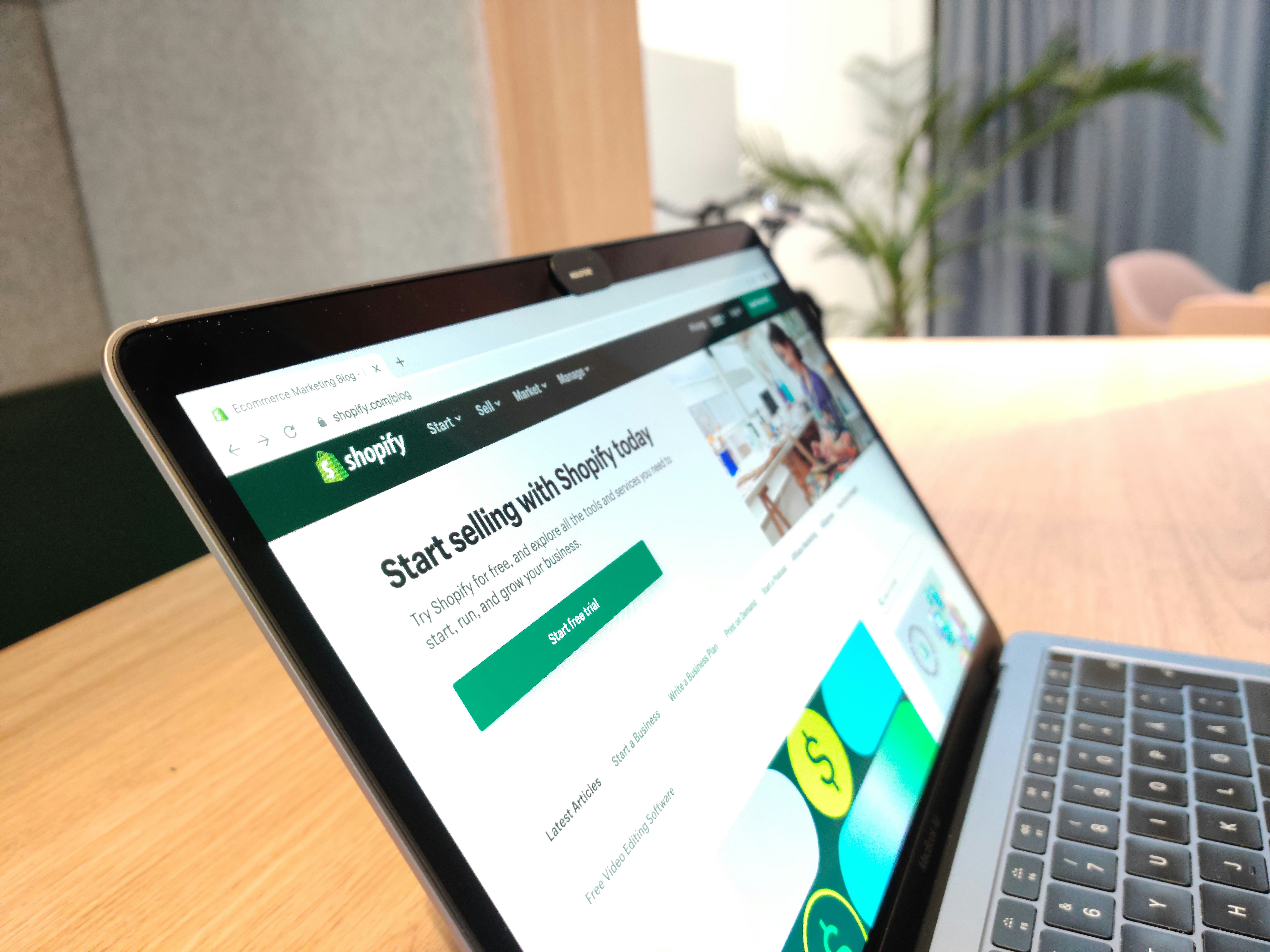
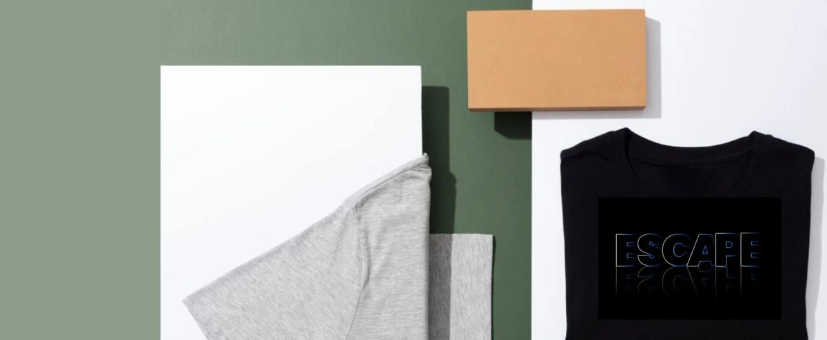
Hub: Shopify Product Page Examples
You've set up your Shopify store, uploaded your T-shirt designs, and hit publish. But something's off. Your conversion rates are underwhelming, and visitors leave without buying. The difference between a store that struggles and one that thrives often comes down to how you present your products, which is why studying successful Shopify product page examples becomes essential for any apparel brand owner looking to turn browsers into buyers. Throughout this article, you'll discover real Shopify T-shirt store examples that consistently convert, examining everything from their product photography and sizing charts to their checkout flows and trust signals.
AI page builder structures product descriptions, displays color variations, and creates urgency without resorting to gimmicks. It eliminates the manual design process by instantly generating layouts that prioritize psychological triggers and user flow. By automating the creation of identity-focused pages, the platform allows you to shift your focus from tedious technical setup to high-level brand strategy.
Summary
- Most T-shirt stores fail not because their designs are weak, but because their product pages can't convert interest into purchases. According to Printful, 90% of T-shirt businesses fail within the first year, and the breakdown happens after the click, when potential customers land on pages that answer "What is this product?" but completely miss "Why should I buy this now?" The real constraint isn't audience size or design quality. It's persuasion.
- More than 49% of ecommerce sessions end after viewing just one page, according to Contentsquare. For T-shirt stores, this means most visitors see the product page once, and if that page doesn't convert, the opportunity is gone. When your page looks identical to fifty other stores selling similar humor or aesthetics, visitors have no reason to choose you.
- High-converting stores offer an average of 47% more customization options than low-performing competitors, according to Printful. This isn't about overwhelming customers with choices. It's about letting them shape the product to match their specific identity. When someone can adjust colors, add personalized text, or choose between fits, the shirt stops being a generic item and becomes their version of the design.
- Product pages that convert leads with identity signals before product details. A fitness apparel store doesn't open with thread count. It opens with images of someone mid-workout, sweat visible, determination clear. The shirt becomes evidence of commitment, not just clothing.
- The average ecommerce conversion rate is 3.65%, according to Adobe Business, meaning nearly 4 out of every 100 site visitors take a desired action. For T-shirt stores selling low-cost, highly substitutable products, this gap is critical.
PagePilot's AI page builder compresses product page creation from hours to under 60 seconds, generating identity-focused pages with psychological triggers and conversion architecture already built in so store owners can test five products per week instead of one.
Most T-Shirt Stores Don’t Fail Because of the Product
The barrier to entry for launching a T-shirt brand has never been lower. Print-on-demand services eliminate inventory risk, Shopify lets anyone build a store in hours, and social media provides free distribution. The result is a market flooded with stores that have:
- Decent designs
- Clear niches
- Reasonable pricing
The Profit Gap
Most of these stores generate little to no consistent revenue. The instinct is to blame the product:
- The design isn't unique enough
- The niche is too crowded
- The pricing is off
According to Printful, 90% of T-shirt businesses fail within the first year, not because their designs are weak, but because they can't convert interest into purchases. The real breakdown happens after the click, when a potential customer lands on a product page that fails to persuade.
What Happens After the Click
Traffic arrives from TikTok, Instagram ads, or influencer posts. The customer comes with some level of interest, maybe even intent. Then they hit a product page that looks like every other default Shopify setup: one mockup image, a short product title, a generic description, and a buy button. The page answers "What is this product?" but completely misses "Why should I buy this now?"
Selling Identity, Not Just Design
T-shirts are rarely purchased on design alone. Customers buy what the shirt represents: identity, humor, belonging to a specific community, or alignment with a lifestyle. High-performing stores communicate who the shirt is for, what it represents, why it matters, and why it's worth buying today. When that layer is missing, even strong designs sit unsold. The page is functional but not persuasive.
Closing the Conversion Gap
Most underperforming stores follow the same pattern. They generate traffic through ads or organic content, but conversion rates stay below 1%. According to Adobe Business, the average ecommerce conversion rate is 3.65%, meaning nearly 4 out of every 100 site visitors take a desired action.
For T-shirt stores selling low-cost, highly substitutable products, this gap is even more critical. A few percentage points in conversion rate can determine whether a store survives or shuts down.
The Presentation Problem
The common assumption is that more traffic solves the problem. Spend more on ads, post more content, chase viral moments. But pouring traffic into a weak product page is like pouring water into a leaky bucket. The real constraint isn't audience size, it's persuasion.
Why Slow Page Production Kills Momentum
A product page that doesn't communicate value, build trust, or create urgency will underperform no matter how much traffic it receives. This is where speed matters. Testing product pages manually, writing copy from scratch, sourcing images, and tweaking layouts takes hours per product. For dropshippers testing multiple products weekly, that pace kills momentum.
Tools like PagePilot's AI page builder compress page creation from hours to under a minute, letting store owners focus on finding winning products and scaling rather than getting stuck in manual design work. The faster you can test and iterate, the faster you discover what converts.
Related Reading
- Shopify Product Page Examples
- How to Make Your Shopify Store Look Professional
- How to Increase Conversion Rate Shopify
- Best Size for Shopify Product Images
- eCommerce Product Page Optimization
- Shopify Banner Size
- How to Create Multiple Product Pages in Shopify
- How to Change Favicon on Shopify
- How to Add Size Chart in Shopify
- How to Customize Shopify Checkout Page
The Belief That Good Designs Will Sell Themselves
When a shirt makes you laugh, captures a subculture perfectly, or looks visually striking, it's easy to assume customers will feel the same pull. This belief drives most new T-shirt store founders. They pour energy into creating or sourcing designs, convinced that quality will do the selling. But customers don't buy T-shirts the way founders think they do.
The Questions Every Visitor Asks
When someone lands on your product page, they're not just looking at the design. They're running a mental checklist, often without realizing it. Is this shirt for someone like me? Can I trust this brand? What makes this different from the dozen similar options I've seen today? Why should I buy it right now instead of bookmarking it and forgetting it exists?
If your page doesn't answer those questions within seconds, the visitor leaves. The design might be perfect, but the page failed to persuade. Most underperforming stores share the same pattern:
- Minimal product descriptions that state facts without communicating value.
- Basic mockup images that don't show the shirt in a real-world context.
- No brand story or positioning around what the design represents.
- Default Shopify layouts that look identical to thousands of other stores.
These elements display the product. They don't convert interest into action.
Why Design Alone Isn't a Differentiator
The T-shirt market is brutally competitive. Thousands of stores target the same niches with similar humor, aesthetics, and themes. A funny dog shirt for pet owners? There are hundreds. A minimalist design for gym enthusiasts? Thousands. A sarcastic quote for teachers? You're competing with an endless scroll of alternatives.
The Presentation Edge
In that environment, a good design is the baseline, not the advantage. What separates stores that scale from stores that shut down is how they present what they sell. High-performing stores position their designs within a clear identity.
- They show how the product fits into a lifestyle, connects to a community, or represents a specific point of view.
- They use visuals, messaging, and social proof to reinforce that positioning.
Without that layer, even exceptional designs feel interchangeable. When products feel interchangeable, customers default to not buying. But even when store owners recognize this gap, building persuasive pages takes time most don't have.
Why Most T-Shirt Stores Still Underperform
The answer comes down to execution, not ideas. Most stores never move beyond the "display" stage. They show the product, but they do not build a reason to buy. This gap becomes especially costly when traffic is involved.
According to Contentsquare, more than 49% of ecommerce sessions end after viewing just one page. For T-shirt stores, that means most visitors will see the product page only once, and if it doesn't convert, the opportunity is lost. You get one chance. One impression. One moment to answer the visitor's unspoken questions before they click away.
The Execution Gap
Stores with solid designs and steady traffic still struggle because they fail to communicate who the product is for. A visitor lands on a page featuring a funny gym shirt, but nothing indicates whether it's for:
- Powerlifters
- CrossFit enthusiasts
- Casual fitness hobbyists
The design might be perfect for one of those groups, but without clear positioning, it appeals to none of them. Ambiguity kills conversion faster than bad design ever could.
The Differentiation Breakdown
Differentiation is the second breakdown point. When your page looks identical to fifty other stores selling similar humor or aesthetics, visitors have no reason to choose you. They see:
- Same mockup style
- Same generic descriptions
- Same layout
Even interested buyers pause, wondering whether to keep browsing for a better option or a lower price. That hesitation usually ends with them leaving entirely.
The Hesitation Factor
Trust signals matter more than most store owners realize. A product page without reviews, user photos, or social proof asks visitors to take a leap of faith on an unknown brand. For a $25 T-shirt, that's often too much friction. People want evidence that others bought, wore, and loved the product. Without it, even a strong interest fades into doubt.
The Message Alignment Problem
The most overlooked failure happens when the product page does not align with the message that brought the user there. A TikTok ad promises a shirt that "gym bros will actually get," but the landing page uses bland, corporate language about "premium cotton blends" and "durable construction."
The tonal shift breaks trust instantly. The visitor came expecting one experience and landed in another. That disconnect tells them this brand does not understand them, so they leave.
The Hidden Cost of Manual Page Fixes
Manually fixing these issues across multiple products takes hours per page. Writing positioning copy, sourcing lifestyle images, adding trust elements, and testing layouts compounds quickly when you are testing five or ten products a week.
Tools like PagePilot's AI page builder compress that process to under a minute, generating persuasive pages with psychological triggers already built in. The faster you can test and iterate, the faster you discover what actually converts instead of guessing.
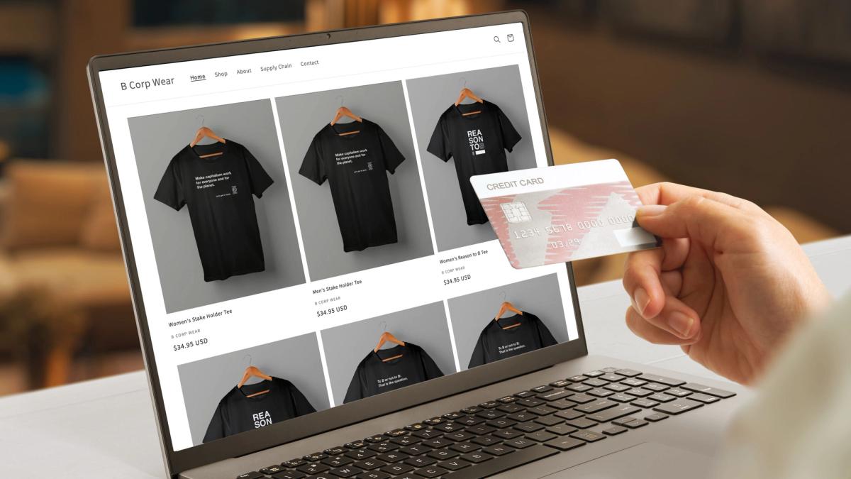
19 Shopify T-Shirt Store Examples That Actually Convert
1. TrueClassicTees.com: Premium Fitted Basics with Mass-Market Scale
True Classic Tees operates in a crowded basics market but wins by owning a single promise: better fit for men. Every page reinforces this through copy, visuals, and product structure.
- Standout conversion tactic: Bundle-first pricing strategy. Instead of pushing single tees, they anchor value at $99 for 3-packs, which increases average order value and simplifies decision-making. Customers aren't comparing styles; they're buying a solution.
- Growth engine: TikTok UGC paired with performance creative. Real customers show fit transformations, directly addressing skepticism around sizing and quality. Celebrity endorsements add top-of-funnel credibility.
- Why it converts: Hero videos outperform static images by 2x because they demonstrate fit instantly, removing friction at the most critical moment.
2. Shirtwascash.com: Community-Driven Humor That Manufactures Demand
Shirtwascash flips the traditional apparel model by letting the audience decide what gets produced. This creates built-in demand before inventory even exists.
- Key conversion driver: Community voting plus limited drops creates strong FOMO. Customers aren't just buying a shirt; they're participating in a cultural moment.
- Technical execution: Uses Shopify's Dawn theme effectively with sticky add-to-cart CTAs, ensuring users can purchase at any scroll depth. Combined with humor-based impulse buying, this reduces drop-off.
- Expansion strategy: Extending designs onto swimwear and other formats increases lifetime value without needing new creative concepts.
3. TeeFury.com: Scarcity as a Core Business Model
TeeFury's entire model revolves around 24-hour product lifecycles. Every design is temporary, forcing immediate purchasing decisions.
- Strongest tactic: Visible scarcity signals, "only available today" and "sold out" badges. These aren't just UI elements; they're psychological triggers pushing urgency.
- Community leverage: Artist community brings built-in audiences. Each artist promotes their drop, turning every product launch into a micro-campaign.
- Retention mechanism: Email waitlist captures users who miss drops and brings them back daily.
4. Factory43.com: Storytelling-Driven Premium Positioning
Factory43 positions itself around hand-drawn designs and sustainability, allowing for higher pricing and bundling strategies.
- Visual strategy: Product pages use flat-lay photography combined with narrative storytelling, making each item feel crafted rather than mass-produced.
- AOV driver: Bundles (tees plus hoodies) increase order value, but the real driver is brand narrative. Customers aren't just buying clothing, they're buying into eco-conscious artistry.
- Positioning lesson: Classic example of perceived value expansion through storytelling, not discounts.
5. TextualTees.com: Simplicity and Price Anchoring for Repeat Purchases
Textual Tees thrives on minimalism and affordability. Designs are text-based, reducing production complexity and speeding up iteration.
- Conversion model: Flash sales and sub-$25 pricing lower the barrier to entry and encourage impulse purchases.
- UX approach: Navigation is intentionally simple to reduce cognitive load. Combined with strong email flows, they drive repeat purchases rather than maximizing single-session revenue.
6. Shelfies.com: Niche Product Plus TikTok-Driven Discovery
Shelfies targets a very specific niche: decorative pop culture shelf inserts. This clarity allows for highly targeted marketing.
- Biggest lever: UGC galleries filled with colorful customer setups, which double as inspiration and social proof.
- Platform focus: Leans heavily into TikTok trends, where visually striking products perform well organically.
- Conversion boost: Free shipping thresholds reportedly increase conversions by 20% by nudging customers to add more items to their cart.
7. Spreadshirt.com: Marketplace Scale With Customization at the Core
Spreadshirt operates more like a platform than a store, offering a massive design library and customization tools.
- Main conversion driver: User control customers can modify designs, increasing perceived ownership and willingness to buy.
- Revenue expansion: Serves both B2C and B2B audiences, expanding revenue streams. Businesses ordering in bulk benefit from the same infrastructure.
- Upsell approach: Happens naturally through design personalization and product variations, not aggressive sales tactics.
8. ThinkPup.com: Emotional Targeting Through Pet Personalization
ThinkPup taps into a highly emotional niche: dog lovers. Products often allow pet personalization, making each purchase unique.
- Strongest growth channel: Instagram Reels, where pet content naturally performs well.
- On-site strategy: UGC sections featuring customer pets build trust and relatability. Buyers see others like them, reducing hesitation.
- Why it works: A combination of personalization plus emotional appeal significantly increases conversion rates.
9. TheOrganicTShirt.com: Minimalism Meets Sustainability Messaging
This store focuses on eco-conscious consumers, particularly Gen Z.
Design strategy: Intentionally minimal, allowing organic cotton certifications and sustainability badges to take center stage.
- Theme choice: Uses Dawn theme to maintain a clean, distraction-free experience aligned with brand values and improved usability.
- Conversion approach: Driven less by urgency and more by alignment with customer identity and values.
10. CreativeApparatus.net: B2B-Focused Conversion Through Clarity and Trust
Creative Apparatus targets bulk buyers and corporate clients, requiring a different conversion strategy.
- Homepage emphasis: Flat-lay product shots and clear messaging around bulk orders immediately signal relevance to businesses.
- Key driver: Quote-based purchasing removes friction for large orders and allows for customization.
- Social proof: A strong portfolio gallery showcases past work, providing credibility for enterprise buyers.
11. Trendphoria.com: Riding Trends with Speed and Visual Engagement
Trendphoria thrives on rapid trend adoption, particularly from TikTok.
- Product strategy: Uses viral sounds and cultural moments to inform product design, ensuring relevance.
- Theme advantage: Motion theme enables dynamic scrolling and animations, keeping users engaged longer.
- Friction reduction: Color swatches and visual options reduce friction in product selection, improving conversion rates.
12. IlluminatedApparel.com: Product Demonstration as the Primary Selling Tool
Illuminated Apparel sells glow-in-the-dark clothing, which requires demonstration to be understood.
- Most effective tactic: Video-based product demos showing the glow effect in real time.
- AOV strategy: Increases order value through bundles (tees plus tanks) and drives repeat engagement with mystery drops.
- Virality factor: Novelty creates natural virality, but conversion depends heavily on visual proof of functionality.
13. FoodnitedStates.com: Geographic Identity as a Conversion Hook
Foodnited States builds products around state-based food pride, tapping into regional identity.
- Site strategy: Uses map-based visuals and location-based targeting to make products feel personal.
- Community building: UGC plays a major role in helping customers share their state pride and reinforce community and authenticity.
- Conversion principle: Strong example of identity-driven commerce, where relevance replaces persuasion.
14. Meowgicians.com: Playful Branding With High Engagement Loops
Meowgicians combines cats plus magic, creating a highly shareable niche.
- Engagement tactic: Site uses cute animations, increasing time on site and engagement.
- Community strategy: Runs pet photo contests, turning customers into content creators and building community.
- Lead capture: Email popups reportedly capture 30% of visitors, feeding a strong retention engine.
15. TheOutrage.com: Real-Time Relevance and Cultural Commentary
The Outrage thrives on timely, satirical political content.
- Key tactic: Rapid product drops tied to current events to ensure constant relevance.
- Attention-grabbing: Bold headlines and messaging grab attention, while Twitter integration amplifies reach and virality.
- Conversion driver: Urgency plus emotional alignment with beliefs.
16. LoveInFaithClothing.com: Faith-Based Community and Recurring Revenue
Love In Faith targets Christian audiences, focusing on inspirational messaging.
- Trust building: Uses testimonial videos to build trust and emotional connection.
- Standout tactic: Subscription box model creates predictable recurring revenue.
- AOV strategy: Bundles aligned with faith themes increase order value while reinforcing brand identity.
17. SoWorthLoving.com: Inclusion as a Core Conversion Strategy
So Worth Loving centers on body positivity and inclusivity.
- Product pages: Feature diverse models and size-inclusive charts to reduce buyers' uncertainty.
- Amplification: Influencer collaborations amplify reach while maintaining authenticity.
- Conversion driver: Representation and emotional resonance, not discounts.
18. LimelightByNikki.com: Boutique Positioning With Guided Styling
Limelight by Nikki blends graphic tees with fashion styling to elevate perceived value.
- Purchase intent boost: Outfit guides show how products fit into a full look, increasing purchase intent.
- Urgency creation: Live sales create urgency and real-time interaction, mimicking in-store experiences.
- Premium positioning: The prestige theme gives the store a boutique feel, justifying higher prices.
19. Wohven.com: Subscription Plus Artist Ecosystem
Wohven differentiates through artist-designed abstract tees and a strong creative identity.
- Storytelling depth: Spotlights artists, adding depth and storytelling to each product.
- Conversion improvement: 360° product views reduce uncertainty and improve conversions.
- Scalability: Integration with Printful enables global print-on-demand fulfillment, allowing scale without inventory risk.
- Revenue consistency: The subscription model ensures consistent revenue while regularly introducing customers to new designs.
What High-Converting T-Shirt Stores Actually Do Differently
Some stores turn customization into a competitive edge. High-converting stores offer an average of 47% more customization options than low-performing competitors, according to Printful. This isn't about overwhelming customers with choices. It's about letting them shape the product to match their specific identity.
When someone can adjust colors, add personalized text, or choose between fits, the shirt stops being a generic item. It becomes their version of the design.
Building Experience, Not Just Display
The strongest stores treat product pages like environments, not listings. Video shows the shirt in motion:
- How the fabric drapes
- How the colors look under natural light
Multiple angles replace guesswork with clarity. Lifestyle shots place the design in context: someone wearing it at a concert, a gym, or a coffee shop. The customer doesn't have to imagine whether this fits their life. The page shows them. This approach removes friction before it forms.
Lifestyle Contextualization
Questions about fit, quality, or styling get answered visually. The decision shifts from "Should I risk this?" to "Which color do I want?" When pages eliminate uncertainty, conversion rates follow. Stores that integrate video and contextual imagery consistently outperform static mockups because they answer objections the customer hasn't even voiced yet.
Social Proof That Feels Real
Reviews matter, but only when they feel authentic. High-converting stores surface customer photos alongside written feedback. Someone sees the shirt on a body type similar to theirs, worn in a real setting, not a studio. That single image does more to build confidence than ten five-star ratings without context.
User-generated content works because it bypasses skepticism. Brand claims can be dismissed. Another customer's experience feels harder to ignore. Stores that actively collect and display real customer content create trust faster than any copy could. The message becomes: other people like you bought this, wore it, and felt good about it.
Mobile Speed as Conversion Strategy
Most traffic comes from phones, yet most stores still design for desktop first. High-performing stores flip that priority. They assume the customer is scrolling quickly, possibly distracted, on a smaller screen. Every element gets optimized for that reality: larger buttons, faster load times, fewer steps to checkout.
Speed as Respect for Customer Attention
Speed isn't just technical performance. It's a respect for the customer's attention. When a page loads instantly and navigation feels frictionless, buying becomes easy. When it lags or requires zooming to read text, the customer leaves.
Tools like PagePilot's AI page builder generate mobile-optimized pages in under a minute, letting store owners test products without getting stuck in manual layout adjustments. The faster you can launch and iterate, the faster you find what actually converts.
Natural Purchase Expansion
Bundles work because they reframe the decision. Instead of "Do I want this shirt?" the question becomes "Do I want three shirts for $60 or six for $100?" The single-item option still exists, but the value proposition makes buying more feel smarter. Average order value climbs without aggressive upselling or pressure tactics.
Free shipping thresholds operate the same way. A customer adds a $25 shirt to their cart, then sees they're $10 away from free shipping. Adding a second item suddenly makes financial sense. The store didn't push. It structured the offer so the customer chose to buy more because it benefited them.
Related Reading
- Shopify Variants vs Options
- Product Recommendations Shopify
- How To Add Frequently Bought Together On Shopify
- Shopify Variants Vs Options
- How To Add Size Chart In Shopify
- Best Shopify Themes For Conversion
- How To Change Favicon On Shopify
- Shopify Order Confirmation Page
- How To Choose A Shopify Theme
- How To Customize Shopify Checkout Page
The Real Advantage: Product Pages That Sell an Identity

Product pages that convert don't just describe fabric weight or list available sizes. They answer a question most store owners never think to address: "Does this shirt fit who I am?" That shift transforms the buying decision from practical evaluation to emotional recognition.
When a customer sees themselves reflected in the product, hesitation drops. The purchase becomes less about risk and more about confirmation. This explains why two stores selling nearly identical designs can see wildly different conversion rates.
One shows a mockup on a white background with bullet points about material composition. The other shows real people wearing the shirt at a skate park, laughing with friends, living a specific lifestyle. The second store isn't selling cotton. It's selling a sense of belonging to a community the customer already identifies with or wants to join.
Identity First, Product Second
The strongest product pages lead with identity signals before product details. A fitness apparel store doesn't open with thread count. It opens with images of someone:
- Mid-workout
- Sweat visible
- Determination clear
The shirt becomes evidence of commitment, not just clothing. Someone shopping for gym wear isn't asking "Is this comfortable?" They're asking, "Will this make me look like someone who takes training seriously?" This works because customers buy to reinforce how they see themselves or how they want to be seen.
Social Currency Signaling
A graphic tee referencing an obscure band isn't valuable because of print quality. It's valuable because wearing it signals insider knowledge to others who recognize it. The product page that converts shows people wearing that shirt in contexts where that signal matters: concerts, record stores, casual hangouts where music taste becomes social currency.
Transformation via Video
Video amplifies this effect faster than static images ever could. A 15-second clip showing someone pulling on a shirt, checking the fit in a mirror, and walking out the door does more than demonstrate the product. It shows the transformation from a person without a shirt to a person embodying what the shirt represents.
Movement, expression, and context answer questions about fit and style without requiring a single word of description.
Removing Interpretation Burden
Weak product pages force customers to imagine how a shirt fits into their lives. That extra cognitive work creates friction. High-converting pages remove that burden entirely by showing the shirt already integrated into scenarios the customer recognizes. A teacher-themed shirt is worn by someone grading papers at a coffee shop.
A hiking design appears on a trail, with mountains in the background. The customer doesn't have to project. They see it and recognize themselves. This approach solves a problem most store owners don't realize exists.
Visual Identity Validation
When someone has to mentally translate a product into their own context, doubt creeps in. "Would I actually wear this?" "Does this match my style?" "Will this look good on me?" Each question is a potential exit point. Pages that answer those questions visually, before they form, keep momentum moving toward purchase.
Social proof works the same way. Customer photos showing real people in real environments do more than build trust. They provide identity validation. Someone sees a photo of a customer who looks like them, is dressed similarly, and is in a familiar setting. That single image communicates "people like you bought this and felt good about it." The decision shifts from "Should I take a chance?" to "This is clearly for me."
Accelerated Testing Velocity
Building pages like this manually takes hours per product, and most store owners testing multiple designs weekly can't sustain that pace. Tools like PagePilot's AI page builder generate identity-focused pages in under 60 seconds, with lifestyle context and psychological triggers already built in. The speed lets you test what actually resonates, rather than guessing based on design alone.
What separates stores that scale from stores that stall isn't better designs or lower prices. It's the pages that make customers feel seen before they ever add to cart.
How PagePilot Helps You Build High-Converting T-Shirt Stores
PagePilot solves the speed problem that kills most T-shirt stores before they find a winning product. Instead of spending hours writing copy, sourcing lifestyle images, and building persuasive layouts for each design you test, you generate a complete, conversion-optimized product page in under 60 seconds.
The platform doesn't just create pages. It builds them using the same psychological triggers and identity-focused frameworks that high-performing stores use, letting you test products at the pace required to actually discover what resonates.
Testing Velocity Determines Success
Most store owners test one or two products per week because manual page creation becomes the bottleneck. Writing positioning copy that speaks to a specific audience, finding images that show the shirt in a lifestyle context, and structuring the page to guide someone from interest to purchase.
Each step compounds. By the time you finish one product page, you've lost days that could have been spent testing three more designs.
Positioning Shirts by Identity and Urgency
PagePilot compresses that entire process into less than 5 minutes, according to a Facebook demonstration. You input the product, and the AI generates identity-driven copy, selects persuasive layouts, and structures the page around proven conversion flows. The result is a page that doesn't just display the shirt. Its positions:
- Who it's for.
- What it represents.
- Why someone should buy it today.
Speed stops being a constraint. You can test five products this week instead of one, discovering faster what actually converts instead of guessing based on design appeal alone.
Built-In Conversion Architecture
Generic Shopify themes treat every product the same. A luxury watch gets the same layout as a novelty T-shirt. PagePilot generates pages structured around the specific psychology of impulse apparel purchases. Hook, identity signal, social proof, urgency. Each section answers an objection before it forms.
The visitor doesn't have to imagine whether this shirt fits their life. The page shows them through contextual visuals and messaging that speaks directly to their identity. This matters because conversion rates separate profitable stores from failed experiments.
Tripling Revenue Through Persuasive Pages
PagePilot has helped merchants achieve a 3% conversion rate, triple the industry baseline for cold traffic. That gap compounds quickly. If you're spending $500 on ads to generate 1,000 visitors, a 1% conversion rate gives you 10 sales. A 3% rate gives you 30. Same traffic cost, triple the revenue.
The difference isn't better designs or lower prices. It's the pages that persuade rather than just inform.
Mobile-First, No Design Skills Required
Most T-shirt traffic comes from phones, often from social media, where attention spans measure in seconds. PagePilot generates pages optimized for thumb-scrolling, fast load times, and instant clarity. Sticky add-to-cart buttons, mobile-optimized images, and layouts that work on small screens without requiring zooming or sideways scrolling.
The visitor can browse and buy without friction, which matters when you're competing against infinite scroll and constant distraction.
Eliminating Execution Barriers for Apparel Merchants
You don't need copywriting skills, design experience, or technical knowledge. The AI handles positioning, messaging, and layout based on what actually converts for apparel products. You focus on finding winning designs and scaling traffic. The platform removes the execution barrier that keeps most stores stuck testing one product at a time.
Related Reading
- Shopify T-shirt Stor
- Shopify Electronics Store
- Shopify Beauty Stores
- Shopify Contact Us Page Example
- Best Shopify Theme For Print On Demand
- Pagefly Alternatives
- Best Trust Badges For Shopify
Start a FREE Trial and Generate 3 Product Pages With Our AI Page Builder Today
You already understand what makes T-shirt pages convert. The question is whether you can build them fast enough to find what actually sells before running out of time or budget. PagePilot lets you generate three complete product pages in the time it used to take to write one headline, testing multiple designs this week instead of guessing which one might work next month.
Start your free trial and create three pages today. No credit card required. No design experience needed. Just product URLs and 60 seconds per page. You discover what resonates by testing at speed, not by perfecting one page and hoping it converts.