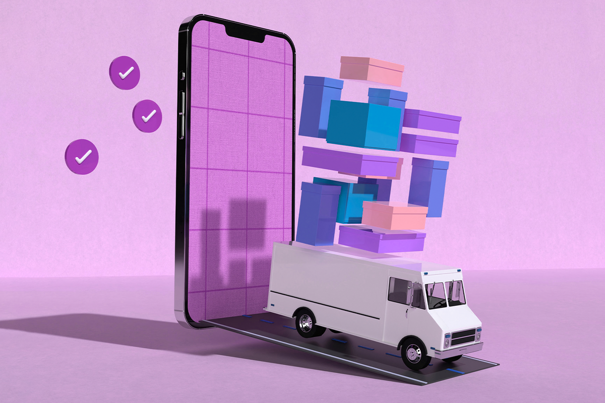
You've spent hours perfecting your Shopify store, but are you leaving money on the table? When customers view a single product, they're often ready to buy more if you guide them correctly. Looking at successful Shopify product page examples reveals a common thread: stores that convert best use smart product recommendation strategies, particularly the "Frequently Bought Together" feature, which mirrors Amazon's proven approach. This article will show you exactly how to add frequently bought together sections to your Shopify store, turning single-item purchases into bundles that increase your average order value and boost revenue without requiring more traffic.
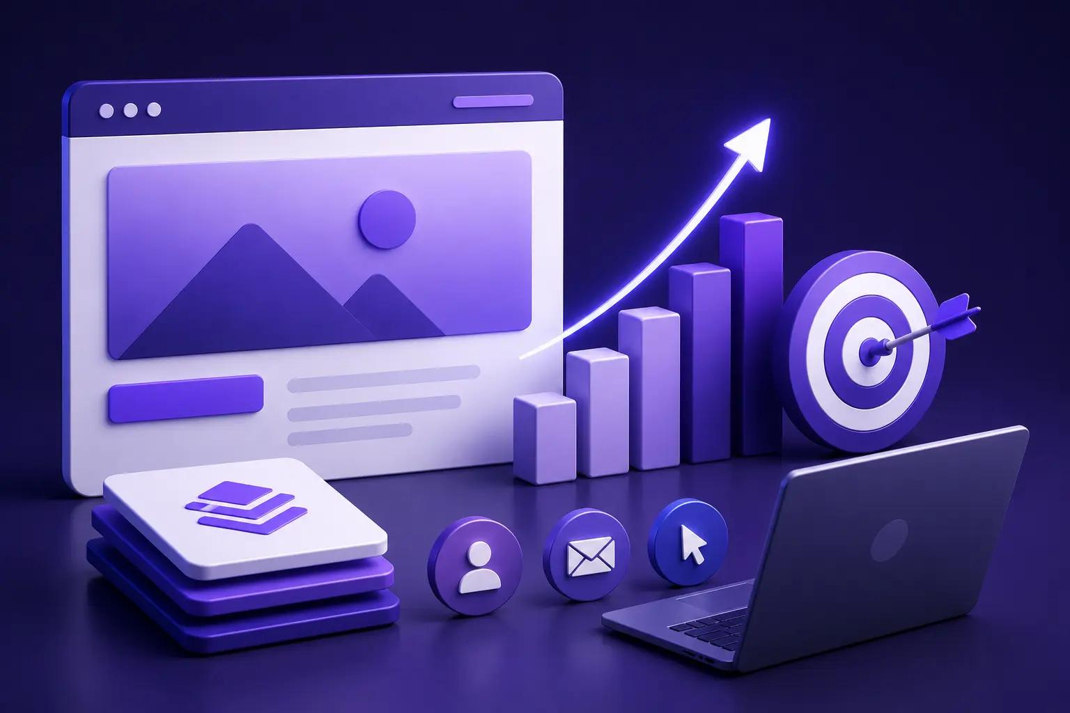
PagePilot's AI page builder makes it simple to create product pages with intelligent product bundling recommendations that feel natural and encourage customers to add complementary items to their cart. The tool helps you design high-converting product pages with frequently bought together sections that match your brand, and uses data to suggest the right product combinations your customers actually want.
Summary
- Amazon's recommendation engine drives an estimated 35% of its total sales according to McKinsey & Company, but most Shopify stores never see similar results from Frequently Bought Together widgets. The gap isn't in the technology itself. It's in how bundles are positioned, when they appear in the customer journey, and whether they match the specific problem someone is trying to solve.
- Excessive product choice kills conversion rates more effectively than poor offers. Research published in the Journal of Personality and Social Psychology found that consumers faced with too many options were 10 times less likely to make a purchase than in scenarios with fewer choices.
- Bundle placement determines whether it supports or sabotages the primary sale. When Frequently Bought Together sections appear before customers have decided on the main product, they fragment attention and create premature choice overload. Effective product pages guide customers through awareness, interest, desire, and action sequentially.
- Testing velocity matters more than the implementation method for increasing average order value. Apps are fast to install but slow to customize. Manual bundles offer control but create operational drag. Custom code provides flexibility but requires developer resources for every change.
- Successful bundle strategies treat recommendations as outcome-focused offers rather than product collections. Instead of "customers also bought these items," high-converting stores frame bundles as "everything you need for clear skin in 30 days" or "get studio-quality sound."
AI page builder addresses this by generating product pages with bundle sections already positioned according to conversion psychology, allowing stores to test different messaging angles and placements in minutes rather than days without touching app configurations or writing code.
Why Store Owners Add “Frequently Bought Together”

Store owners add Frequently Bought Together to their product pages because they believe it's a shortcut to higher average order value. If Amazon can attribute 35% of its sales to product recommendations, then surely the same widget on a Shopify store will nudge customers to buy more. It's a bet on automation doing the heavy lifting, with minimal setup required.
The Power of Recommendations
According to industry research on how retailers can keep up with consumers, Amazon's recommendation engine is responsible for an estimated 35% of its total sales. That statistic is frequently cited in ecommerce circles because it underscores the appeal: higher revenue per transaction without acquiring additional Shopify stores or customers.
The Promise vs. Reality Gap
For store owners struggling to scale past tight customer acquisition cost limits, the promise of bundling feels like oxygen. But the gap between expectation and reality shows up fast. Many merchants install a Frequently Bought Together app, enable it, and wait for the AOV bump that never comes.
The Conversion Friction Trap
The widget sits there, technically functional, but it doesn't move the needle. Customers scroll past it. The bundles feel random. The placement competes with the main product instead of supporting it. What should have been a conversion accelerator becomes visual clutter that distracts rather than persuades.
The Real Reason Amazon's Recommendations Work
Amazon's success doesn't depend on the widget's existence. It comes from how deeply the recommendations are woven into the entire buying experience. All matter:
- Context
- Placement
- Relevance
- Pricing logic
- Intent
Amazon's system isn't simply showing related products at random. It analyzes purchase history, browsing behavior, category patterns, and session data to surface bundles that feel intuitive rather than forced.
The Conversion Friction Trap
Most Shopify implementations skip that work entirely. Bundles get bolted onto product pages as an afterthought, disconnected from the story the page is trying to tell. There's no consideration for why a customer landed on that product, what problem they're trying to solve, or what complementary item would actually make sense in their cart.
What Happens When Implementation Misses the Mark
When Frequently Bought Together is poorly executed, it creates friction instead of momentum. The page becomes harder to navigate. Decision fatigue sets in because the customer must evaluate multiple products when they came to consider only one.
The primary call to action gets diluted. Instead of deciding whether to buy the main product, the customer is now weighing whether a bundle makes sense, whether the discount is worthwhile, and whether they need the add-on.
The "Banner Blindness" Barrier
A common pattern surfaces across stores: the widget goes completely unnoticed. It blends into the page like banner blindness. Customers have learned to ignore recommendation blocks that feel generic or sales-driven. If the bundle doesn't immediately answer an obvious need or solve a clear problem, it registers as noise.
The tension most store owners face is this: they want the results Amazon achieves, but they're not willing to do the work Amazon does. They assume the technology alone will deliver the outcome. But technology without strategy is just decoration.
Why Frequency and Intent Beat Automation Alone
Frequently Bought Together works when it reflects actual buying behavior, not guesswork. The bundles that convert are:
- The ones customers would have thought of themselves, or almost thought of, but needed a small nudge to act on.
- A phone case with a screen protector.
- A camera with a memory card.
- A blender with a recipe book.
These pairings feel natural because they solve adjacent problems simultaneously.
Data-Driven vs. Arbitrary Bundling
When bundles are based on real purchase data from your store, or at least from similar stores in your niche, they carry weight. When they're auto-generated by an algorithm with no context, they feel arbitrary. Customers can sense the difference. One feels helpful. The other feels like a sales tactic.
Strategic Widget Placement
Placement also dictates performance. A Frequently Bought Together section that appears too early on the page, before the customer has even decided they want the main product, creates premature choice overload. One that appears after the product description, after trust has been built and intent is clearer, performs better because it aligns with the customer's mental progression.
The Strategy Behind Effective Bundling
The stores that see real AOV increases from Frequently Bought Together treat it as part of a broader conversion framework, not a standalone hack.
- They test bundle combinations.
- They adjust pricing logic to make the deal feel like a win.
- They position the widget to support the buying decision rather than interrupt it.
- They use it alongside other strategies such as quantity breaks and volume discounts.
- They spend thresholds to create multiple paths to a higher cart value.
AI-Enhanced Conversion Architecture
Tools like PagePilot's AI page builder remove the guesswork by generating product pages with intelligently placed bundle sections that match your brand and feel contextually relevant. Instead of manually configuring widgets or relying on an app's default settings, the page is built with conversion psychology embedded.
Seamless Upsell Integration
The Frequently Bought Together section becomes part of a cohesive layout designed to guide the customer smoothly from interest to purchase, with logical upsell opportunities woven in at the right moments.
This approach treats bundling as a design decision, not just a feature toggle. It acknowledges that the widget only works when it fits naturally into the customer's journey and feels like helpful curation rather than aggressive cross-selling.
Why Most Implementations Fail by Default
The core issue is that most store owners expect Frequently Bought Together to work automatically.
- They think the app will figure it out.
- They assume customers will engage with any bundle that's presented, but customers don't behave that way.
- They ignore what doesn't serve them.
- They tune out recommendations that feel generic or irrelevant.
- They abandon carts when the page feels cluttered or confusing.
Strategic Iteration and Testing
Frequently Bought Together isn't a set-it-and-forget-it solution. It's a lever that only works when you understand what you're pulling and why. It requires testing, iteration, and a willingness to adjust based on what actually drives behavior in your store. The widget itself is neutral. The strategy behind it determines whether it increases AOV or just adds noise.
Consumer-Centric Implementation
Most merchants never get to the strategy part because they're stuck in the setup phase, trying to make the widget look decent or wondering why it's not converting. They're solving the wrong problem.
The question isn't whether to add Frequently Bought Together. The question is whether you're adding it in a way that respects how customers actually buy. That distinction is where the real work begins, and where most assumptions start to break down.
Related Reading
- Shopify Product Page Examples
- How to Make Your Shopify Store Look Professional
- How to Increase Conversion Rate Shopify
- Best Size for Shopify Product Images
- eCommerce Product Page Optimization
- Shopify Banner Size
- How to Create Multiple Product Pages in Shopify
- How to Change Favicon on Shopify
- How to Add Size Chart in Shopify
- How to Customize Shopify Checkout Page
What “Frequently Bought Together” is and Isn’t
Frequently Bought Together is a merchandising tactic that surfaces complementary products at the point of maximum buying intent. It works by reducing the cognitive effort required to discover what else a customer might need, turning a single purchase into a multi-item transaction. When executed properly, it feels less like a sales push and more like helpful curation.
Relevance and Trust
The distinction between effective and ineffective implementation comes down to relevance. A bundle that solves an adjacent problem (phone + case, camera + memory card) feels intuitive. One that pairs unrelated items (laptop + dog toy) creates confusion and erodes trust in your recommendations.
What it Actually Does
At its core, this feature guides customers toward logical next purchases without forcing them to search your catalog. It compresses the discovery process into a single decision point, which matters because every additional click or page load increases the chance of cart abandonment. The customer sees the main product, recognizes they'll need something else to complete the experience, and adds both without leaving the page.
Anticipating Customer Needs
This works because it aligns with how people naturally think about purchases. When someone buys a blender, they're already considering recipes or ingredients. When they add running shoes to the cart, they're mentally planning their first workout. Frequently Bought Together intercepts that thought process and offers the solution before the customer has to hunt for it.
Frictionless Decision-Making
The psychological principle underneath is simple: reduce friction at the moment of highest intent. Customers are already in buying mode. They've evaluated the main product, decided it solves their problem, and committed mentally to the purchase. Presenting a relevant add-on at this moment requires little additional persuasion, as the decision-making work is already done.
What it Isn't
Frequently Bought Together is not a random product generator. Throwing three items together just because they're in your inventory creates decision fatigue, not value. Customers can immediately sense when a bundle feels algorithmic rather than intentional. The moment they question why these products are grouped, you've lost the sale.
It's also not a substitute for weak product positioning. If your main product page fails to clearly communicate value, adding more products won't fix the problem. It amplifies it.
The Illusion of Automatic Growth
A confused customer presented with three mediocre options will choose none. Bundles only work when the primary offer is already strong enough to stand alone. And it's definitely not a guaranteed revenue boost. Many store owners treat this feature like a light switch: flip it on, watch AOV climb. That's not how customer behavior works.
The Data-Driven Strategy Gap
According to SellerApp's analysis of Amazon's internal metrics, the e-commerce giant attributes a 35% increase in average order value directly to its recommendation engine's performance. But that result comes from years of behavioral data, machine learning, and relentless testing. Copying the widget without copying the strategy produces mediocre results at best.
The Clarity Principle
Here's the belief shift most store owners miss: bundles amplify whatever's already on the page. If your product story is clear, compelling, and well-positioned, Frequently Bought Together accelerates the sale and increases cart value. If your page is cluttered, confusing, or unconvincing, the bundle makes matters worse by adding more choices.
When it Works
Frequently Bought Together performs when it reflects actual buying behavior rather than guesswork. The stores seeing real results use purchase data to inform their bundles. They track what customers naturally buy together and proactively surface those combinations. This isn't about forcing random pairings. It's about recognizing patterns and making them easier to act on.
Incentive-Based Pricing Logic
Pricing logic matters just as much as product selection. A bundle that saves the customer $2 feels pointless. One that offers $15 or more in savings creates a tangible incentive to add both items. The discount needs to be significant enough to register as a win, but not so steep that it erodes your margin or makes the main product seem overpriced by comparison.
The Technical Trust Factor
Timing also dictates performance. A Frequently Bought Together section that loads slowly, appears inconsistently, or breaks on mobile destroys trust faster than it builds revenue. Customers expect seamless experiences. If your bundle widget feels janky or unreliable, they'll ignore it entirely, no matter how good the offer is.
The Implementation Gap
Most merchants want the result Amazon gets without doing the work Amazon does. They install an app, accept the default settings, and assume the technology will handle it. But technology without strategy is just decoration. The widget exists, but it doesn't serve the customer's decision-making process.
AI-Driven Layout Optimization
Tools like PagePilot's AI page builder address this gap by generating product pages with intelligently placed bundle sections that match your brand and feel contextually relevant. Instead of manually configuring widgets or relying on an app's default logic, the page is built with conversion psychology embedded.
The “Frequently Bought Together” section becomes part of a cohesive layout designed to guide the customer smoothly from interest to purchase, with logical upsell opportunities woven in at the right moments. This approach treats bundling as a design decision, not just a feature toggle.
Intentional Design vs. Plugin Clutter
The difference shows up in performance. Pages built with intent convert better than pages assembled from disconnected plugins. Customers can feel when a page has been designed versus when it's been cobbled together. One feels professional and trustworthy. The other feels like a template someone forgot to finish.
Why Most Bundles Fail Quietly
The core issue is expectation mismatch. Store owners:
- Expect Frequently Bought Together to work automatically.
- Assume customers will engage with any bundle presented, but customers don't behave that way.
- Ignore what doesn't serve them.
- Tune out recommendations that feel generic or irrelevant.
- Abandon carts when the page feels cluttered or confusing.
Common Bundle Failure Points
Bundles fail when they're treated as an afterthought. They fail when they're positioned incorrectly. They fail when the products don't make logical sense together. They fail when the discount isn't compelling. They fail when the page loads slowly or the widget looks cheap. Any one of these issues can kill conversion, and most stores have three or four happening simultaneously.
The Iterative Framework for Success
The stores that succeed treat Frequently Bought Together as part of a broader conversion framework. They test bundle combinations. They adjust pricing logic. They monitor which placements perform best. They iterate based on what actually drives behavior in their store, not what worked for someone else's store six months ago.
But that level of intentionality requires seeing the widget for what it really is: a lever that only works when you understand what you're pulling and why.
The Hidden Tradeoffs of Implementation
The question isn't whether to add it, but how you're adding it, in a way that reflects how customers actually make decisions. Most store owners skip that question entirely, which is why the three most common implementation methods all carry hidden tradeoffs nobody mentions upfront.
Common Ways to Add Frequently Bought Together on Shopify
Shopify offers three ways to add product bundles: install an app, manually build bundles, or write custom code. Each solves the surface problem of showing complementary items. Where they differ is in how much control you get, how fast you can test, and what breaks when you need to change direction.
The choice most merchants make comes down to speed versus flexibility. But there's a third variable no one optimizes for up front: iteration velocity. That gap shows up later, usually right when you need to test a new bundle angle or adjust pricing logic.
Apps (Rule-Based or AI-Driven)
This is where most store owners start. You browse the Shopify app store, select an option with strong reviews, such as the Frequently Bought Together app, which maintains a high rating from over 2,600 users, install it, and configure a few settings. Within minutes, you have bundles live on your product pages.
The appeal is obvious. No developer needed. No inventory restructuring. Just toggle a few options, and the widget appears. For merchants testing the concept or running lean operations, apps remove the technical barrier entirely.
Rigid Customization Constraints
Where this breaks down is customization depth. Most apps lock you into their layout, their messaging structure, and their placement logic. You can choose which products to bundle, but you can't control how the offer is framed or where it sits relative to other page elements. Testing a different psychological angle (e.g., scarcity versus value) usually means reconfiguring the entire app or building a new one.
The Friction of Rapid Iteration
The bigger issue surfaces when you want to iterate quickly. Changing bundle composition, adjusting discount logic, or testing new product pairings often requires navigating clunky admin interfaces. Some apps refresh slowly. Others cache aggressively, meaning changes don't appear immediately. That lag kills momentum when you're trying to test multiple variations in a short window.
Apps prioritize ease of installation over testing speed. That tradeoff works fine if you plan to set it once and leave it. It falls apart the moment you want to treat bundling as an active conversion lever.
Manual Product Bundles
Some merchants skip apps entirely and create standalone bundles. You combine multiple items into a single SKU, set a bundled price, and list it on your store like any other product. This gives you complete control over how the offer is presented, what's included, and how it's priced.
The advantage is clarity. Customers see a single product with a clear value proposition. There's no widget to ignore, no dynamic recommendations that might feel random. The bundle is the product, and you control every aspect of its marketing.
Operational and Inventory Overhead
The operational cost shows up fast. Each bundle requires its own SKU, inventory tracking, and product page. If you want to test five different bundle combinations, you're managing five separate products. Changing what's included means updating inventory rules, adjusting pricing, and sometimes rebuilding the product listing entirely.
The Scalability Trap
This approach works for stores with a small catalog and stable bundle offerings. It collapses under complexity. Testing becomes expensive because every variation requires backend work. Seasonal changes, promotional adjustments, or new product launches all create friction. You're no longer iterating on the conversion strategy. You're managing inventory logistics.
Manual bundles provide UX control at the expense of operational flexibility. That's a reasonable trade if your bundles rarely change. It's a nightmare if you need to move fast.
Theme Sections or Custom Code
Advanced stores often build Frequently Bought Together directly into their theme. This means writing custom Liquid code, integrating it with your design system, and controlling exactly how bundles render across devices. The result is the cleanest possible integration, visually and functionally.
This path offers maximum control. You decide placement, styling, behavior, and data logic. The bundle section feels native to your store because it is native. There's no third-party branding, no performance hit from loading external scripts, and no layout conflicts with other apps.
The Technical Dependency Burden
The cost is technical dependency. Every change requires developer time. Testing a new bundle angle means writing code, deploying updates, and hoping nothing breaks. Most teams hesitate to iterate frequently because each test carries overhead. What should be a quick experiment becomes a multi-day project involving design, development, and QA.
Custom code optimizes for design perfection, not testing velocity. If your store has reached a stable state where bundles rarely change, this approach makes sense. If you're still figuring out what converts, the friction will slow you down more than the control helps.
The Hidden Cost Nobody Mentions
All three methods work. They all put bundles on your product pages. But none of them prioritize what actually drives AOV increases: rapid iteration.
Apps are fast to install but slow to customize. Manual bundles offer control but create operational drag. Custom code provides flexibility but requires technical resources. The pattern is consistent. You pick your constraint.
The Impact of Testing Velocity
What most store owners miss is that the implementation method shapes how often you'll actually test. If changing a bundle takes five minutes, you'll test frequently. If it takes two hours or requires a developer, you won't. Testing velocity determines how quickly you find what works, and most setups quietly kill that velocity by design.
The Trap of Strategic Rigidity
Many merchants find themselves locked into a structure that's technically functional but strategically rigid. The bundle exists, but improving it feels like more work than it's worth. So it sits there, underperforming, because the cost of iteration exceeds the expected benefit of optimization.
Unified Conversion Ecosystems
Solutions like PagePilot's AI page builder bypass this tradeoff by generating product pages with bundle sections already optimized for conversion. Instead of choosing between speed, control, and testing velocity, the page is built with all three embedded.
Integrated Conversion Systems
Bundle placement, pricing logic, and visual integration are handled automatically, and adjustments occur at the page level without requiring app reconfigurations or code deployments. This treats bundling as part of a cohesive conversion system, not a feature you bolt on and hope performs.
The difference shows up in how quickly you can test new angles. When iteration is frictionless, you test more. When you test more, you find what actually moves AOV. When implementation creates friction, testing slows, and performance plateaus.
What Actually Matters
The method you choose matters less than whether it lets you iterate. A mediocre bundle you can test daily will outperform a perfect bundle you can't touch for weeks. Conversion optimization is a feedback loop, and the speed of that loop determines how fast you improve.
Most merchants optimize for the wrong variable. They want the cleanest integration or the fastest install. What they should want is the shortest path from idea to live test. That's where real AOV gains come from, not from picking the right app or writing the perfect code.
Why Most "Frequently Bought Together" Setups Don't Convert

The widget appears on the page. Products get grouped. Nothing happens. Most Frequently Bought Together sections fail because they ignore the customer's mental state at the moment of decision. They present options without context, bundles without logic, and deals without clear value. The result isn't persuasion. It's noise that customers scroll past without a second thought.
Bundles That Don't Match Buying Intent
A customer lands on a yoga mat product page to start a morning routine. The Frequently Bought Together section suggests a foam roller, resistance bands, and a water bottle. Technically, these are fitness products. Logically, they might all get used to it eventually. But in that specific moment, the customer is solving one problem: finding the right mat. Everything else feels like a distraction.
Functional vs. Categorical Mismatch
Mismatch happens constantly. Stores group products by category rather than by the task the customer is trying to accomplish. A camera paired with a tripod makes sense for travel photography. It makes no sense if they're buying for video calls. The bundle assumes a use case that the customer never had.
When the suggested items don't align with the reason someone clicked the product, the bundle appears irrelevant.
The Risk of Buyer Hesitation
Customers don't stop to evaluate whether they might need those items later. They dismiss the entire section and move on. Worse, a poorly matched bundle can create doubt about the main product itself. If the store doesn't understand what goes together, they may not understand the product either.
Decision Overload From Too Many Choices
You open a product page for a single item. Before you finish reading the description, you'll see four additional products, each with its own price, image, and value proposition. Now you're not deciding whether to buy one thing. You're comparing five things simultaneously, doing mental math on bundle discounts, and questioning whether you even need any of it.
The Paradox of Choice
Research on consumer psychology consistently shows that excessive choice creates paralysis, not excitement. A study published in the Journal of Personality and Social Psychology found that when consumers faced too many options, they were 10 times less likely to make a purchase than when they had fewer choices.
The Friction of Cognitive Load
Most Frequently Bought Together setups pile on options without considering cognitive load. Three products might be manageable. Six products turn the decision into work. The customer came in to evaluate a single purchase, and now they're managing a spreadsheet in their head. That friction doesn't increase AOV. It tanks conversion on the primary product.
The stores that see bundle performance gains limit choices aggressively. One or two complementary items at most. Clear pricing. Obvious value. The bundle should simplify the decision, not complicate it. When it does the opposite, customers bail.
Placement That Competes With the Main Offer
The product hero image loads. The headline explains what it does. Then, before the customer reads a single benefit or understands why they should care, a Frequently Bought Together section interrupts with three more products demanding attention. This isn't strategic merchandising. This is self-sabotage.
Strategic Placement Sequence
Placement determines whether a bundle supports or undermines the sale. If the section appears too early, it fractures attention before trust has been established. The customer hasn't decided they want the main product yet, and now they're being asked to evaluate add-ons. That's backwards. You can't upsell someone who hasn't mentally bought into the core offer.
The Psychology of Sales Funnels
Effective product pages guide customers through a sequence: awareness, interest, desire, action. Bundles belong in the desire or action phase, after the product's value is clear and the customer is leaning toward purchase. Dropping them into the awareness phase creates premature choice overload and dilutes the primary message.
Many apps default to placing the bundle widget high on the page because it's more visible there. But visibility without context is just clutter. The widget gets seen and ignored because it arrived at the wrong moment in the customer's decision process.
Visual Design That Blends Into Background Noise
Customers have learned to ignore recommendation blocks that look like ads. If your Frequently Bought Together section uses generic styling, stock layouts, or visual patterns that scream "automated widget," it will get the same treatment as banner ads: complete invisibility.
The Risk of Banner Blindness
This phenomenon, often called banner blindness, extends beyond traditional ads. Any page element that looks formulaic or disconnected from the main content gets filtered out. Your bundle section might be perfectly positioned and logically constructed, but if it looks like every other Shopify store's bundle widget, customers won't consciously process it.
Native Design and Brand Integration
The design has to feel native to your store. Custom styling that matches your brand, integrates with your layout, and uses visual hierarchy to guide attention. When the bundle section looks like an afterthought or a plugin someone installed and forgot about, it performs like an afterthought.
Stores that treat bundle design as seriously as they treat their product photography see better engagement. The section doesn't need to be flashy. It needs to look intentional, like it belongs on the page rather than being bolted on as an afterthought.
No Path to Test What Actually Works
You launch a bundle. It sits there for three months. You have no idea if anyone clicks it, which products perform well together, or whether the discount structure makes sense. Most setups provide a zero-feedback loop, which means no ability to improve.
The Friction of Static Bundling
Testing is where real performance gains come from, but most implementations make testing prohibitively difficult. Changing bundle composition requires app reconfigurations, manual product updates, or code deployments. Each test carries enough friction that merchants simply don't bother. The bundle becomes static, and static bundles become invisible.
Frictionless AI Iteration
Stores using PagePilot's AI page builder bypass this problem entirely. The system generates product pages with bundle sections already optimized for conversion psychology, and adjustments happen at the page level without touching app settings or writing code. When iteration is frictionless, testing becomes routine. When testing is routine, you identify what actually drives behavior rather than guessing.
The Power of Testing Velocity
The difference between a bundle that converts at 2% and one that converts at 8% isn't the products. It's the fifteen iterations you ran to figure out the right combination, pricing structure, and placement. Most stores never get past iteration one because the cost of testing exceeds the perceived benefit.
Weak or Confusing Discount Logic
A bundle offers $3 off when buying three items together. The customer does the math and realizes the discount barely covers shipping. There's no incentive to add more to the cart. The bundle exists, but it doesn't persuade.
Simplicity Over Complexity
Discount structures need to create a tangible win. If the savings feel trivial, customers ignore them. If the math is confusing (15% off one item, 10% off another, free shipping on orders over $50), customers give up trying to determine whether it's worth it. Complexity kills conversion faster than a weak offer.
The Zero-Effort Value Proposition
The most effective bundles use simple, clear pricing: "Buy all three, save $20." No percentage calculations. No conditional logic. Just a straightforward value proposition that requires zero mental effort to evaluate. When the deal is obvious, customers act on it. When it requires work to understand, they don't.
The Pricing Discrepancy Trap
Some stores accidentally make bundles less appealing than buying items separately. The discount doesn't offset the psychological cost of committing to multiple products at once. Or the bundle price ends up higher than the current sale prices on individual items. These mistakes happen when bundles are set up once and never revisited as pricing strategies evolve.
The Core Problem Beneath All of This
Every failure mode traces back to the same root cause: treating Frequently Bought Together as a feature instead of a strategy. The widget gets installed, products get grouped, and merchants assume the technology will handle the rest. But customers don't respond to technology. They respond to:
- Relevance
- Clarity
- Value
The Illusion of Opportunity
A bundle that doesn't match intent, is overwhelmed with choices, appears at the wrong moment, looks generic, can't be tested, or offers weak value isn't a conversion tool. It's friction disguised as an opportunity. Most stores have that friction live on their product pages right now, quietly suppressing the AOV gains they expected.
The Systematic Approach to Results
The stores that see results treat bundles as part of a broader conversion system, not a standalone hack. They test ruthlessly, adjust based on behavior, and design every element to reduce cognitive load rather than increase it. That approach requires seeing the bundle for what it is: a single decision point in a complex customer journey that only works when everything around it does too.
Related Reading
- Shopify Variants vs Options
- Shopify Websites Examples
- Best Shopify Themes For Conversion
- How To Add Frequently Bought Together On Shopify
- Shopify Variants Vs Options
- How To Add Size Chart In Shopify
- Product Recommendations Shopify
- How To Change Favicon On Shopify
- Shopify Order Confirmation Page
- How To Choose A Shopify Theme
- How To Customize Shopify Checkout Page
How High-Converting Stores Actually Use Bundles

High-converting stores build bundles around customer intent, not inventory convenience. They match the offer to the problem someone is actively trying to solve, position it after trust has been established, and test relentlessly until the combination drives measurable AOV increases. The bundle is a conversion lever that consolidates multiple purchase decisions into a single, frictionless moment.
Frame Bundles as Outcomes, Not Collections
The difference between a bundle that converts and one that gets ignored starts with how it's introduced. Winning stores don't say "customers also bought these items." They explain what the bundle accomplishes.
A skincare store doesn't group three products together and call it a routine. They position it as "Everything you need for clear skin in 30 days." The value proposition comes first. The products are proof.
Outcome-Oriented Bundling
This shift matters because customers don't buy products. They buy results. When a bundle solves a specific problem (completes a setup, achieves a goal, avoid a mistake), the decision becomes obvious. When it's just a collection of related items with no clear purpose, it requires the customer to invent their own reason for buying. Most won't bother.
Persuasive Framing vs. Labeling
Stores seeing real performance gains write bundle headlines like offers, not labels. "Get studio-quality sound" instead of "Microphone bundle." "Start running injury-free" instead of "Running essentials pack." The framing does half the persuasion work before the customer even looks at what's included.
Match Bundles to Where the Customer is Mentally
A first-time buyer evaluating your product needs different guidance than someone who's already purchased twice. One needs reassurance and clarity. The other wants speed and value. High-converting stores segment their bundle strategy by customer familiarity and intent, not just by product category.
Reducing Uncertainty vs. Rewarding Loyalty
For new customers, bundles work best when they reduce uncertainty. "Everything you need to get started" removes the anxiety of buying the wrong thing or forgetting something essential. For repeat buyers, bundles shift toward convenience and savings. "Restock your favorites and save 20%" respects that they already know what they want.
The Two-Pronged Testing Strategy
Testing this doesn't require complex segmentation tools. Start by creating two bundle variations: one for discovery and one for efficiency. Show the discovery version to first-time visitors. Show the efficiency version to returning customers or cart abandoners. Track which drives higher add-to-cart rates and adjust from there.
Aligning Messaging with Readiness
Many stores show identical bundles to every visitor, which means they're either over-explaining to experienced buyers or under-supporting new ones. Both scenarios suppress conversion. The stores that align bundle messaging with customer readiness see 15-20% higher engagement on the bundle section itself, which compounds into meaningful AOV increases over time.
Test Angles Without Rebuilding Infrastructure
The fastest way to kill bundle momentum is to make every test require backend changes. High-converting stores experiment at the page level, adjusting messaging, visual hierarchy, and price anchors without touching product structures or inventory systems. This lets them run five tests in the time it would take most stores to configure one.
They test bundle headlines first
- Does "Complete your setup" convert better than "Save 25% on these three items"?
- Does leading with the discount outperform leading with the outcome? Small phrasing shifts create measurable performance differences, but only if you can test them quickly enough to gather signal.
They test visual grouping
- Does showing all three products side by side work better than stacking them vertically?
- Does adding a visual indicator (like "Most Popular" or "Best Value") increase selection rates? These aren't subjective design preferences. They're testable hypotheses that either move the metric or don't.
The Continuous Optimization Loop
Most merchants treat bundle setup as a one-time decision, configuring it once and hoping for the best. In contrast, high-performing stores that generate 25-30% of their revenue from bundles treat these offers as dynamic conversion elements that require continuous optimization based on real-time customer behavior.
Optimize Clarity Before Scaling Complexity
A bundle that's hard to understand at a glance will never convert well, no matter how good the offer is. High-converting stores obsess over making the bundle decision feel simple. Clear headline. Obvious visual grouping. Single call to action.
The Three-Second Rule
The customer should be able to evaluate the entire offer in three seconds or less. This means stripping out anything that doesn't directly support the decision. No lengthy descriptions of each individual product. No complex discount calculations. No conditional logic that requires mental math. Just the outcome, the products, the price, and the action. Everything else is friction.
The Detail Trap
The stores include too much information, thinking that more detail equals more persuasion. But detail creates cognitive load. The customer came to buy one thing and now they're reading three product descriptions, comparing specifications, and trying to calculate whether the bundle discount is actually worth it. That's not a buying experience. That's work.
Visual Hierarchy and Action
Effective bundle design uses visual hierarchy to guide attention. The headline and total savings get the most visual weight. Product images are large enough to be recognized without dominating the layout. The add-to-cart button is prominent and uses action-oriented copy ("Get the complete kit" instead of "Add bundle to cart"). Every element reinforces the same message: this is the obvious next step.
Scale Only What's Proven to Work
High-converting stores don't roll out bundles across their entire catalog at once. They select one or two high-traffic products, build bundles around them, and measure performance over two weeks. If the bundle increases AOV without tanking conversion on the main product, they expand. If it doesn't, they iterate on messaging and positioning before scaling.
Compounding Strategic Knowledge
This approach prevents the common mistake of building dozens of bundles that nobody buys. It also creates a feedback loop in which each successful bundle informs the next. You learn which types of products pair well, which discount structures drive action, and which placements perform best. That knowledge compounds as you scale.
The Complexity Fallacy
Most stores do this backwards. They spend weeks setting up bundles for every product, launch everything at once, and then have no idea which ones are working or why. When performance is mediocre, they can't diagnose the problem because there are too many variables. Testing becomes impossible because changing anything affects everything.
The Evidence-Based Scaling Model
The pattern that works:
- Prove the concept on a small scale
- Document what drove the result
- Replicate that approach across similar products
This builds a bundle strategy grounded in evidence rather than assumptions. It also makes scaling faster because you're not starting from scratch each time.
Conversion comes from positioning, not plugins. Bundles work when they're clearly framed, aligned with the customer's objectives, and tested as real offers rather than set-and-forget features. The stores seeing consistent AOV gains treat bundling as a discipline, not a checkbox.
Test “Frequently Bought Together” With PagePilot for Free
Most Shopify stores never discover what actually drives AOV because testing requires too much overhead. You need to reconfigure apps, adjust product structures, or wait on developers. By the time you're ready to test variation two, you've lost interest in variation one. PagePilot removes that entire bottleneck by enabling you to generate and test bundle strategies at the page level, where decisions are made.
You can create three product pages for free, no credit card required. Each page includes intelligently positioned bundle sections built with conversion psychology already embedded. Instead of wrestling with app settings or writing code, you can test different bundle angles in minutes. One page frames the offer around outcomes.
Another emphasizes savings. A third test placement after social proof instead of before product details. You learn what moves your specific audience before committing to infrastructure changes.
Generate Pages That Test Bundle Positioning Instantly
The standard workflow requires you to select a bundle strategy, lock it in, and hope it performs. PagePilot flips that sequence. You generate multiple page variations with different bundle approaches, send traffic to each, and let actual customer behavior tell you what works. One store might find that bundles convert best when positioned as starter kits.
Another discovers their audience responds to restocking convenience. You're not guessing anymore. You're measuring. This matters because bundle performance varies wildly by niche, price point, and customer sophistication. A strategy that works for skincare won't necessarily work for electronics.
The only way to know what drives your AOV is to test multiple angles quickly enough to act on the data while it's still relevant.
Validate Messaging Before Scaling Complexity
The stores that see consistent bundle revenue treat messaging like a variable, not a constant. They test whether leading with the discount outperforms leading with the outcome. They compare "complete your setup" against "save 25% on these essentials" and track which frame drives higher add-to-cart rates.
Most merchants never run these tests because changing headline copy requires touching app configurations or editing theme files.
The Feedback Loop Advantage
When you can generate a new page variation in three minutes, testing becomes routine instead of exceptional. You're not debating which message might work better. You're running both and checking the conversion data two days later. That feedback loop is where real optimization happens, and it only works when iteration costs approach zero.
Improve Visuals Without Design Skills
Bundle sections fail when they appear bolted-on rather than native. Customers scroll past widgets that feel generic or disconnected from the rest of the page. PagePilot generates layouts in which the bundle section aligns with your brand aesthetic and integrates with the page's visual hierarchy.
Native UX Integration
The section doesn't scream plugin. It feels like part of a cohesive buying experience. This removes the common problem where bundle performance suffers because the design looks cheap or the placement feels awkward. You're not trying to make a third-party widget blend in. The entire page is built as a unified conversion system, with bundles positioned to support the decision rather than interrupt it.
Learn What Increases AOV Before Backend Changes
The traditional approach locks you into technical decisions before you know if they'll work. You configure products as bundles in Shopify, adjust inventory rules, set up SKUs, and hope customers respond. If they don't, you've invested hours into infrastructure that doesn't drive revenue.
PagePilot lets you test the customer-facing experience first. You validate that the bundle angle resonates, that the pricing makes sense, and that the placement drives action. Only after you've confirmed it converts do you invest in backend complexity.
Data-Driven Scaling
This sequence prevents the common mistake of building elaborate bundle systems that nobody uses. You're optimizing for what actually moves behavior, not for what feels technically elegant. The free trial gives you three pages to test different strategies. That's enough to identify which bundle approach works for your top products before you scale it across your catalog.
Start your free trial at PagePilot and generate three product pages with built-in bundle sections. No credit card. No setup complexity. Just fast testing on what actually converts for your store.
Related Reading
• Pagefly Alternatives
• Shopify Electronics Store
• High Converting Product Pages
• Shopify Beauty Stores
• Best Trust Badges For Shopify
• Shopify Contact Us Page Example
• Best One Product Shopify Theme
• Shopify T-shirt Store Examples
• Best Shopify Theme For Print On Demand