Store owners often invest significant time perfecting their Shopify web design, selecting colors, writing product descriptions, and configuring their shops. However, many discover that visitors browse extensively but leave without making a purchase. The gap between traffic and sales highlights where Shopify conversion rate optimization becomes essential, transforming casual browsers into customers through strategic improvements to checkout processes, product pages, and user experience.
Proven strategies can significantly boost conversion rates, from persuasive copywriting and trust signals to mobile optimization and cart abandonment solutions. Store owners need tools that help them implement these conversion strategies quickly and test different layouts that drive actual purchase decisions rather than just aesthetic appeal. PagePilot's AI page builder enables rapid creation of high-converting landing pages and product pages without requiring design skills or technical expertise.
Table of Contents
Most Shopify Stores Don’t Have a Traffic Problem
What “Shopify Conversion Rate Optimization” Actually Means
5 Core Elements That Drive Shopify Conversions
Why Most Shopify CRO Efforts Fail
The CRO Framework That Actually Improves Results
How PagePilot Helps You Improve Conversion Rates Faster
Start a FREE Trial and Generate 3 Product Pages with Our AI Page Builder today
Summary
- Most Shopify stores stall not because they lack traffic, but because they fail to convert the visitors they already have. Analysis of two years of Shopify data shows that average conversion rates hover between 1.4% and 1.8%, meaning 98 out of 100 visitors leave without making a purchase. Doubling traffic at that conversion rate doesn't increase revenue; it increases the number of bounces. Moving from 1.5% to 3% conversion doubles revenue without increasing ad spend, and that shift comes from fixing the experience after the click rather than buying more traffic.
- Sixty-eight percent of small businesses don't have a documented CRO strategy, according to Shopify research. This absence shows up in product pages that jump straight to features without context, bury value propositions three scrolls deep, or assume trust without earning it. Without structured testing that compares performance before and after changes, stores constantly make modifications, but never build knowledge of what actually drives purchases. The effort compounds into noise instead of insight because there's no baseline measurement or clear way to attribute results to specific changes.
- Companies that invest in CRO see an average return of $223 for every $100 spent, but most of that return comes from fixing invisible problems rather than redesigning hero images. Page speed, mobile navigation, and checkout friction operate below the surface but control whether someone completes a purchase. A product page that takes four seconds to load on mobile loses buyers before they see the offer, and a checkout process that requires account creation introduces doubt at the worst possible moment. Small points of friction accumulate into abandoned carts, with visitors not reporting why they left.
- Over 70% of ecommerce traffic comes from mobile devices globally, according to Statista, while Google research shows that 53% of mobile users abandon sites that take longer than three seconds to load. This combination makes mobile performance non-negotiable. A store that converts well on desktop but breaks on mobile is losing the majority of potential buyers before they engage with the content, yet most optimization work focuses on desktop layouts while mobile experience remains an afterthought.
- Fifty-two percent of companies wait at least three months to evaluate A/B test results, according to Shopify data. That pace kills learning because by the time there's enough data to draw conclusions, market conditions have shifted, or the product lineup has changed. Effective CRO depends on rapid iteration, where the faster you can test variations, the faster you identify what works and compound those insights into sustained improvement. Stores that test slowly never build momentum because the gap between tests is so long that they forget what they learned from the previous experiment.
- AI page builder compresses the testing cycle from days to minutes by generating conversion-focused layouts from a product URL, letting stores test structural changes and messaging variations without waiting on designers or developers.
Most Shopify Stores Don’t Have a Traffic Problem
When revenue stops growing, stores want to buy more traffic. But Gaëtan Caillot's analysis of 2 years of Shopify store data shows most stores don't have a traffic problem: they have a conversion problem. Trying to fix the wrong problem wastes money without solving anything.
"Most Shopify stores don't have a traffic problem—they have a conversion problem." — Gaëtan Caillot, 2-Year Shopify Store Analysis
🎯 Key Point: Before investing in paid advertising or SEO campaigns, analyze your current traffic's conversion performance to identify the real bottleneck.
⚠️ Warning: Throwing money at traffic generation when your conversion rate is broken will amplify your losses and create expensive disappointment.

The Real Bottleneck Sits After the Click
Average Shopify conversion rates hover between 1.4% and 1.8%, meaning 98 of every 100 visitors leave without buying. Increasing traffic at that rate scales bounces, not revenue.
One store owner, hitting $10K monthly revenue, admitted: "I was getting traffic but my conversion rate was low. I've made little profit, if any." The gap between traffic and sales is where growth lives.
What separates high-converting stores from the rest?
Two stores with the same number of visitors can have different results. The difference isn't about luck or product quality—it's about what happens in the first few seconds after someone lands on a product page.
Does the page clearly explain its value? Does it build trust quickly? Does it guide the visitor's decision, or does it assume prior knowledge?
Why More Traffic Amplifies the Problem
Scaling traffic when conversion is broken compounds inefficiency. Ad costs rise, visitor counts climb, but profit margins tighten or disappear. You're paying more to acquire customers unlikely to buy. A store converting at 1.5% that doubles traffic won't double revenue unless conversion holds steady—and under pressure, it rarely does.
What makes high-performing stores different?
High-performing stores convert more of their existing visitors rather than attract new ones. Moving from 1.5% to 3% doubles revenue without additional ad spend. This shift comes from optimizing what happens after someone clicks your ad: clearer messaging, stronger trust signals, faster load times, better mobile layouts, and simpler checkout flows. These are structural improvements, not creative ones.
Speed Removes the Guesswork
Testing what works used to mean hiring designers, waiting on copywriters, and rebuilding pages manually for every iteration. That delay kills momentum. By the time you launch version two, the market has shifted, or your budget has run out. Our AI page builder compresses that cycle from days to minutes, generating conversion-focused layouts from a product URL so you can test what drives purchases rather than guess which layout might work.
But conversion rates don't reveal why visitors leave or what would keep them.
What “Shopify Conversion Rate Optimization” Actually Means
Conversion rate optimization increases the percentage of store visitors who complete a purchase by systematically removing friction, clarifying value, and guiding decisions—not through redesigns or visual trends.

🎯 Key Point: CRO is about strategic improvements to your customer journey, not just making things look prettier. Focus on eliminating barriers that prevent purchases.
"Conversion rate optimization is the systematic process of increasing the percentage of website visitors who take a desired action—whether that's filling out a form, becoming customers, or otherwise." — Optimizely
💡 Tip: The most effective CRO strategies target specific friction points like confusing navigation, unclear pricing, or complicated checkout processes rather than broad visual overhauls.
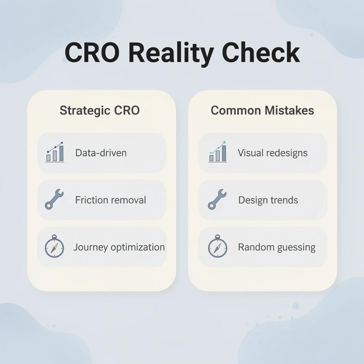
- What CRO is
- Data-driven improvements
- Friction removal
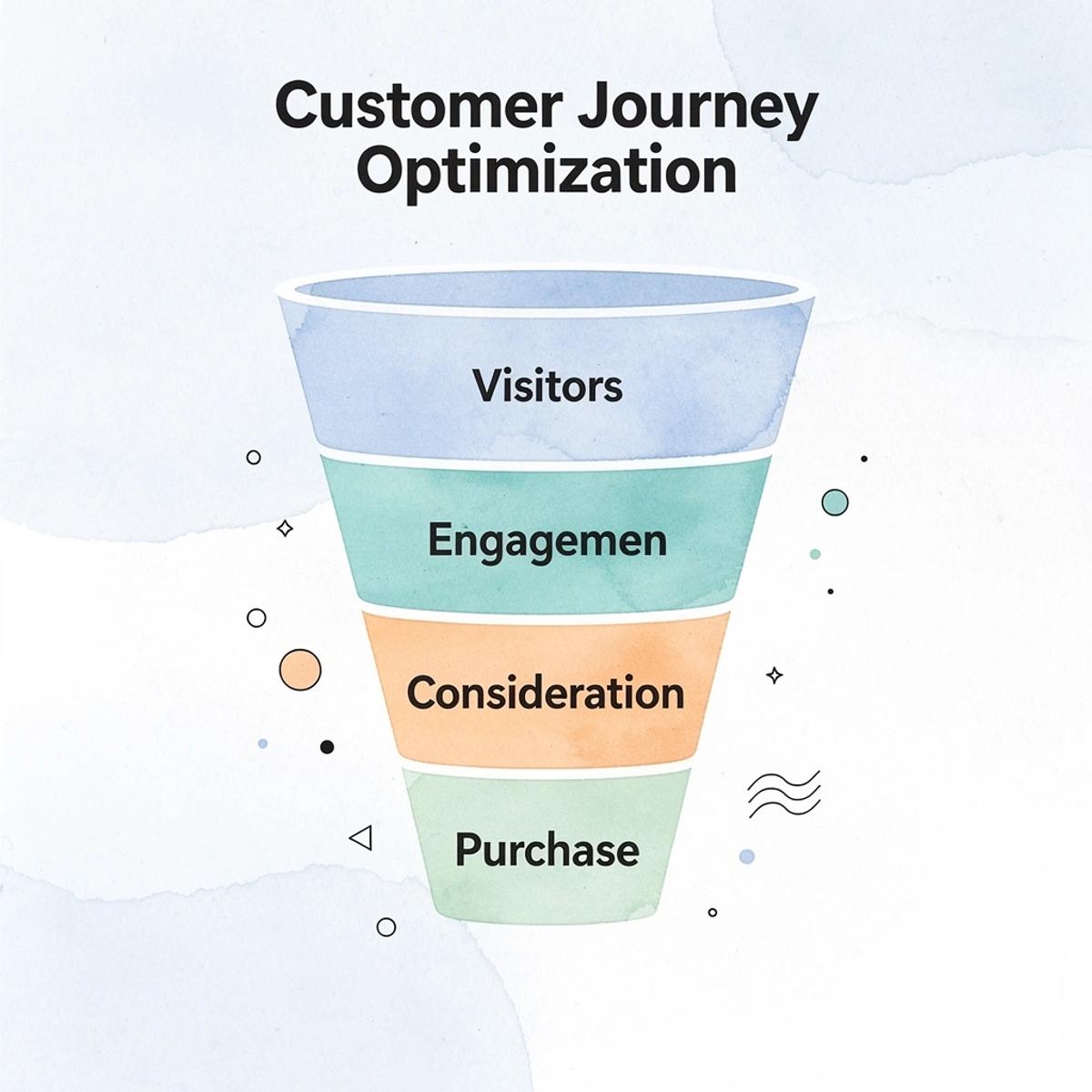
- Customer journey optimization
- Systematic testing
- What CRO isn’t
- Visual redesigns
- Following design trends
- Guessing what looks better
- One-time changes
The Structure Problem Most Stores Ignore
High-converting product pages follow a predictable structure: name the problem, position the product as the solution, explain specific benefits, build credibility through proof, and guide action with clarity. When that sequence breaks down, visitors hesitate and exit.
Research from Shopify shows that 68% of small businesses lack a documented CRO strategy. This manifests in pages that jump to features without context, bury the value proposition, or assume trust without earning it. Structure respects how people make buying decisions when uncertain.
Why Messaging Determines Whether People Stay
What you say matters more than how it looks. Generic positioning like "premium quality" or "fast shipping" fails to differentiate your product. Strong messaging articulates a specific result the buyer wants or a problem they want to avoid, making the product feel essential to their situation rather than merely available.
Why do visitors leave when messaging is unclear?
Weak messaging forces visitors to work harder to understand why they should care—and they won't. Teams often spend weeks perfecting layouts while leaving placeholder copy unrefined. The page looks polished, but the words don't land. Conversions stay flat because visitors never understood what they were buying or why it mattered.
The Experience Layer That Quietly Kills Sales
Page speed, mobile navigation, and checkout friction control whether someone completes a purchase. A product page that takes four seconds to load on mobile loses buyers before they see the offer. A checkout process that requires account creation raises doubt at the critical moment. Small friction points accumulate into abandoned carts.
Why do invisible problems matter more than design changes?
Companies that invest in CRO see an average return of $223 for every $100 spent, but most comes from fixing invisible problems, not redesigning hero images. Visitors don't report "the checkout was too slow" when they leave—they simply leave. The experience either supports the decision to buy or quietly undermines it.
How can you test faster without waiting on developers?
Our AI page builder eliminates the bottleneck of manual testing by generating conversion-optimized layouts from a product URL in under two minutes. You can test structural changes, messaging angles, and layout variations without waiting on designers or developers. The faster you test what works, the faster you stop losing buyers to preventable friction.
But knowing what conversion optimization is doesn't tell you which specific elements drive purchases.
Related Reading
- Shopify Web Design
- Ai Tools for E-commerce
- Shopify Alternatives
- Ecwid Alternatives
- Shopify App Detector
- AI Use Cases In Ecommerce
- Shopify Website Optimization
5 Core Elements That Drive Shopify Conversions
Shopify stores that convert well reduce friction at decision points, build credibility before asking for commitment, and guide visitors through a logical sequence that mirrors how people evaluate purchases. These elements address psychological barriers that cause hesitation.

🎯 Key Point: The most successful Shopify stores focus on eliminating doubt rather than just showcasing products. Every element should answer the question "Why should I trust this store with my money?"
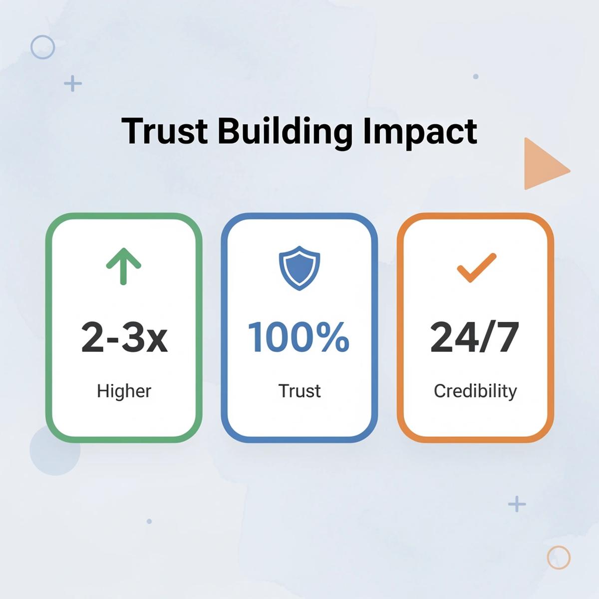
"Stores that prioritize trust-building elements see conversion rates that are 2-3x higher than those focused solely on product features." — E-commerce Psychology Research, 2024
💡 Best Practice: Map your customer's decision journey from awareness to purchase. Each page should anticipate objections and provide reassurance before visitors even realize they need it. This proactive approach to conversion optimization transforms browsers into confident buyers.
1. What makes visitors decide within seconds?
The first screen you see determines whether someone keeps reading or leaves. According to the Nielsen Norman Group, users decide whether a page is useful within seconds and focus most of their attention on the visible area without scrolling.
If a visitor can't quickly figure out what the product is, who it's for, and why it matters to them, they'll leave the page.
How should your value proposition answer key questions?
A visitor shouldn't need to scroll, read multiple sections, or piece together context clues to understand the core offer. The value proposition should instantly answer three questions: What problem does this solve? Who experiences that problem? Why is this solution different from alternatives?
When that clarity is missing, interested buyers hesitate. Uncertainty sets in, and conversion drops because the page demands too much effort.
2. What makes a product page flow effective?
High-converting pages follow a deliberate sequence that matches how people make decisions: identify the problem the visitor feels, position the product as the solution, explain specific benefits that matter to that buyer, provide proof that those benefits are real, and then guide action.
Why does this structure work for conversions?
This structure works because it respects how people evaluate unfamiliar products. They need to see their problem reflected back before considering a solution, benefits explained in terms of results they care about rather than features, and proof that others achieved those results. Only then does a call to action feel timely rather than premature.
Breaking this order creates problems. A page that lists features before explaining their value forces visitors to determine how the specifications personally benefit them. A page that requests a purchase before building trust makes people doubt your claims.
3. Why do trust signals need strategic placement?
According to BrightLocal's 2023 consumer review survey, 97% of consumers read online reviews before making a purchase. Without visible trust signals, buyers assume unacceptable risk.
Where should trust signals appear for maximum impact?
Good stores place reviews next to product images, guarantees next to the add-to-cart button, and security badges near checkout. This placement answers questions as they arise. A guarantee in the footer won't reduce purchase anxiety because visitors don't scroll there when deciding whether to buy.
What happens when trust signals are missing or buried?
When trust signals are missing or hard to find, interested buyers delay their purchase. They search for reviews elsewhere, compare competitors, or plan to return later—most never do.
4. What makes calls to action convert visitors into customers?
A call to action is when someone decides to take the next step. If the next step is unclear, easy to miss, or appears only once at the bottom of a long page, visitors delay the decision—and delay usually means they leave.
How should you position CTAs for maximum impact?
Pages that convert well make it clear what to do next at several different spots. The call to action appears near the top, after visitors learn about the benefits, and again after social proof. Each placement matches a moment when a visitor might be ready to take action.
Being clear matters more than being creative. A button labeled "Add to Cart" works better than clever alternatives because it removes confusion about its purpose.
Why do poorly designed buttons hurt conversions?
A button that blends into the background or competes visually with other elements gets overlooked. Visitors don't hunt for ways to give you money; they follow the clearest path or leave.
5. Why is mobile optimization critical for conversions?
Statista reports that more than 70% of online shopping traffic globally comes from mobile devices. Google's research shows that 53% of mobile users abandon websites that take longer than three seconds to load.
A store that performs well on desktop but not on mobile is losing most of its potential buyers.
What makes a mobile experience convert effectively?
Mobile optimization requires fast load times, simplified thumb-friendly navigation, and a checkout flow without zooming or horizontal scrolling. Each factor directly impacts purchase completion.
Our AI page builder generates conversion-focused layouts from a product URL in under two minutes, letting you test structural changes, messaging variations, and trust signal placement without waiting on development resources. The faster you identify what works, the faster you stop losing buyers to fixable friction.
Why These Elements Work Together
Each element addresses a specific barrier to purchase: value propositions eliminate confusion, structured flow reduces cognitive effort, trust signals lower perceived risk, clear CTAs remove decision paralysis, and mobile optimization prevents technical abandonment.
Together, they create a compounding effect by removing friction at every stage of the evaluation process. A visitor who immediately understands the offer, follows a logical flow, sees proof at the right moments, knows what to do next, and experiences no technical barriers is far more likely to buy than someone who encounters friction at any of those points.
How do high-performing stores create effortless buying experiences?
High-performing stores systematically address every point where a visitor might hesitate, delay, or leave, creating a buying experience that feels effortless instead of uncertain.
But understanding which elements matter doesn't explain why most stores struggle to implement them effectively.
Related Reading
- Bigcommerce Alternatives
- Best Subscription Apps For Shopify
- Shopify Store Cost
- Ai Use Cases in E-commerce
- How To Edit Pages In Shopify
- Shopify Web Design Experts
- Shopify Website Optimization
Why Most Shopify CRO Efforts Fail
Most CRO efforts fail because they treat optimization as isolated changes rather than a structured system. Stores adjust button colors, tweak headlines, or move sections around without controlled experiments to measure impact. Without comparing performance before and after, there's no way to know what worked or why revenue shifted.

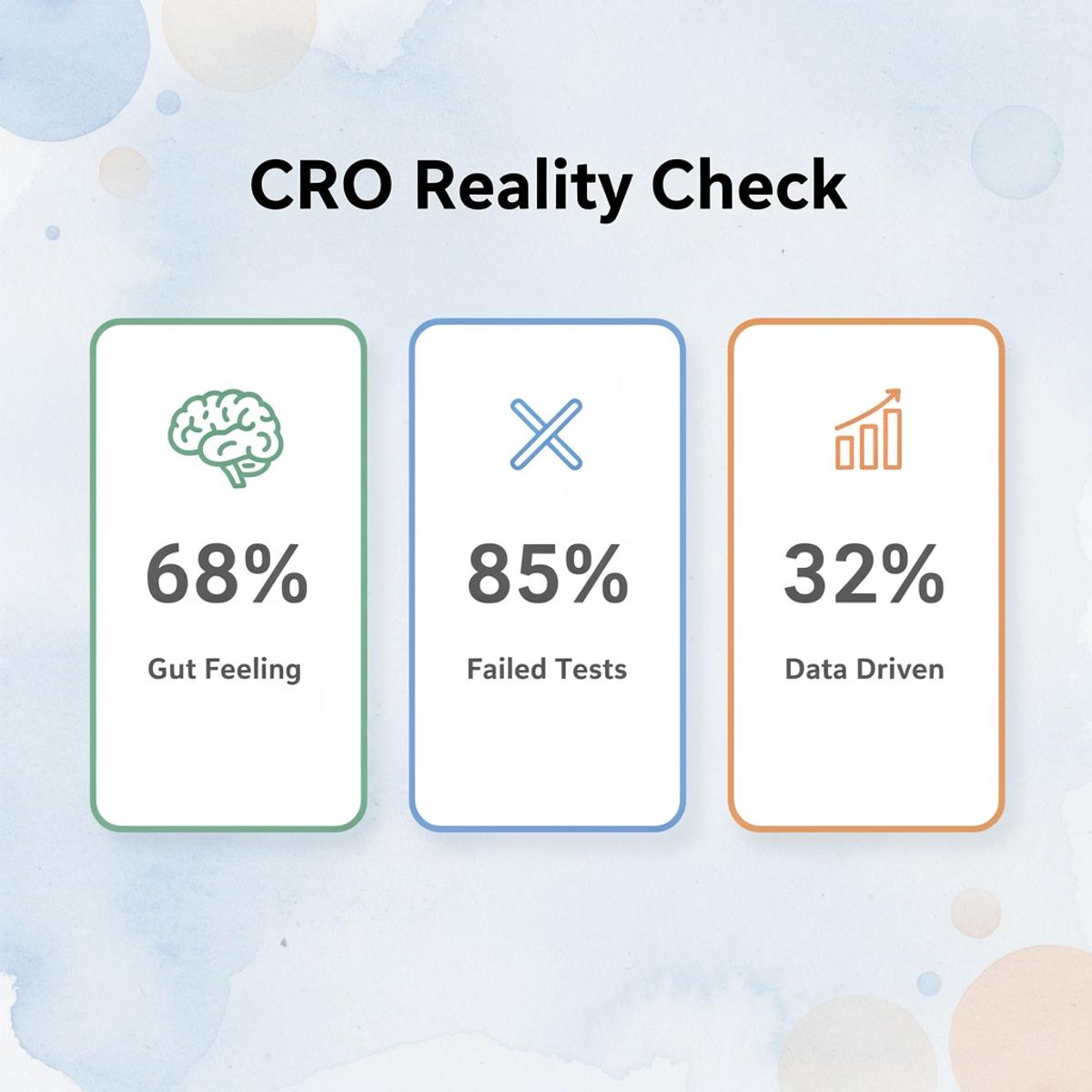
🚨 Warning: Random changes without proper testing can actually hurt your conversion rates. 68% of businesses make optimization decisions based on gut feeling rather than data-driven insights.
"85% of A/B tests either show no significant difference or are inconclusive due to poor experimental design." — ConversionXL Research, 2023
💡 Key Point: Successful CRO requires a systematic approach with proper testing frameworks, statistical significance, and documented results to build sustainable growth rather than temporary fluctuations.
What happens when stores test without structure?
According to Shopify Blog - CRO Statistics, 68% of small businesses lack a written CRO strategy. Without one, stores make changes based on intuition: a new layout because it appealed to the owner, rewritten copy because it felt dated, or different product images because a competitor used a similar style. These changes go untested against the original version, leaving no baseline to measure from, no clarity on what should improve, and no way to determine if specific changes drove results.
Why does unstructured testing prevent growth?
This creates a cycle in which stores constantly change things but never learn what drives purchases. One month, they test a new hero image, the next, they change the pricing display. Three months later, conversions remain flat, yet they cannot determine which changes helped, which hurt, or which made no difference. Effort accumulates into noise instead of insight.
Why do stores prioritize visual design over messaging?
Design is visible. Messaging is invisible. Most optimization work focuses on how pages look rather than what they say. Stores invest hours adjusting spacing, choosing fonts, and refining color schemes while leaving weak value propositions untouched.
A visually polished page that fails to explain why someone should buy underperforms. Conversions depend on clear product positioning, a compelling offer, and benefits that align with buyer needs.
What happens when messaging problems go unaddressed?
Many store owners recognize this gap only after multiple redesigns fail to produce meaningful lift. They've tested five different homepage layouts, but all five used the same generic positioning: the page looked different each time, yet the message remained equally unclear.
Why do popular Shopify themes hurt conversion rates?
Shopify is easy to use, but this creates an unexpected problem: most stores start with popular themes, which means they look similar to thousands of others. They share the same layouts, section structures, and product page flows as their competitors. When your page resembles others selling similar products, customers lack a clear reason to choose you. CRO efforts confined to standard structures rarely create meaningful separation.
How can you break free from template limitations quickly?
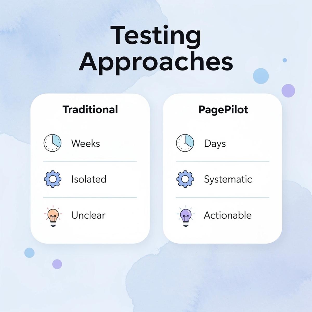
AI page builder eliminates the need to hire designers and developers for custom layouts and wait days or weeks for changes. PagePilot generates conversion-focused layouts from a product URL in under two minutes, letting you test different structures and messaging approaches without design delays. Speed matters: the faster you test what makes your offer different, the faster you stop looking like everyone else.
Why do slow iteration cycles hurt conversion optimization
According to Shopify Blog - CRO Statistics, 52% of companies wait at least 3 months to evaluate A/B test results. This slow pace impedes learning: weeks pass between changes, and by the time data accumulates, market conditions shift, or product lineups change.
Effective CRO depends on fast iteration: the quicker you test variations, the quicker you find what works and build those insights into steady improvement.
How does slow testing prevent momentum building?
Stores that test slowly never build momentum. They make one change every three months, see mixed results, and lack sufficient data to determine whether to repeat or pivot.
The long intervals between tests cause teams to forget earlier findings, preventing them from building a clear understanding of what drives customer purchases.
But knowing why most efforts fail doesn't show what works when done correctly.
The CRO Framework That Actually Improves Results
A results-driven framework treats conversion as a discovery process. You build multiple page versions, each testing a different idea about what drives purchases, then let performance data reveal what works. This eliminates guessing and breaks through the plateau most stores hit.

🎯 Key Point: The most successful stores treat every page element as a hypothesis to be tested, not a final decision.
"Conversion optimization is about systematic discovery - testing what drives purchases rather than guessing what might work." — CRO Best Practices, 2024
💡 Pro Tip: Start with high-impact elements like headlines, product descriptions, and checkout flows before testing minor design details.
- Headlines
- Impact level: High
- Time to results: 2–3 weeks
- Product images
- Impact level: High
- Time to results: 2–4 weeks
- Checkout flow
- Impact level: Very high
- Time to results: 1–2 weeks
- Color schemes
- Impact level: Low
- Time to results: 4–6 weeks
Start With Positioning Before You Touch Design
The first decision is about how you present the product. Why should someone pick this instead of other options they've already considered? Most stores skip this question, talking about features and listing what the product can do instead. Without clear positioning that shows a specific result or fixes a recognized problem, even well-designed pages fail because visitors never understand why it matters to them.
Strong positioning gives every other part of the page something to support. Weak positioning means you're improving a message nobody cares about. Fix the frame first.
Build Multiple Variations That Test Different Angles
Create three or four-page variations testing different angles: one leading with the problem solved, another with the transformation created, and a third emphasizing urgency or scarcity. Each represents a testable idea about what motivates your audience to act.
This shows which message works better, rather than guessing which design looks better. According to VWO, companies that use A/B testing are 60% more likely to see improved conversion rates. Testing actual performance beats trusting intuition.
Test the Elements That Control Decisions
Not every change matters equally. Hooks determine whether people engage or leave. Headlines shape how they understand everything that follows. Layout controls whether key information gets seen or missed. Testing these elements reveals which combinations ease comprehension and which impede it.
Small shifts produce big results. A headline that reframes the product from a feature to an outcome can double engagement. A layout that surfaces trust signals earlier can cut hesitation. These improvements become visible only through controlled comparisons, not editing alone.
Iterate Based on What Actually Converts
Testing without trying different versions wastes the information you learn. You find the version that works better, then improve it further. Each round builds on the last: the difference between your starting point and your best-performing version grows as you remove what doesn't work and strengthen what does.
Why does iteration speed matter for optimization?
In the past, this cycle moved slowly because each change needed to be rebuilt by hand. Our AI page builder accelerates that timeline by creating conversion-focused layouts from a product URL in under two minutes. This lets you test different positioning angles and structural changes without waiting for designers. Speed matters because the faster you try new approaches, the faster ineffective ones get replaced by those that work.
But even the best framework depends on having the right tools to execute it without technical barriers slowing you down.
How PagePilot Helps You Improve Conversion Rates Faster
Most Shopify stores improve conversions through isolated changes: a new headline here, a layout adjustment there. The process is slow, with unclear feedback loops. By the time results appear, it's difficult to know what worked.

PagePilot is built to change that through faster testing. Instead of waiting weeks for meaningful data, you get clear insights that show which changes drive conversions. This accelerated feedback loop means you can optimize continuously rather than making scattered adjustments and hoping for the best.
🎯 Key Point: Traditional A/B testing takes weeks or months to show meaningful results, while PagePilot delivers actionable insights in days, allowing you to iterate faster and compound improvements.
"Faster testing cycles are the difference between stores that optimize once and stores that optimize continuously." — Conversion optimization best practices
💡 Tip: The speed advantage isn't just about getting results faster—it's about building a systematic approach to conversion optimization where each test builds on the last, creating compound growth in your conversion rates.

Starting With Market Intelligence
Instead of starting from a blank page, you begin with real market input. Using a competitor or supplier URL, PagePilot generates a structured product page based on what has already proven to convert. You are not copying—you are learning from what works in your market and adapting it to your specific offer.
From there, the focus shifts to variation. You can generate multiple versions, each with a different angle, hook, or positioning: one emphasizing urgency, another benefits, another problem-solution framing. This lets you test ideas simultaneously rather than sequentially.
Compression of Execution Time
The platform improves execution automatically by rewriting copy for conversion, upgrading visuals, and optimizing structure—creating distinct versions rather than duplicating existing pages. According to PagePilot AI Blog, a 1-second delay in mobile load time can reduce conversions by up to 20%. Speed matters because delays translate directly to lost revenue.
This speeds up learning cycles. Instead of spending days building one page, you launch multiple variations simultaneously, enabling faster testing, clearer data, and quicker identification of what converts. This transforms CRO into a system: generate variations, test performance, and refine based on results.
Why Iteration Velocity Matters
Getting better happens faster when you test quickly. Using data instead of guesses works better, and each winning change becomes the starting point for the next test. The difference between where you start and where you end up grows with each test, but only if you move fast enough to finish tests before the market changes or your budget runs out.
Moving fast doesn't guarantee good results if you don't know what to do with your pages once they're live.
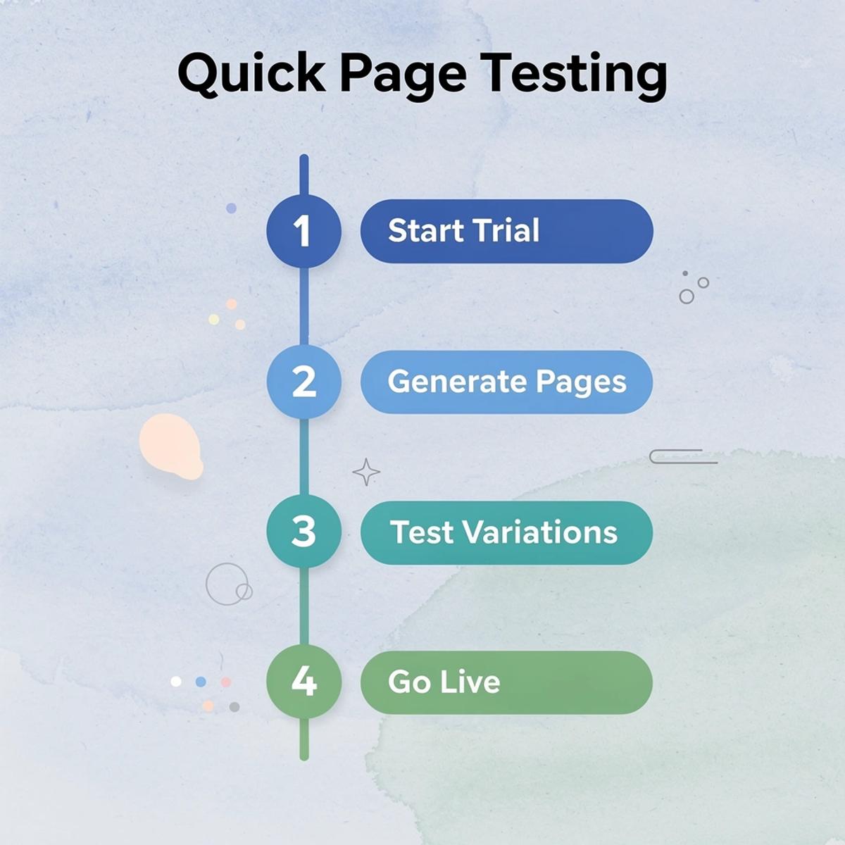
Start a FREE Trial and Generate 3 Product Pages with Our AI Page Builder today
The real test is whether you can act on conversion optimization before your budget runs out or competitors move faster. Most stores stay stuck between knowing what to do and doing it. You need working pages, not more theory.
🎯 Key Point: Speed matters more than perfection when testing product pages—your competitors won't wait for you to figure it out.
Start a free trial of PagePilot and generate three product page variations today. Our AI page builder lets you test different positioning angles and see which messaging converts. Pages go live in minutes, not weeks, so you can learn what drives purchases while the insight still matters.
"Pages go live in minutes, not weeks, so you can learn what actually drives purchases while the insight still matters." — PagePilot AI, 2024
💡 Tip: Your first step isn't more traffic—it's testing better pages that convert the visitors you already have.

If your store isn't converting, your first step isn't more traffic: it's testing better pages.
Related Reading
- Builder.ai Competitors
- How To Add Products To Shopify Page
- Best Shopify Plugins
- Best Shopify Landing Pages
- On Page Seo Shopify
- Shopify Ai Apps
- How To Add A Custom Popup In Shopify