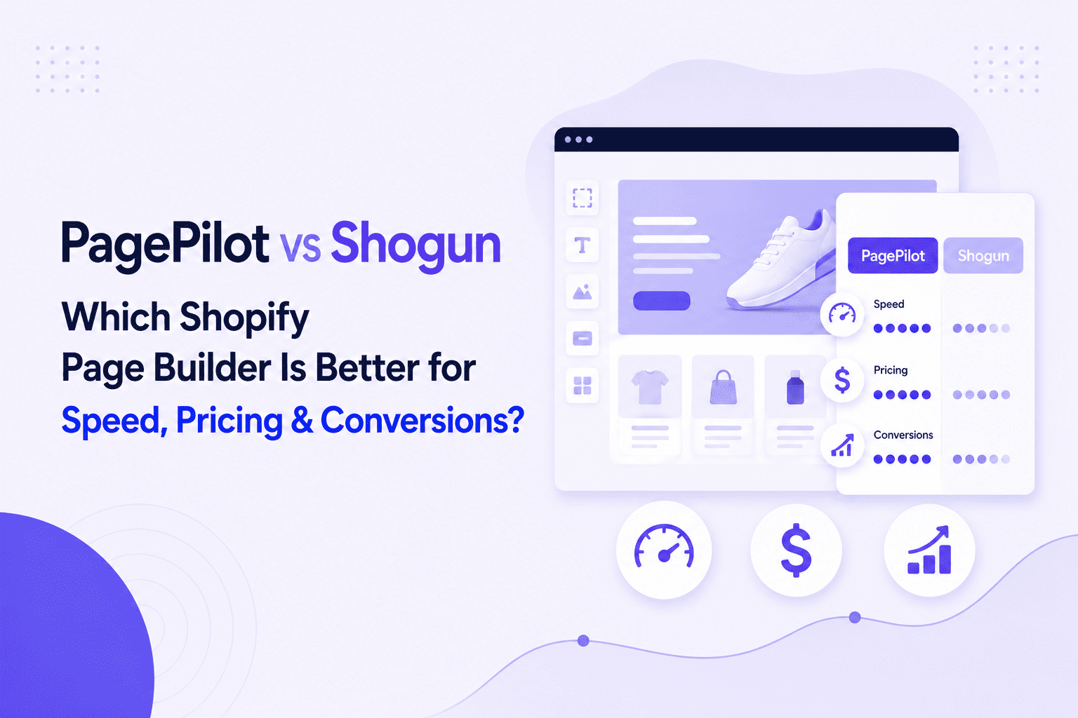

Your store looks sharp on desktop, but on a phone, the pages load slowly, images shy out of view, and checkout feels clumsy — so shoppers click away. When you compare the best Shopify page builders, mobile responsive design, page speed, touch navigation, and a smooth checkout often mark the real winners. This article provides practical Shopify mobile optimization insights to improve UX for users, covering responsive themes, image optimization, lazy loading, caching, breakpoints, core web vitals, and minor layout fixes that raise mobile conversion rates. PagePilot is an AI page builder that helps you apply those tactics quickly by creating mobile-friendly layouts, optimizing images, and trimming load time without code. This allows you to test and improve mobile UX efficiently.
Why Mobile Optimization Matters for Shopify Stores

Over 70% of ecommerce traffic now comes from mobile devices. Statista projects mobile commerce will account for about 63% of all ecommerce sales by 2028. Google reports that 53% of mobile users leave a site if it takes more than three seconds to load.
Those figures show traffic, revenue, and user patience all tilt toward mobile-first experiences — and that gap between visits and purchases shows up as lost revenue if your store feels slow or clumsy on a phone. How fast are your pages on a real device right now?
Where Shopify Stores Commonly Fail on Mobile
Slow page speed from large images and excess JavaScript clogs the experience. Themes not built for small screens create:
- Awkward navigation
- Tiny touch targets
- Hidden calls to action
Combating Conversion Killers
Complex checkout flows and too many mandatory fields drive cart abandonment. Third-party apps can inject extra scripts that increase load time and block rendering. Intrusive pop-ups kill momentum on a phone. Each of these issues chips away at mobile conversion rates and increases bounce and cart drop off.
High-Impact Fixes You Can Implement Today
- Replace heavy themes with a mobile-responsive theme optimized for speed and accessibility.
- Compress and serve images as WebP or modern formats and enable lazy loading for below-the-fold content.
- Remove unused apps and defer non-essential JavaScript to reduce main thread work.
- Use Shopify CDN and enable browser caching and asset minification where possible.
- Limit redirects and serve critical CSS inline for faster first paint.
- Offer one-step checkout options and enable Apple Pay and Google Pay to shorten the path to purchase.
Apply one or two of these changes and retest your mobile page speed and conversion funnel.
Design Moves That Increase Mobile Conversion
Make touch targets at least finger-friendly size and place primary CTAs where thumbs naturally reach. Use sticky add-to-cart or buy-now buttons so the purchase action stays visible. Simplify product pages with collapsible sections for specs and quick access to reviews. Reduce form fields, enable autofill, and allow guest checkout to reduce friction. Use clear fonts, larger buttons, and concise copy so shoppers can scan fast and act faster.
Technical Checks for Performance and SEO
Run Google PageSpeed Insights and Lighthouse for Core Web Vitals on mobile and monitor the Shopify Online Store Speed report. Track time to:
- First byte
- Largest contentful paint
- Cumulative layout shift
- Total blocking time
Search ranking and ad quality can suffer when mobile pages load slowly, which raises acquisition costs and lowers return on ad spend. What metrics are you watching for mobile performance?
Measure, Test, and Iterate
Use mobile analytics to follow the funnel from landing to purchase. Add heat maps and session replay to see tap behavior and menu friction. To measure real impact on mobile conversion rate, A/B test changes like:
- Sticky CTAs
- Shortened checkout
- Image galleries
Keep experiments small, measure uplift, and roll out winners.
Quick Checklist to Run Now on Your Shopify Store
- Test pages on an actual low-bandwidth mobile network.
- Audit and remove slow apps.
- Convert product images to modern formats and lazy load them.
- Enable accelerated checkout options.
- Reduce the number of form fields and add autofill and guest checkout options.
- Monitor Core Web Vitals and mobile conversion metrics.
Which page on your store would you test first on a phone right now?
Related Reading
- Does Shopify Host Websites
- Is It Worth Buying a Prebuilt Shopify Store
- How Much Does It Cost to Build a Shopify Website
- Shopify Product Page Customization
- What is Custom Liquid Shopify
- How to Customize a Shopify Website
- Shopify Speed Optimization
Understanding Mobile User Behavior When Shopping

Mobile shoppers move fast and act on sight.
- They scan images
- They tap buttons
- They expect pages to load instantly
According to Google, reported by Marketing Dive, 53% of mobile users abandon a site if it takes longer than three seconds to load. That single figure explains why page speed, image optimization, and responsive design sit at the top of any Shopify mobile optimization checklist.
How Attention and Decision-making Change on Small Screens
On mobile, attention is short and decisions come sooner. Shoppers rely on explicit product imagery, short benefit bullets, and bold calls to action placed within thumb reach. They do less comparison across tabs and more in situ evaluation, so product galleries, quick buy options, and concise trust signals must be visible without extra taps. Which product pages lose your mobile traffic most often?
Reduce Friction Where It Shows Up
Forms, slow checkout flows, persistent pop-ups, and tiny tap targets destroy conversions. Simplify checkout to cut typed inputs, enable autofill and mobile wallets, and keep one-page flows for mobile. Remove intrusive overlays, increase tap target size, and collapse deep navigation into simple, predictable menus to lower bounce rates.
Technical Priorities That Move the Needle
Optimize images with modern formats like WebP and serve adaptive sizes to avoid wasting mobile bandwidth. Use lazy load for below-the-fold media, minify scripts, and leverage a CDN and caching to improve TTFB and First Contentful Paint. Monitor Core Web Vitals, such as Largest Contentful Paint and Cumulative Layout Shift, and conduct field tests with:
- Real device testing
- Real user monitoring.
Mobile UX and Visual Hierarchy for Product Pages
Lead with a strong hero image, quick product highlights, and a clear "add to cart" or "buy now" action. Offer zoom, alternate views, and short social proof snippets near the CTA. Make pricing and shipping costs visible early to prevent surprises, and test sticky purchase bars and persistent cart previews that keep the path to checkout obvious.
Measure, Test, and Iterate Continuously
Use Shopify analytics, heatmaps, and A/B tests to identify where mobile users drop off and which layouts boost the conversion rate. Look at mobile traffic segments, bounce by device, and conversion funnels split by screen size to target fixes where they matter. Run experiments that change one variable at a time so you know what works for mobile shoppers.
AI-Powered Product Page Builder
PagePilot’s AI page builder will help you test products, ideas, and angles far faster: give our AI a competitor or supplier URL, and we will build a high-converting product page using the information on their site and upgrade product visuals with our AI product image function so you do not compete with the exact copy and images.
Start a FREE trial and generate three product pages for free today, no credit card needed.
10 Best Practices for Shopify Mobile Optimization

1. Keep Navigation One Tap Away
Make the navigation bar sticky so shoppers can move between collections, search, and account pages with a single tap. Use a compact hamburger or bottom nav for quick access, but label icons and include a visible search field when possible. Ensure tap targets meet mobile accessibility sizes and provide adequate contrast so users can spot the menu in low light.
Add aria labels and focus states to ensure assistive tech reads navigation correctly, while keeping the DOM structure lean to avoid extra JavaScript overhead.
2. Fit Visuals to Small Screens
Check every banner, hero image, and video on actual phones and tablets. Use responsive images via srcset or the picture element and serve scaled versions to match device pixel ratio. Control cropping with object-fit and predefined aspect ratios for product rows and collection pages.
Host rich media externally when appropriate and lazy load below-the-fold assets to reduce initial load time. Test on multiple breakpoints to confirm images do not pixelate and that embedded media keeps its intended framing.
3. Put Product Images Front and Center
Give product photography priority on product, collection, and landing pages. Use consistent lighting, framing, and background so images read quickly on small screens. Write descriptive alt text for SEO and accessibility, compress files without losing detail, and crop for the placement you intend.
Prefer .jpg for photos and .png for graphics with transparency; consider modern formats if your theme and CDN support them. Automate repetitive image optimization with tools like TinyIMG to keep file sizes low and page speed high.
4. Speed Up Mobile Pages
- Pick a fast Shopify theme and remove unnecessary apps that inject scripts.
- Compress and resize images, defer noncritical JavaScript, and inline critical CSS to improve first meaningful paint.
- Host large videos on third-party players and embed with lightweight placeholders.
- Monitor Core Web Vitals and run Lighthouse or PageSpeed Insights regularly to find bottlenecks.
- Use a CDN, preconnect critical third parties, and minimize render-blocking resources to reduce time to interactive.
5. Make Calls to Action Thumb-Friendly
Design CTA buttons for thumbs: At least 48 pixels tall, with 32 pixels of vertical breathing room from other elements. Use high contrast colors and action verbs like:
- Buy Now
- Start Checkout
Test a fixed versus sticky CTA to see which converts better on mobile. Use larger body and button fonts—14 to 16 pixels—to aid readability and adjust layouts so columns stack rather than squish text. Run A/B tests to confirm which placement and copy move people toward conversion.
6. Write for Mobile Scanners
Mobile visitors skim. Break product descriptions into short paragraphs.
- Use numbered or bulleted lists for key specs
- Add icons to highlight benefits
Place detailed technical information in accordions or a separate tab to keep the page scannable while ensuring SEO content is accessible to search engines. Use short headlines and lead with the most essential facts. Include short demo videos or animations when they explain faster than paragraphs.
7. Kill or Tame Mobile Pop-Ups
Avoid full-screen modals that cover content and frustrate shoppers. If you need signups, use slide-ins or small banners that leave page content visible and include a clear close button. Limit the time and frequency of any promotional overlay to ensure it does not trigger immediately on page load.
Pop-ups often hurt Core Web Vitals and raise bounce rates; test subtle alternatives like persistent header bars or exit intent tech on desktop only.
8. Stop Unexpected Layout Jumps
Prevent cumulative layout shift by reserving space for images, ads, and embeds. Always set width and height attributes or use CSS aspect-ratio so the browser can allocate space before resources load. Use placeholders for lazy-loaded content and avoid injecting content above existing elements after paint. Limit heavy JavaScript that manipulates layout post-load, and preload fonts carefully to reduce flashes and reflows that move on-screen content.
9. Streamline Mobile Checkout
- Keep checkout minimal: only ask for the fields you need, and enable guest checkout and autofill to reduce typing.
- Offer multiple mobile payment options and digital wallets in addition to Shop Pay and PayPal.
- Use clear, high-contrast buttons and a visible progress indicator so shoppers know where they are in the flow.
- Set appropriate input types and bring up numeric keyboards for phone and card fields.
- Validate fields inline and handle errors with focused messages so customers can correct entries quickly.
10. Design Forms That Fit a Thumb
- Break long forms into logical steps and show progress so mobile users do not feel overwhelmed.
- Use correct input types like tel, email, and number to trigger suitable keyboards.
- Replace typing-heavy fields with radio buttons, pickers, and dropdowns where possible, and keep labels large and readable.
- Add ample padding around each field for accurate taps and provide inline validation and autofill hints to prevent frustration.
- Keep font sizes consistent and ensure the final submit button is prominent and easy to reach with a thumb.
Related Reading
- Hire Someone to Build Shopify Store
- Shopify User Experience
- How to Add Products to Shopify
- How to Design Shopify Website
- How to Create a New Page Template in Shopify
- How to Create a Landing Page on Shopify
- How to Add a Review Section on Shopify
7 Best Tools to Test Mobile Site Speed

1. Google PageSpeed Insights: Mobile Speed Scoring and Step-by-Step Fixes
Google PageSpeed Insights runs Lighthouse to analyze mobile performance and reports on Core Web Vitals, giving an overall score and specific guidance for Shopify mobile optimization. A green score signals that those measured areas meet performance thresholds.
Mobile Optimization Recommendations
Mobile-related optimization KPIs and features: the report lists practical recommendations for mobile pages, such as eliminating render-blocking resources, reducing font sizes where appropriate, and optimizing images for mobile resolutions and formats. You will see two key report zones: Diagnostics and Passed Audits.
Report Zones: Issues and Successes
Diagnostics explains issues that hurt mobile page load and user experience, for example, render-blocking scripts or oversized images, and provides actionable suggestions to fix them. The Passed Audits section shows what the page already handles correctly, such as minified CSS or compressed images, so you know what not to change.
2. Chrome DevTools: Hands-On Mobile Audit Inside Your Browser
Chrome DevTools integrates Lighthouse, allowing you to test a Shopify store directly in the browser and inspect performance, accessibility, and SEO details relevant to mobile users. How to access: open Chrome Settings > More Tools > Developer Tools > Lighthouse > Analyze page load.
Lighthouse and DevTools for Mobile
Mobile-related optimization KPIs and features: Lighthouse in DevTools returns Core Web Vitals and a full performance breakdown. You can record a performance trace to inspect runtime behavior, adjust network throttling to emulate fast 4G or other mobile links, and see CPU throttling to simulate slower devices. These controls let you recreate real-world mobile page load scenarios and find bottlenecks.
3. GTmetrix | Website Performance Testing and Monitoring: Multi-Device Audits with Prioritized Fixes
GTmetrix uses Lighthouse data and adds its own interface to evaluate mobile speed and Core Web Vitals for Shopify themes and apps. The tool grades metrics and organizes recommendations so you can prioritize the most significant wins first.
Simulating Visitor Conditions
Mobile-related optimization features and KPIs: test from over 40 simulated devices and choose connection throttling, such as 4G or custom speeds, to approximate visitor conditions. GTmetrix highlights:
- Responsive design issues
- Mobile caching gaps
- Server response problems
Suggestions are tagged by impact level so you focus on red, high-impact items for the best improvement in page load time and mobile conversions.
4. WebPageTest: Advanced, Device-Specific Measurements and Real Device Testing
WebPageTest is an open-source performance lab used by major eCommerce platforms to measure how pages load on real mobile hardware and networks. It gives deep timing data and visual evidence of how a mobile visitor experiences your store.
Mobile Environment Customization
Mobile-related optimization features and KPIs:
- Select real mobile devices like specific iPhones or PixelsChange the connection type to 4GChoose the testing location and browser size
- Measure Core Web Vitals, Speed Index, Page Weight, and Time to First Byte
Waterfall charts, filmstrips, and video capture expose rendering bottlenecks and let you compare changes across test runs.
5. YSlow: Rule-Based Grades and Component-Level Stats for Mobile Pages
YSlow evaluates pages against Yahoo’s established rules for performance. The mobile version runs as a bookmarklet and scores pages using a ruleset you can select or customize.
Yahoo's Performance Grading
Mobile-related optimization features and KPIs: YSlow computes grades using one of three default rulesets or a user-defined ruleset and summarizes page components and statistics. Yahoo’s performance team identified 34 rules that affect page speed, each scored from A to F and color-coded to show priority. Use this output to fix component-level problems, such as:
- Too many requests
- Large assets
- Missing compression
6. UpTrends: Core Web Vitals Plus a Loading Timeline and Global Checks
UpTrends combines Core Web Vitals with W3C navigation timing metrics and adds a screenshot timeline, allowing you to watch page updates during load. That screenshot timeline helps you see perceived load for mobile visitors.
Global Mobile Performance Emulation
Mobile-related optimization features and KPIs: select tests from 10 global locations, pick connection types like 4G, and test from device profiles such as iPhone or Samsung. UpTrends reports events like First Contentful Paint and Time to First Byte, and the visual timeline assists in diagnosing rendering delays and user-facing blank screens.
7. BrowserStack: Real Device Layout Checks and Interactive Responsiveness Testing
BrowserStack loads your Shopify site on actual devices with their native screen resolutions and browsers so you can inspect layout, touch behavior, and CSS issues across models.Mobile-related optimization features and KPIs: choose devices such as iPhone X, Galaxy Note 10, or iPad Pro and interact with the page to reveal responsiveness problems and visual regressions. Enter the URL and click Check to view how the site appears per device and spot issues that affect mobile conversions, like:
- Misaligned images
- Slow loading fonts
- Broken navigation
Start a FREE Trial and Generate 3 Product Pages with Our AI Page Builder Today
PagePilot uses AI to turn a competitor or supplier URL into a ready-to-test product page in minutes. Feed it a page and it pulls hero copy, feature lists, reviews, price points, and layout cues, then assembles a mobile-responsive product page optimized for mobile UX and mobile conversion rate. You can generate variants with different headlines, images, and button layouts, and quickly push them to live or to A/B tests. Want to test ten angles on phone screens before noon?
Build High-Converting Pages From Any Competitor or Supplier URL
Paste a URL and PagePilot extracts the signals that matter for conversion. The AI translates competitor copy into a page structure that keeps mobile navigation tight, uses larger touch-friendly buttons, and prioritizes fast-loading hero assets. It applies responsive product page principles, allowing the viewport, image sizes, and layout to adapt for phones and tablets while preserving the desktop structure. Which competitor page will you outconvert next?
AI Product Image: Upgrade Visuals for Faster Mobile Loading and Better Clicks
PagePilot’s AI Product Image tools remove background clutter, create lifestyle mockups, crop for mobile aspect ratios, and output compressed formats like WebP to cut mobile loading times.
The tool can create multiple image variants optimized for lazy loading and responsive image sets, so phones get smaller files while desktop gets higher resolution. That means cleaner visuals on small screens and fewer slow loads during checkout. Want images that load fast on 3G and still look crisp on an iPhone?
Mobile First Page Design That Targets Shopify Mobile Optimization
Templates and blocks are built with mobile-first design in mind. Sticky buy buttons, one-click checkout triggers, compact mobile navigation, and collapsible product detail sections keep the experience fast and friction-free for shoppers on phones.
AI-Driven Mobile Speed Boost
PagePilot also enforces performance best practices that affect mobile SEO and Core Web Vitals, such as reduced main thread work, optimized image delivery, and deferred scripts, so mobile page speed improves without manual edits. Have you measured your mobile bounce rate on product pages lately?
A/B Testing, Analytics, and Iteration Focused on Mobile Performance
PagePilot integrates A B testing and analytics that report mobile-specific metrics: mobile conversion rate, time to interact on phones, add to cart rate on touch devices, and checkout drop off by device type. Run variants that change hero copy, reorder feature lists, or swap images to see which layout wins on slower connections and touch screens. Use heatmaps and funnel tracking to spot mobile UX friction and iterate quickly. Ready to scale the mobile winner?
Start a Free Trial and Generate Three Product Pages Free
Sign up without a credit card and generate three product pages instantly to test copy, imagery, and mobile layouts in your Shopify store. Pages export cleanly to Shopify and include responsive image sets and performance settings, ensuring your mobile shoppers see optimized content right away. Want to create three pages now and see how they behave on real phones?