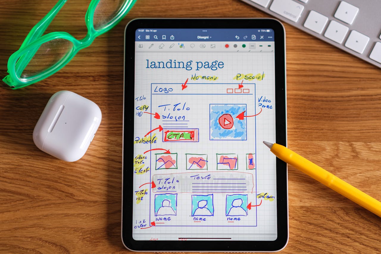

A landing page can underperform even when the traffic is substantial. If visitors arrive but don't convert, there are things you can check before assuming you need even more traffic.
This guide covers landing page best practices for structure, copy, and testing, and where an AI builder like Page Pilot, the AI Shopify landing page builder, can get a page like this live without a week of manual build time.
A high-converting landing page pairs one focused offer, a benefit-led headline, a single strong CTA, fast mobile load, and visible social proof. After launch, compare the page against the closest relevant benchmark and test specific changes to the offer, message match, CTA, proof, and mobile experience.
Key Takeaways
- A high-converting landing page targets one goal and one primary CTA.
- Median conversion rates vary widely by industry, from under 4 percent for SaaS to over 6 percent for professional services, so benchmark by page type, not a single number.
- Headline clarity, CTA wording, load performance, and form friction are practical places to audit before commissioning a full redesign.
- Message match matters especially on paid-search and paid-social pages, because the landing page needs to continue the promise made by the ad.
- Mobile usability and social proof affect different parts of the decision. One reduces interaction friction, while the other helps answer trust objections.
- You can build and publish Shopify landing pages without a developer using a builder like Page Pilot, then run experiments through whichever testing tool your stack already uses.
What Makes a Landing Page Convert at a High Rate
A landing page converts at a high rate when it states one clear offer, removes friction from the form and layout, and gives the visitor a reason to trust it before asking for money or contact details. A weak result on any one of the three usually shows up as a lower conversion rate than the traffic quality alone would predict.
What Is a Good Landing Page Conversion Rate?
There's no single good conversion rate. It depends heavily on industry and offer type. One large current benchmark is Unbounce's 2024 Conversion Benchmark Report, which analyzed more than 41,000 landing pages, 464 million unique visitors, and 57 million conversions between July 23, 2023 and July 23, 2024.
The Landing Page Elements That Boost Purchase Intent Most
Good high-converting landing page design comes down to elements that answer four questions quickly: what is the offer, is it relevant to me, can I trust it, and what should I do next.
The 9-Point High-Converting Landing Page Elements Checklist
One benefit-led headline that matches the traffic source.
A single, unambiguous primary CTA, repeated at natural scroll points.
A hero section that communicates the offer above the fold, without requiring a scroll.
Social proof placed near the CTA (reviews, logos, counts, testimonials).
Trust signals: guarantees, security badges, and clear policies.
Form length matched to the offer, asking only for fields you'll actually use.
A mobile-first layout with tap targets sized for thumbs. WCAG 2.2's target-size guidance sets a 24 by 24 CSS pixel minimum, with some exceptions.
Good mobile load performance. Google defines a "good" Largest Contentful Paint (LCP) as 2.5 seconds or less at the 75th percentile of page visits, alongside an INP under 200ms and a CLS under 0.1, per its Core Web Vitals guidance. LCP measures when the main content becomes visible, which isn't the same thing as total page load time.
Directional cues and whitespace that guide the eye toward the CTA.
For Shopify pages, Page Pilot's Shopify sections and blocks include heroes, reviews, trust badges, and comparison blocks that map to several items in this checklist.
High-Converting Landing Page Examples and Layouts by Use Case
Different offers need different page structures. A SaaS trial has to explain the product before signup. A product launch has to make the offer and buying terms clear. A lead magnet has to make the exchange worth an email address.
High-Converting SaaS Landing Page Layout for Free Trials
- Hero: the outcome, plus a product screenshot or short clip
- Proof: a customer result or recognizable logo
- CTA: "Start free trial"
- Friction note: state plainly beside the CTA whether a credit card is required
- Next section: feature-to-outcome blocks, one benefit per block
The CTA should state what the visitor gets and whether a credit card is required. If the trial doesn't require one, say so beside the CTA instead of making visitors discover that later.
High-Converting Ecommerce Landing Page Design for Product Launches
- Hero: show the product clearly, preferably in use when that helps explain the benefit
- Offer: make the price and any genuine launch terms, availability limits, or promotion easy to find
- Proof: reviews and ratings
- Terms: shipping or delivery window, and returns or guarantee, easy to find
- CTA: "Buy now" or "Add to cart"
A product-launch page should make the product, the price or offer, the primary benefit, proof, delivery terms, return terms, and the add-to-cart action all easy to find. If you're citing a limited-time or limited-stock claim, the FTC's Disclosures guidance covers what counts as a clear and conspicuous claim online.
See Page Pilot's Shopify product page templates for a starting layout built around this structure, and our guide to the best Shopify landing pages for more examples across categories.
High-Converting Lead Magnet Landing Pages for Email List Growth
- Hero: name the resource and who it's for
- Preview: show what the subscriber actually receives
- Form: ask only for what's needed to deliver or segment the offer, often just an email address
- CTA: "Get the free [asset]"
The W3C's accessible forms guidance recommends keeping forms short and avoiding requests for data you don't need, noting that irrelevant or excessive fields make abandonment more likely. A lead magnet typically sits at the top of the funnel, so keep the ask small even when the resource itself is valuable.
Mobile-Optimized Landing Page Templates for Paid Ads
Mobile deserves its own QA pass on any paid-traffic page. In Unbounce's 2024 dataset, 83% of analyzed landing page visits happened on mobile devices, while desktop still converted 8% better overall. The CTA column below doubles as a set of landing page CTA examples you can adapt directly.
Landing Page Optimization: How to Improve Conversion Without a Full Redesign
Before commissioning a full redesign, test the parts of the existing page that can be changed independently. Start with these six.
Rewrite the headline to mirror your top ad or search query.
Cut form fields to only what sales or fulfillment truly needs.
Compress hero images and defer offscreen assets to speed up load.
Move relevant proof closer to the first major CTA.
Make the CTA button copy specific and outcome-based.
On a single-goal paid-traffic page, test reducing or removing navigation that sends visitors away from the offer.
If the page already exists on Shopify, you can usually make all six changes without a developer, using Page Pilot's drag-and-drop Shopify page builder to edit and relaunch it directly.
Landing Page Mistakes That Quietly Kill Conversions
Most conversion problems show up as a symptom well before anyone diagnoses the actual cause. Match what you're seeing to the likely problem before changing anything.
How to Test Landing Pages for Maximum Conversions
A/B testing splits into two different jobs: diagnostics tell you where to look, and controlled experiments tell you whether a specific change actually caused a difference.
If you don't yet know where the problem is, start with diagnostics. Analytics, heatmaps, session recordings, and form or checkout drop-off data show you where visitors are dropping out. Experiments come next, once you have a specific hypothesis to test rather than a general sense that something's wrong. In conversion rate optimization (CRO), diagnostics help identify where to investigate, while controlled experiments test whether a specific change caused a measurable difference.
Define the hypothesis. State the specific change and why you expect it to help.
Choose one primary conversion metric. Pick the single outcome the test is meant to move.
Set the audience, duration, and sample rule before launch. Decide in advance what counts as enough data to call the test, so you're not tempted to stop early because one version takes a lead.
QA both versions, then run the experiment.
Interpret the result against the rule you set, apply the winner, and document what you learned before moving to the next test.
Proven Landing Page Formulas for Paid Traffic Campaigns
A paid-traffic landing page should continue the promise made in the ad. The structure changes depending on where the click came from and how much the visitor already knows about the offer.
Search Ads
Search traffic usually arrives with clear intent, so the landing page should confirm immediately that the visitor found what they were looking for.
- Repeat the ad promise in the headline.
- Follow with proof that supports the claim.
- Make the offer easy to understand.
- Lead to one clear CTA.
For search traffic, message match is the priority. The primary conversion may be a purchase, lead form, demo request, or another action tied directly to the query.
Paid Social
Paid social often interrupts the user rather than answering an active search, so the page has to establish relevance quickly.
- Start with the hook or outcome used in the ad.
- Show the product, service, or result early.
- Add proof before asking for the conversion.
- Keep the offer and CTA easy to understand on mobile.
The goal is fast comprehension, especially on smaller screens. Depending on the campaign, the primary conversion may be a purchase, signup, or lead.
Retargeting
Retargeting visitors already know something about the brand or offer. The page does not need to start from zero; it needs to address whatever may have stopped the visitor the first time.
- Remind them of the offer.
- Address likely objections.
- Add proof that reduces hesitation.
- Restate the offer and CTA clearly.
The priority here is resolving friction from the earlier visit, whether that involves price, trust, shipping, product fit, or another unanswered question.
Lead Magnet Ads
Lead magnet pages work best when the exchange is obvious: the visitor gives you their contact information and receives a specific resource in return.
- Lead with the benefit of the resource.
- Show or preview what the visitor will receive.
- Keep the form limited to information you actually need.
- Explain what happens after submission.
- Add a clear privacy or consent note where appropriate.
- Use a CTA that names the asset, such as “Get the free guide.”
The primary goal is email capture with as little unnecessary friction as possible.
Expert Viewpoint: The Conversion Priorities That Matter in 2026
Treat this as diagnosis, not a fixed checklist. Start with whichever metric is actually weak.
If bounce rate is high immediately after a paid click, check message match first. Compare the ad promise with the H1 and opening offer.
If mobile conversion trails desktop by a wide margin, check performance first. Google recommends an LCP of 2.5 seconds or less for at least 75 percent of page visits, so measure real mobile performance rather than relying on a desktop preview.
If visitors scroll but don't convert, check the offer and proof next: price clarity, returns or guarantees, reviews, and CTA visibility.
If people start the form but don't finish it, inspect required fields, labels, validation errors, and mobile usability.
For Shopify stores, Page Pilot can turn those changes into a live page without a developer. Its current editor supports drag-and-drop sections, separate mobile and desktop controls, templates, and direct publishing to Shopify.
Start building your high-converting landing page. See plans and start free with Page Pilot, no developer required.
Frequently Asked Questions
Should I compare landing page conversion rates by industry or traffic source?
Landing page conversion rates are most useful compared by industry or page type, when you have the choice. Unbounce's 2024 report breaks conversion rates down by page type (SaaS, ecommerce, professional services), which tends to be more comparable than traffic-source data, since offer complexity and audience intent vary enormously within a single traffic source.
How long should a high-converting landing page be?
A high-converting landing page should be as long as the offer requires, not a fixed word count. A simple lead magnet or familiar free-trial offer may need relatively little copy, while a higher-consideration purchase or B2B offer usually needs enough space to handle objections before asking for the click.
How many CTAs should a landing page have?
A landing page should have one primary call to action, repeated at natural points as the page scrolls. Secondary actions are fine only if they support the same goal, like a smaller "learn more" link near a "buy now" button, rather than competing for a different outcome entirely.
Do I need a developer to build a high-converting landing page?
You don't need a developer to build a high-converting landing page. No-code and AI builders can produce a page that follows these best practices without custom development. Page Pilot, for example, generates a Shopify page directly from a product URL, though you'll still want to review the copy, proof, and offer before publishing.
What is the fastest way to increase landing page conversions?
The fastest way to increase landing page conversions is checking message match, mobile performance, and unnecessary form friction before redesigning the whole page. These are relatively contained changes you can test and measure on their own, without waiting for a bigger project to get scheduled.
How do I test a landing page without a lot of traffic?
Testing a landing page without a lot of traffic means starting with larger changes to the offer, headline, or layout, since low-traffic pages may not generate enough conversions for frequent A/B tests. Use analytics, session recordings, and drop-off data to find problems first, and set the sample and decision rule before launching any experiment.
Which landing page builder is best for Shopify stores?
The best landing page builder for Shopify stores is one built specifically for that platform. Page Pilot generates a page from a product URL, includes sections and blocks for reviews and trust signals, and publishes directly into Shopify without a developer. A general-purpose builder can work too, but usually needs extra setup to match Shopify-specific features.