
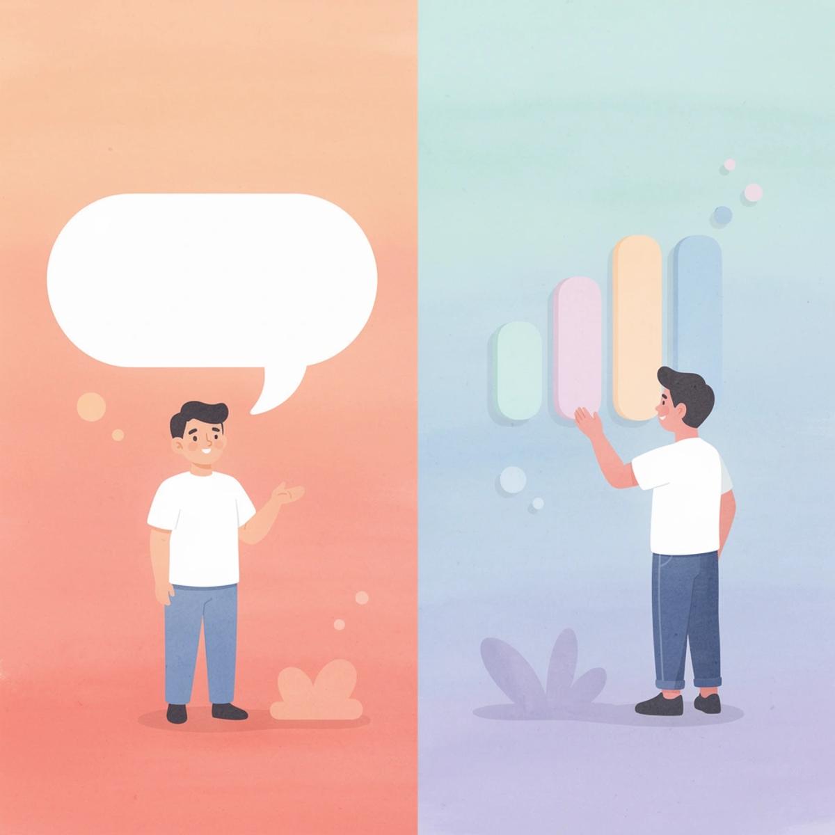
When a Shopify store gets traffic but fails to convert, the landing page is usually where things break down. Effective Shopify web design goes beyond clean visuals — it means building pages that guide visitors toward a single, clear action. The best Shopify landing pages share specific structural and design choices that consistently lift conversions, and understanding those choices is the fastest way to improve store performance.
Replicating those high-converting layouts no longer requires a designer or hours of manual editing. PagePilot streamlines the entire process with an AI page builder that quickly generates optimized Shopify landing pages, with no design or technical background required.
Table of Contents
Why Most Shopify Landing Pages Fail to Convert
What Makes the Best Shopify Landing Pages Different?
9 Elements Found on High-Converting Shopify Landing Pages
Why Most Merchants Optimize the Wrong Things
How to Test Shopify Landing Pages Faster Than Competitors
How PagePilot Helps You Build and Test Landing Pages Faster
Start a FREE Trial and Generate 3 Product Pages with Our AI Page Builder today
Summary
- Landing pages with a single call-to-action can increase conversions by up to 371% compared to pages with multiple CTAs, according to Salesgenie's 2025 landing page research. The reasoning behind this figure matters more than the number itself. Every additional choice on a page creates a small exit ramp, and the stores converting at the highest rates remove those exit ramps rather than multiply them.
- Only about 22% of businesses are satisfied with their landing page conversion rates, according to Shopify's landing page statistics. The average conversion rate sits at 2.35%, while the top 25% of pages convert at 5.31% or higher. That gap is not a minor difference in polish. It separates stores that scale from ones that stall, and it almost always traces back to page structure rather than visual design.
- The most common optimization mistake merchants make is treating the redesign as the fix. Swapping fonts, reordering sections, or updating hero images produces visible progress without addressing the actual failure point: whether the page guides a visitor through a logical, trust-building sequence. Merchants who optimize layout while leaving the underlying message unchanged are producing a more expensive version of the same mistake.
- Video is one of the most underused tools on product pages. Landing pages with video can increase conversions by up to 86%, according to Shopify's landing page research. The reason is not novelty. Video compresses the explanation-to-trust timeline by showing a product working under real conditions, resolving the uncertainty that written copy alone cannot address.
- Personalized calls to action convert 202% better than generic ones, according to involve.me's landing page data. A CTA that reflects the customer's specific desired outcome feels less like a button and more like a decision they were already making. The stores that treat the CTA as the final beat of a well-constructed argument, rather than a design element to test in isolation, build pages that convert consistently, not occasionally.
- Testing speed determines which merchants find their winning angle first. When building a new page requires hours of layout work and copywriting, merchants ration experiments rather than run them freely. Shrinking the gap between a new hypothesis and a live test is the execution advantage that compounds over time.
- AI page builder addresses this by generating brand-consistent, conversion-optimized Shopify pages in minutes, removing the bottleneck between a new creative angle and a live test before it can slow the learning cycle.
Why Most Shopify Landing Pages Fail to Convert
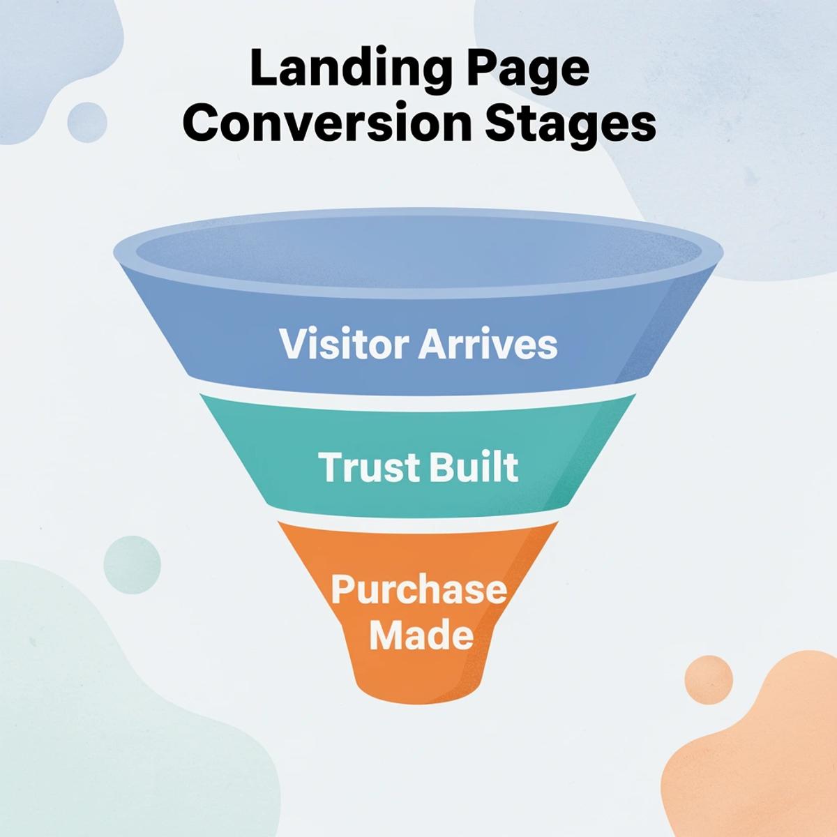
Most Shopify landing pages fail because they show products instead of answering questions. A visitor arrives with doubt, and if that doubt isn't resolved within seconds, they leave. The product's quality becomes completely irrelevant if the page never communicates its value.
"A landing page that showcases a product without resolving visitor doubt isn't a sales page — it's a digital brochure that converts no one."
⚠️ Warning: If your Shopify landing page leads with what you sell instead of why it matters, you are actively losing conversions every single day.
💡 Tip: The first 3–5 seconds of a visitor's experience are critical — your page must immediately answer the question every shopper silently asks: "Is this for me, and can I trust it?"
What Failing Pages Do
- Showcase product features
- Lead with aesthetics
- Assume the customer is ready
- Ignore hesitation
What Converting Pages Do
- Answer visitor doubts
- Lead with value and clarity
- Build trust from the first second
- Resolve objections proactively
What mistakes are merchants making that kill conversions?
Merchants list specifications when customers need outcomes. They show product angles to help customers visualize how the product fits into their lives. They write headlines describing what the product is, not what it does for the reader. According to the Shopify Blog's Landing Page Statistics, only 22% of businesses are happy with their landing page conversion rates, meaning most store owners sense something is wrong but can't identify what to fix.
The real cost of a page that doesn't answer objections
The math is straightforward. A visitor who leaves without buying wastes an ad dollar and a potential customer. The Shopify Blog reports the average landing page converts at 2.35%, while the top 25% convert at 5.31% or higher. That gap isn't about polish; it's the difference between a store that grows and one that stagnates.
Why does redesigning the page rarely fix the real problem?
Most merchants respond to low conversion rates by redesigning pages: swapping fonts, reordering sections, testing new images. These changes rarely address the actual problem. The failure point is structural: the page doesn't guide visitors through a logical, trust-building sequence. It presents information without building a case. It asks for a purchase before earning the right to ask.
The familiar approach treats a landing page as a display case rather than a sales argument. As ad spend increases, that gap becomes expensive. Tools like the AI page builder from PagePilot address this by generating pages structured around conversion logic from the start, with automatic brand matching so pages look native to the store rather than templated.
What do high-converting stores do differently in every section?
Stores converting at 5% or higher treat every section as a deliberate answer to a specific customer doubt. That discipline, applied consistently across headline, proof, objection handling, and call to action, separates pages that move people from ones that inform them.
What Makes the Best Shopify Landing Pages Different?
The best Shopify landing pages are conversion systems where every element earns its place by moving visitors toward purchase. Structure matters, but it doesn't fully explain the gap between high-performing and plateauing pages.
"The best Shopify landing pages aren't just pretty — they are precision-built conversion systems where every element has one job: move the visitor closer to buying." — PagePilot
🎯 Key Point: A landing page that looks good but doesn't convert is just expensive decoration. The best Shopify pages treat every headline, image, and CTA as a strategic conversion lever.
💡 Tip: Audit your landing page by asking one question about each element: "Does this move my visitor toward purchase?" If the answer is no, it must be removed or reworked.
High-Performing Pages
- Every element serves a conversion goal
- Strategic structure drives visitor flow
- Continuous testing and optimization
- Clear, singular CTA per section
Plateauing Pages
- Elements added for aesthetic reasons
- Structure is random or template-default
- Set once and forgotten
- Multiple competing calls to action
What separates a page that sells from one that just looks good
The difference shows up most clearly in focus. According to Salesgenie's 14 Essential Landing Page Statistics for 2025, landing pages with a single call-to-action can increase conversions by up to 371% compared to pages with multiple CTAs. Every extra choice functions as an exit ramp. The best pages eliminate these distractions and replace them with a clear, single path forward.
Why does page structure matter more than how full a page looks?
Most merchants build pages by instinct: a hero image, product description, reviews, related links. A full-looking page feels professional. But this approach divides visitor attention across competing priorities, making no single action feel urgent. Our PagePilot AI page builder addresses this by generating pages structured around conversion from the first element, with brand-matched design that feels native rather than assembled.
How does brand cohesion act as a conversion signal?
Brand identity is undervalued in conversion discussions. A page that looks like it was built by a different team than the one that wrote the copy creates a subtle but real trust gap. Visitors notice inconsistency even when they cannot name it. Pages that convert consistently feel coherent: the tone, visuals, and offer all speak the same language. That coherence is a trust signal.
What role does video play in high-converting landing pages?
Video is a purposeful element on high-converting pages. Research on Shopify's Blog landing pages found that landing pages with video can increase conversions by up to 86%. A thirty-second product demonstration outperforms three paragraphs of writing by answering the visitor's unspoken question: "Does this work as advertised?"
Speed, clarity, brand cohesion, and a single conversion goal reinforce each other. The stores converting at the highest rates treat these elements as a system rather than a checklist.
Related Reading
- Shopify Web Design
- Shopify Conversion Rate Optimization
- Ai Tools for E-commerce
- Shopify Alternatives
- Ecwid Alternatives
- Shopify App Detector
- Shopify Website Optimization
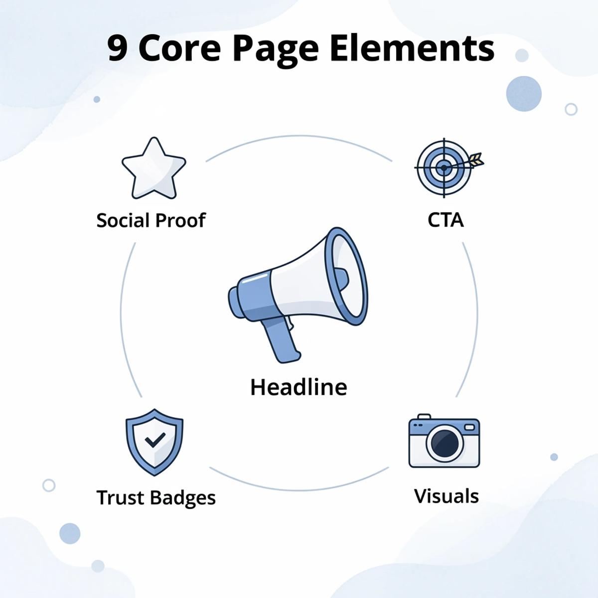
9 Elements Found on High-Converting Shopify Landing Pages
These nine elements are the load-bearing structure of every high-converting Shopify landing page, each earning its place by doing a specific job.
"A high-converting landing page is never an accident — every element is intentional, strategic, and built to convert." — Conversion Design Principle
🎯 Key Point: Every single one of these nine elements works together as a system — remove one, and your conversion rate pays the price.
1. Hero Section
Primary Job
- Capture attention instantly
2. Value Proposition
Primary Job
- Communicate why it matters
3. Social Proof
Primary Job
- Build trust and credibility
4. Product Imagery
Primary Job
- Drive desire and confidence
5. CTA Button
Primary Job
- Direct the conversion action
6. Benefits Section
Primary Job
- Speak to customer outcomes
7. Urgency Triggers
Primary Job
- Motivate immediate action
8. Trust Badges
Primary Job
- Eliminate purchase hesitation
9. FAQ Section
Primary Job
- Remove final objections
💡 Tip: Study each of these nine elements individually — understanding their specific role is the first step to building a page that converts at scale.
1. A Headline That Sells the Outcome, Not the Object
The headline is a promise, not a label. Visitors decide within seconds whether to stay, and headlines that describe the product rather than its results immediately lose that window. The strongest headlines name the transformation: not "portable blender" but "fresh nutrition anywhere you go."
2. Product Imagery That Closes the Imagination Gap
Customers cannot hold your product, test its weight, feel its texture, or see its size. Strong imagery answers the silent question every visitor asks: "Does this fit my life?" Show the product in context, in use, and in the hands of someone who resembles your customer.
3. Benefits Written for the Person, Not the Product Spec Sheet
Features describe what a product has. Benefits explain why a person should care. A lumbar support cushion's foam density is a specification; explaining that your lower back stops aching by 3 pm is a reason to buy. High-converting Shopify product pages translate every capability into a lived experience.
4. Social Proof That Feels Specific, Not Staged
Generic satisfaction claims don't convert customers. What works is specific, recognizable evidence: user-generated content, real customer photos, and verified purchase counts carry far more weight than polished testimonials that read like press releases.
High-converting stores place social proof where doubt surfaces, not at the bottom of the page. They treat it as testimony, not decoration.
5. Reviews That Tell a Before-and-After Story
A five-star rating without context is noise. A review that explains what problem the customer faced, what they tried before, and what changed after using the product becomes a conversion asset. It lets the next visitor see themselves in the story—that recognition converts skeptical browsers into buyers.
6. Product Demonstrations That Replace Doubt With Evidence
When a product is unfamiliar or solves a problem in a non-obvious way, demonstrations—especially video—are essential. Seeing a product work in real conditions proves more convincing than reading about it. According to Salesgenie, landing pages with videos can increase conversions by up to 86%, demonstrating how effectively visual proof resolves uncertainty that written copy cannot.
7. Objection Handling Built Into the Page, Not Hidden in the FAQ
Every visitor arrives with unspoken concerns: shipping time, return policy, sizing, battery life. Most stores bury answers in an FAQ page requiring a separate click—friction that costs sales. The best Shopify landing pages anticipate these questions and answer them in line, before doubt hardens into a reason to leave.
Objection handling placed at the bottom of a long page arrives too late for visitors who decide midway through the page.
8. Trust Signals That Answer "What Happens If Something Goes Wrong?"
A money-back guarantee, a clear return window, a secure checkout badge, and a visible customer support channel all reduce the perceived risk of making the wrong choice. Customers consider not only whether they want the product but also whether they trust the store with their payment details. Every trust signal answers that question directly.
The common mistake is treating trust signals as a checklist. Placing a single badge in the footer misses the point. Trust signals belong near where customers make decisions: next to the add-to-cart button, beside the price, and next to big claims.
9. A Call-to-Action That Earns the Click
Weak calls-to-action are unclear. "Submit" and "Learn More" ask people to take action without explaining why. Strong CTAs connect the click to customer desires: "Start Sleeping Better Tonight" or "Get Yours Before It Sells Out." According to involve.me, personalized CTAs convert 202% better than generic ones because they show what customers specifically want rather than offering a generic button.
Why the system matters more than any single element
The pattern across every high-performing Shopify store page is not the presence of one standout element, but the absence of gaps. A compelling headline paired with weak imagery creates dissonance. Strong imagery paired with vague benefits creates confusion. Confident benefits undermined by zero social proof create skepticism. Each element supports the next.
Most stores that struggle with conversions are missing two or three elements, and those gaps allow doubt to resurface at the exact moment a visitor is close to committing.
What happens when landing pages are treated as a system to build intentionally?
The familiar approach is to build a product page quickly using a supplier template, add a few images, write a short description, and launch. But as ad spend increases and traffic grows, those gaps worsen. Each visitor who almost converted represents a real cost. Stores that recognise this early treat their landing pages as a system to build intentionally rather than a form to fill out. Our AI page builder is built around this idea, generating pages where brand identity, conversion structure, and product presentation are integrated from the first draft rather than added afterward.
The Element Most Stores Get Backward
There is one element that almost every store misunderstands, and it is not the one you would expect.
Why is the CTA the conclusion of an argument, not a final step?
The call-to-action is not the final step on the page; it is the conclusion of an argument. Every element above it exists to make the CTA feel like the natural next step rather than something forced. When the headline connects with people, the imagery convinces them, the benefits are clear, the reviews prove it works, and the objections are answered, the customer does not need persuasion to click. They need permission. A strong CTA provides that permission cleanly and confidently.
Stores that treat the CTA as a button problem keep testing colors and copy. Stores that treat it as the final beat of a well-constructed sales sequence build pages that convert consistently, not occasionally.
Related Reading
- Bigcommerce Alternatives
- Best Subscription Apps For Shopify
- Shopify Store Cost
- Shopify Web Design Experts
- How To Edit Pages In Shopify
- Shopify AI Apps
Why Most Merchants Optimize the Wrong Things
Merchants almost universally start with the wrong question. Instead of asking "does my offer resonate with this customer?", they ask "does this page look good enough to convert?" Those two questions lead to completely different places — and the gap between them is where conversion rates go to die.
"The difference between asking 'does this resonate?' versus 'does this look good enough?' is the difference between optimizing for the customer and optimizing for yourself." — Core CRO Principle
⚠️ Warning: If your optimization process starts with aesthetics over offer-market fit, you are solving the wrong problem — no matter how polished the result looks.
🎯 Key Point: The right question isn't about design — it's about whether your offer genuinely connects with the specific customer reading it right now.
Does This Page Look Good Enough to Convert?
Right Question
- Does this offer resonate with this customer?
Focus
- Focuses on aesthetics
- Leads to surface-level fixes
- Optimizes for merchant comfort
Does This Offer Resonate With This Customer?
Focus
- Focuses on customer alignment
- Leads to meaningful conversion gains
- Optimizes for customer motivation
What happens when merchants focus on aesthetics over message?
A merchant spends weeks finding a new theme, paying someone to refresh the logo, and deciding whether the product grid should be two or three columns. Meanwhile, the headline still describes the product instead of the customer's problem. The copy still lists features instead of outcomes. The page looks polished, but it's saying the wrong thing with more confidence. A redesign that doesn't question the underlying message is a more expensive version of the same mistake.
Where the real conversion gap lives
The failure point is usually data quality and decision logic, not visual execution. According to Grazitti Interactive, bad data can cost businesses over 12% of revenue. For ecommerce merchants, that loss often stems from optimizing based on surface metrics like bounce rate or time-on-page without understanding what those numbers mean. A high bounce rate on a product page could indicate a confusing design or a mismatch between the traffic and the offer. Treating both problems with a layout change solves neither.
Why do visible changes consume attention without moving conversions?
Most merchants make the most visible change available to them: adjusting the hero image, reordering page sections, or swapping fonts. These actions feel like progress and produce something tangible to review. The hidden cost is that each cycle consumes weeks of attention while the actual conversion lever—whether the right message reaches the right person—remains untouched. Tools like PagePilot's AI page builder address this differently: the AI generates pages with brand alignment and conversion structure built in, so merchants can focus their energy on testing messaging rather than rebuilding the design.
What actually moves the number
The highest-converting product pages share one quality that has nothing to do with how they look: specificity of promise. A page claiming a 35-year-old desk worker's lower back will feel different by week one makes a claim customers can believe. Specificity creates believability, which closes the gap between browsing and buying. No amount of whitespace or color theory produces that effect.
Why does testing your creative angle matter more than layout?
Creative angle testing is the lever most merchants skip because it feels less concrete than moving a button. Testing whether "sleep deeper, recover faster" outperforms "fall asleep in minutes" reveals more about customer motivation than six months of layout experiments. The merchant who finds the right angle first and then builds a clean page around it wins. The merchant who builds the beautiful page first and never tests the angle is guessing in better clothes.
Knowing you're optimizing the wrong things is only half the battle.
How to Test Shopify Landing Pages Faster Than Competitors
Testing speed is the execution layer. Most merchants lose not because they lack ideas, but because building each new page takes too long. When every angle requires hours of copywriting, layout work, and store implementation, you stop testing freely and start rationing experiments. That caution is expensive.
"When every new page requires hours of copywriting, layout work, and store implementation, you stop testing freely and start rationing experiments — and that caution costs you the race." — Core Principle of Conversion Testing
⚠️ Warning: The #1 reason merchants fall behind competitors isn't a lack of ideas — it's the slow build cycle that turns every test into a costly commitment. If it takes hours to launch a single page, you'll never out-test a faster competitor.
💡 Tip: Treat page-building speed as a competitive advantage. The merchant who can launch, measure, and iterate 3x faster will always find the winning angle before the merchant who rations experiments out of caution.
Slow Manual Builds
Build Time
- Hours per page
Experiments Per Month
- 2–4 tests
Competitive Position
- Falling behind
Templated Workflows
Build Time
- 30–60 minutes
Experiments Per Month
- 10–15 tests
Competitive Position
- Keeping pace
Rapid Deployment System
Build Time
- Minutes per page
Experiments Per Month
- 20+ tests
Competitive Position
- Pulling ahead
🎯 Key Point: Speed of testing is not a nice-to-have — it is the execution layer that separates merchants who find winning pages from those who never run enough experiments to discover them.
What is the real bottleneck slowing down your page tests?
The problem to fix is page creation, not strategy. Tools like our AI page builder generate brand-consistent, conversion-ready Shopify pages in minutes, shrinking the gap between a new hypothesis and a live test from days to seconds. When building a page no longer costs an afternoon, you run more tests, learn faster, and find your winning angle before competitors finish their first draft.
How PagePilot Helps You Build and Test Landing Pages Faster
Understanding what makes Shopify landing pages convert is only half the battle; execution is the real challenge. For many ecommerce businesses, the biggest obstacle isn't a lack of ideas, but a lack of time.
"For many ecommerce businesses, the biggest obstacle isn't a lack of ideas — it's a lack of time to execute."
💡 Tip: If your team is stuck in build mode, you're spending your most valuable resource—time—on the wrong problem.
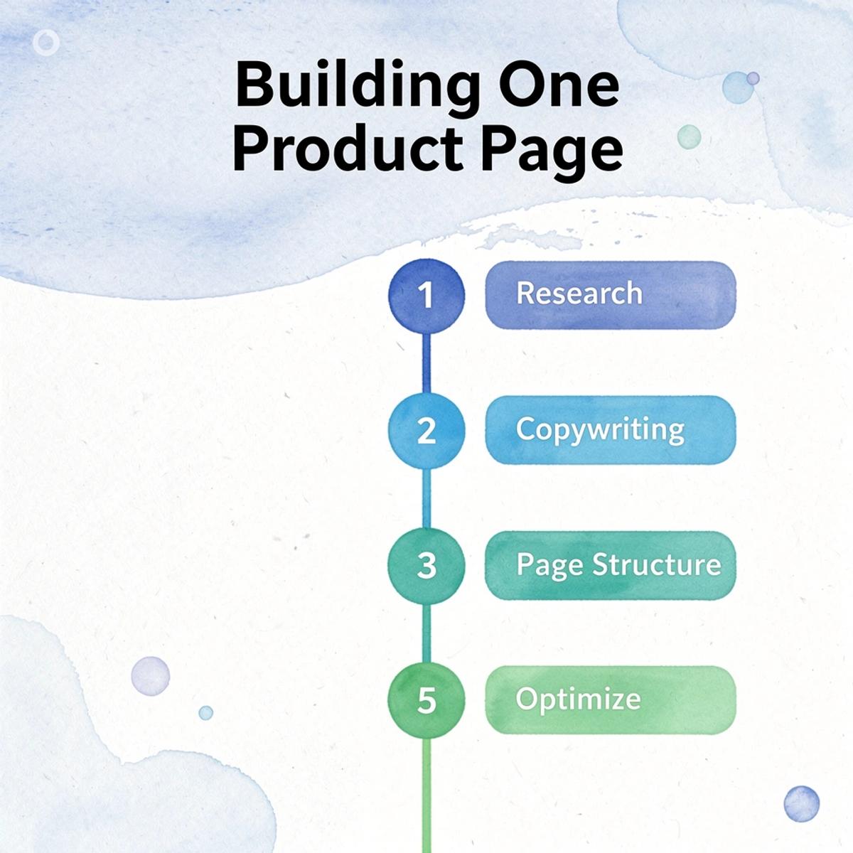
Building a single product page typically requires research, copywriting, page structure, sourcing images, creating assets, and optimization. Even experienced operators spend hours on this process, while less experienced merchants may spend days. Every hour spent building is an hour not spent testing.
Research & Copywriting
Time Cost
- High
Page Structure & Layout
Time Cost
- High
Sourcing & Creating Assets
Time Cost
- Medium–High
Optimization & QA
Time Cost
- Medium
⚠️ Warning: When page creation consumes your team's bandwidth, your testing velocity drops — and so does your ability to find winning offers.
Experimentation is a numbers game. Stores that test more products, offers, and messaging angles learn faster than those perfecting a single page. When page creation becomes a bottleneck, testing volume decreases, and opportunities are missed.
🔑 Takeaway: The brands that win aren't necessarily the ones with the best first page — they're the ones who iterate the most. Speed of execution is a competitive advantage.
How does PagePilot reduce the time from idea to launch?
PagePilot's AI Page Builder significantly reduces launch time. Merchants can provide a competitor or supplier URL, and our AI Page Builder generates a complete, launch-ready Shopify product page in minutes instead of hours. This shifts focus from repetitive building tasks to higher-value activities: product selection, offer development, audience targeting, and creative testing.
How does PagePilot help merchants stand out from competitors?
PagePilot also helps with differentiation. Many merchants buy from the same suppliers and end up with generic descriptions and images that resemble their competitors. PagePilot creates unique product copy tailored to each product rather than copying supplier descriptions, helping merchants communicate value more effectively.
The platform's AI Product Images upgrade visuals beyond standard supplier photos, creating more distinctive assets that improve perceived value and strengthen brand presentation.
Why does faster page creation lead to better ecommerce results?
The result is a faster workflow from idea to launch. Instead of spending hours building before testing, merchants can generate pages quickly, launch sooner, and gather market feedback faster. Ecommerce success rarely comes from perfectly predicting winners; it comes from identifying them before competitors do.
A merchant who can test five products in the time it takes another to test one has significantly more opportunities to discover profitable products and high-performing creative angles. PagePilot isn't a page-building tool—it's a testing acceleration tool that increases velocity without sacrificing quality.
Start a FREE Trial and Generate 3 Product Pages with Our AI Page Builder today
Start a free PagePilot trial today to generate up to three product pages with no credit card required. See how quickly a competitor or supplier URL becomes a conversion-focused Shopify landing page ready for immediate testing.
"Turn any competitor or supplier URL into a conversion-focused Shopify landing page — no credit card required, no setup headaches." — PagePilot AI
🎯 Key Point: Your free trial includes 3 fully generated product pages — enough to immediately see the impact on your Shopify store's conversion rate.
💡 Tip: Use your competitor's URL as the input to instantly generate a high-converting alternative page that's already optimized for your audience — no copywriting skills needed.
Product Pages Generated
Free Trial Details
- Up to 3 pages
Credit Card Required
Free Trial Details
- None
Input Method
Free Trial Details
- Competitor or supplier URL
Output
Free Trial Details
- Conversion-focused Shopify landing page
Ready For
Free Trial Details
- Immediate testing
