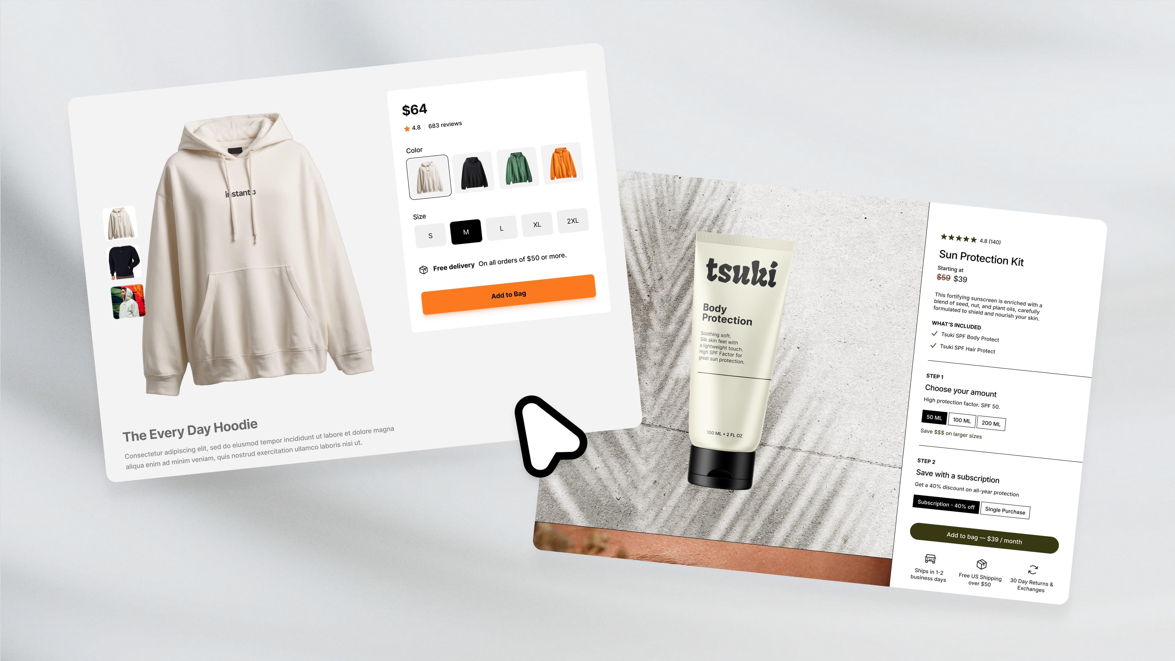
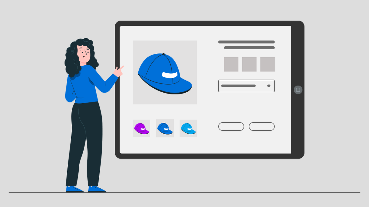
You've found the perfect product to sell, built your Shopify store, and now you're staring at a single product page, wondering why conversions aren't happening. The truth is, when you're selling one hero product, your theme becomes your entire sales pitch, your showroom, and your closer all rolled into one. Looking at successful Shopify product page examples reveals a pattern: stores that convert don't just display a product, they tell a story, build trust, and guide visitors toward that buy button with laser focus.
That's where tools like PagePilot's AI page builder come into play. Instead of wrestling with theme customization or hiring expensive designers, you can create optimized landing pages that match the high-converting layouts you've seen in top-performing stores. The builder helps you arrange product benefits, social proof, and compelling visuals in ways that actually move people to purchase, turning your single-product store into a conversion machine without needing to understand code or design principles.
Summary
- Most Shopify stores struggle with conversions, not because of weak products or insufficient traffic, but because their themes were designed for catalog browsing rather than focused selling. Traditional Shopify themes prioritize navigation menus, category pages, and product filters that work well for retailers with large inventories but create friction for single-product stores.
- The gap between technical capability and strategic alignment becomes costly at scale, as each visitor incurs an acquisition cost through paid advertising. Themes marketed as flexible can display any product, but their underlying architecture assumes customers want to browse and compare multiple options before deciding.
- Ecommerce conversion rates drop by an average of 4.42% with each additional second of load time between 0 and 5 seconds, according to research from Portent. Speed becomes especially critical for stores running paid advertising campaigns, where slow pages directly increase cost per acquisition.
- More than 69% of ecommerce sessions end after viewing only a single page, based on Contentsquare's global benchmark report. For one-product stores relying on paid traffic from Meta or TikTok, the landing experience is critical. When the product page doesn't immediately reinforce the promise made in the advertisement, visitors leave without exploring further.
- Product pages that function as sales funnels convert cold traffic by guiding visitors through a structured sequence rather than encouraging exploration. The most effective layouts start with the customer's problem in the language they recognize from the ad, present the product as the solution with visual proof, layer in testimonials that address specific objections, and close with clear calls to action that lead directly to checkout.
PagePilot's AI page builder generates sales-optimized layouts in minutes by analyzing product URLs, creating sections that address customer problems, visually demonstrating solutions, and placing calls to action at psychologically strategic moments based on proven conversion patterns.
The Hidden Problem With Most Shopify Stores
Most Shopify stores struggle to convert visitors into buyers, even when they have strong products and steady traffic. The issue is not the product itself but the store's structure. Traditional Shopify themes are designed primarily for ecommerce brands with large product catalogs, and they prioritize features such as:
- Navigation menus
- Category pages
- Product filters
- Collection browsing
This structure works well for retailers selling dozens or hundreds of products because it helps customers explore a wide inventory.
The Hero Product Model
Many modern ecommerce brands operate differently. Instead of offering a large catalog, they focus on a single hero product and build an entire marketing experience around it. This approach is common in direct-to-consumer brands that rely on paid traffic from platforms like:
- Meta
- TikTok
- Google Ads
In these cases, customers typically arrive from an advertisement promoting a specific product. The visitor already has a clear context for why they clicked the ad. What they need next is a landing experience that reinforces the product's value and leads quickly to a purchase decision.
The Detriments of Catalog-Style Navigation
Catalog-style store structures often create friction in this scenario. Visitors may encounter navigation menus, unrelated products, and category pages that pull attention away from the product they originally came to see. Instead of guiding the customer toward a purchase, the layout encourages browsing. This friction has measurable consequences.
According to research from Baymard Institute, 70% of customers abandon checkout. For stores built around a single product, conversion performance often depends heavily on how clearly the page communicates the product's value and guides visitors toward checkout.
The Pitfalls of Inappropriate Theme Usage
When a theme designed for large product catalogs is used for a one-product store, the layout can unintentionally introduce distractions that reduce conversions and make it harder for visitors to take action. Product pages end up speaking to no one, evoking nothing. Walls of text on mobile become unreadable, causing visitors to bounce.
The page lacks flow, proper structure, and the kind of focused storytelling that transforms a product listing into a conversion experience. Store owners are often builders, not marketers. They know how to list products but not how to sell them.
Why Catalog Themes Fail Single Product Stores
The familiar approach is to choose a popular Shopify theme, customize the colors and logo, then upload product images and descriptions. It requires no specialized skills and feels safe because thousands of other stores use the same themes. As traffic grows and ad spend increases, however, the limitations become visible.
Visitors land on pages designed to encourage exploration rather than immediate action. Navigation menus offer paths away from the product. Related product sections suggest alternatives before the visitor has even considered the original offer. The entire layout assumes the customer wants to browse upon arrival, ready to evaluate a specific solution.
Creating Focused Landing Experiences With AI
Solutions like PagePilot's AI page builder help stores create focused landing experiences that match high-converting layouts seen in top-performing single-product stores. Instead of wrestling with theme customization or hiring expensive designers, merchants can generate sales-optimized pages in minutes that arrange:
- Product benefits
- Social proof
- Compelling visuals
In these ways, visitors are guided toward purchase. The builder eliminates the traditional barriers of costly professionals and time-consuming manual page creation, turning product pages into conversion-focused experiences without requiring design or copywriting expertise.
Related Reading
- Shopify Product Page Examples
- How to Make Your Shopify Store Look Professional
- How to Increase Conversion Rate Shopify
- Best Size for Shopify Product Images
- eCommerce Product Page Optimization
- Shopify Banner Size
- How to Create Multiple Product Pages in Shopify
- How to Change Favicon on Shopify
- How to Add Size Chart in Shopify
- How to Customize Shopify Checkout Page
The Belief That any Shopify Theme Can Work
Any Shopify theme can technically display a single product. The files upload, the images appear, and the checkout process functions without errors. This technical compatibility leads many store owners to believe theme selection is primarily about aesthetics and loading speed. If the store looks professional and performs well on mobile devices, the foundation seems solid.
The Flexibility Trap
Assumption feels safe because most Shopify themes are explicitly marketed as flexible. Theme descriptions promise adaptability across product types and business models. A store owner launching with a hero product can:
- Browse the theme marketplace
- Select something visually appealing
- Have their store live within hours
The setup process reinforces this belief. There are no error messages warning that the chosen theme was architected for a different sales model.
Why Catalog Architecture Creates Invisible Friction
The structure beneath the surface tells a different story. Traditional themes were built during an era when ecommerce meant digital catalogs. The underlying architecture assumes customers arrive to browse, compare, and explore multiple options before deciding. Navigation systems are designed to surface product categories. Collection pages exist to organize inventory by:
- Type
- Price range
- Popularity
Filtering tools help visitors narrow down choices from dozens or hundreds of items.
Features serve a genuine purpose for stores selling a variety of product lines. A footwear retailer benefits when customers can filter by size, color, style, and price simultaneously. The theme architecture supports discovery behavior. Visitors expect to spend time exploring before committing to a purchase.
Distraction in the Hero Product Experience
When a store focuses on a single hero product promoted through paid advertising, this same architecture works against conversion goals. A visitor clicks an ad promising a solution to a specific problem. They arrive expecting immediate clarity about whether this product delivers on that promise. Instead, they encounter navigation menus suggesting other areas to explore.
Related product sections imply alternatives exist before the visitor has even engaged with the original offer. The page structure whispers "keep looking" when the visitor needs to hear "here's why this works."
Structural Obstacles to Conversion
The friction isn't dramatic. Visitors don't bounce immediately or leave angry feedback. They simply lose focus. Attention drifts toward secondary elements. The buying decision gets postponed. Many store owners interpret this as a product-market fit issue or an advertising targeting problem, when the real obstacle is structural.
The theme is doing exactly what it was designed to do, just for a different type of customer journey.
When Technical Capability Masks Strategic Misalignment
The gap between "can support" and "designed to convert" becomes expensive at scale. Every visitor acquired through paid advertising carries a cost. When catalog-style layouts introduce decision friction, that cost compounds.
Teams using AI page builders like PagePilot bypass this misalignment entirely by generating conversion-focused layouts that follow proven single-product structures. The pages guide visitors through problem recognition, solution presentation, benefit demonstration, and social proof without the architectural assumptions of multiple product catalogs.
Transforming Buying Journeys With Efficient Design
What traditionally required hiring designers and copywriters to restructure theme layouts now happens in minutes, replacing catalog browsing patterns with focused buying journeys. The real question isn't whether your current theme can display one product. It's whether the theme's underlying structure was designed to guide a visitor from an ad click to a purchase decision without introducing competing paths.
Most weren't, and that invisible architecture shapes conversion performance more than any surface-level customization ever will.
7 Best One-Product Shopify Themes for High-Converting Stores
1. Dawn
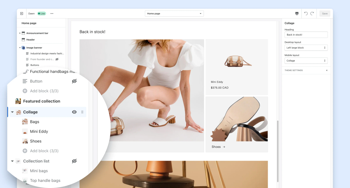
Dawn is Shopify's flagship free theme and the most widely adopted starting point for new stores in 2025. Built on Online Store 2.0 architecture, it allows merchants to add flexible sections across any page without touching code. This means you can construct long-form product pages that integrate:
- Benefit callouts
- Customer testimonials
- FAQ sections
- Trust signals within a single cohesive layout
Optimizing Themes for Mobile Conversion
The theme prioritizes speed and mobile performance, both of which are critical when most traffic comes from mobile ads. Shopify continues to release performance updates throughout 2025, keeping Dawn optimized for Core Web Vitals and page-load metrics that directly impact conversion rates.
For stores with strong product photography or demonstration videos, Dawn provides a clean framework that adapts into a focused landing experience without requiring premium theme costs.
2. Sense and Refresh
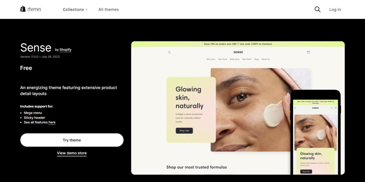
Sense and Refresh are also free Shopify themes, designed with a minimal, modern aesthetic. Both emphasize clean typography, large product imagery, and trust-building elements like review sections and product highlight blocks. This makes them particularly effective for lifestyle products, beauty brands, or wellness items where visual presentation influences purchase decisions as much as product specifications.
Cost-Effective Launching With Limited Customization
The primary advantage is cost. Merchants can launch immediately without purchasing a premium theme, reducing initial investment. Customization options become limited without editing the theme code, however, which can restrict your ability to build more complex landing page structures.
If your product story requires intricate layouts or advanced section combinations, you may outgrow these themes as your conversion optimization efforts mature.
3. Aurora
Aurora is a premium theme built for brands that rely heavily on visual storytelling. It includes multiple layout options for narrative-driven product pages, large visual sections, and flexible design blocks that create immersive experiences. These capabilities work especially well for fashion, lifestyle, or premium consumer products where brand narrative and emotional connection drive conversion.
The theme consistently receives high ratings in Shopify's theme marketplace and continues receiving updates with new features and performance improvements. Merchants selling products where aesthetics and brand perception matter as much as functionality often choose Aurora because it supports the kind of visual depth that catalog themes cannot deliver.
4. Whisk
Whisk focuses on minimalist design that maximizes product clarity. The theme removes browsing-oriented elements found in traditional ecommerce layouts and instead highlights product benefits, imagery, and clear call-to-action sections. This structure keeps the customer journey focused on the product itself rather than encouraging exploration across multiple items.
Merchants selling kitchen products, eco-friendly goods, or niche consumer products often use minimalist themes like Whisk because the design philosophy aligns with a single product focus. When your entire marketing funnel points to one hero product, the last thing you need is a theme architecture suggesting alternatives before the visitor has even considered your offer.
5. Taiga
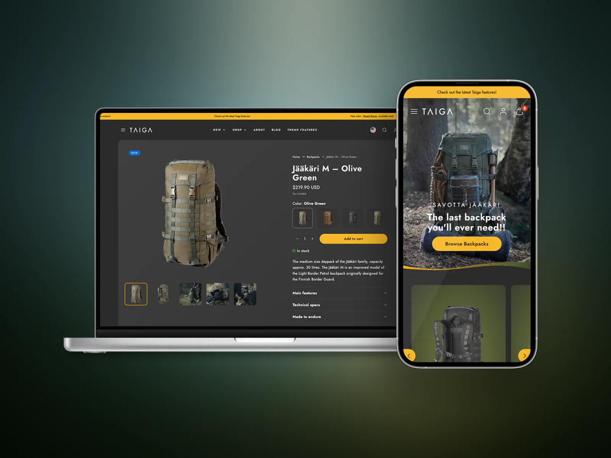
Taiga is designed with performance and speed as primary objectives. Fast loading times become especially important for stores running paid advertising campaigns, where slow pages can significantly reduce conversion rates and increase cost per acquisition. Taiga focuses on lightweight design, efficient image loading, and optimized page structure that keeps Core Web Vitals metrics in the green.
According to research from Portent, ecommerce conversion rates drop by an average of 4.42% with each additional second of load time between 0 and 5 seconds. For stores selling outdoor gear, equipment, or products where detailed imagery and product specifications are important, Taiga delivers the speed foundation that prevents technical performance from undermining your conversion efforts.
6. Be Yours
Be Yours is a popular premium theme known for its flexibility and extensive customization options. The theme includes more than thirty customizable sections, allowing merchants to build product pages that function like long-form landing pages. You can integrate product demonstrations, testimonials, FAQs, and promotional sections without requiring custom development or hiring a designer.
Optimizing Be Yours for Mobile and SEO Success
Be Yours is optimized for mobile responsiveness and search engine visibility, making it a common choice for direct-to-consumer brands that rely on both paid traffic and organic search. The traditional approach involves purchasing a theme like Be Yours, then spending weeks:
- Customizing sections
- Writing persuasive copy
- Arranging elements into conversion-optimized layouts
AI-Powered Sales Pages in Minutes
Solutions like PagePilot's AI page builder bypass this time-consuming process by generating sales-optimized page layouts in minutes that already incorporate proven:
- Conversion patterns
- Psychological triggers
- Compelling product storytelling
Instead of wrestling with theme customization or hiring expensive copywriters, merchants can transform product URLs into high-converting pages that guide visitors through problem recognition, solution presentation, and social proof, without the traditional investment in design and copywriting.
7. Pipeline
Pipeline is a premium theme specifically designed for stores selling a single product or a small product line. The theme architecture assumes visitors arrive with a clear intent and need focused guidance toward purchase rather than catalog exploration. Section layouts emphasize product benefits, visual demonstrations, and trust signals without the navigation complexity of multi-product themes.
Merchants selling subscription products, high-ticket items, or products requiring detailed explanation often choose Pipeline because the theme structure supports the kind of in-depth storytelling that converts skeptical visitors into buyers. The layout encourages vertical scrolling through a narrative rather than horizontal browsing across categories.
Foundations for Focused Selling
Themes illustrate how different Shopify layouts support one-product stores through varying approaches. Some prioritize speed and simplicity, others focus on storytelling flexibility, and some emphasize minimalist clarity. The key takeaway is that one-product stores benefit from themes focused on conversion and product storytelling rather than on catalog browsing.
The right theme creates the structural foundation, but conversion performance ultimately depends on how effectively you communicate product value within that structure.
Why Most One-Product Stores Still Underperform
Choosing a focused theme doesn't guarantee conversions. Many one-product stores attract traffic and showcase strong products, but still fail to turn visitors into buyers. The breakdown happens in the space between the ad click and the product page experience.
Most stores rely on paid traffic from Meta or TikTok, where ads highlight a specific benefit or transformation. The visitor clicks because the ad promised to:
- Solve a problem
- Improve convenience
- Deliver a clear outcome
When they land on the product page, they expect immediate confirmation of that promise. If the page doesn't quickly reinforce the value, they leave before exploring further.
The Critical Importance of the Landing Experience
According to Contentsquare's global ecommerce benchmark report, more than 69% of ecommerce sessions end after viewing only a single page. For one-product stores, this behavior makes the landing experience critical. There's rarely a second chance to convert the visitor if the first page fails to communicate value clearly.
When Themes Encourage Browsing Instead of Buying
Even when merchants select a one-product theme, many still include large navigation menus, category links, or multiple pathways that pull attention away from the core offer. The layout suggests that visitors should look around, compare options, or explore related content upon arrival, ready to evaluate a specific solution.
Direct-Response Landing Pages for Maximum Conversions
High-converting stores follow a different model. Their product pages function like direct-response landing pages, walking visitors through a structured sequence:
- The problem they face
- How the product solves it
- Visual proof or demonstrations
- Customer testimonials
- Clear call to action
When the page reinforces the promise made in the advertisement, visitors move smoothly from interest to purchase.
Streamlining Conversion Optimization With AI Tools
The traditional approach involves purchasing a theme, then spending weeks customizing sections, writing persuasive copy, and arranging elements into conversion-optimized layouts. Tools like PagePilot's AI page builder bypass this process by generating sales-optimized layouts in minutes that already incorporate proven conversion patterns and psychological triggers.
Instead of wrestling with theme customization or hiring expensive copywriters, merchants can transform product URLs into focused buying journeys without the traditional investment in design and copywriting resources.
Related Reading
- Shopify Variants vs Options
- Product Recommendations Shopify
- How To Add Frequently Bought Together On Shopify
- Shopify Variants Vs Options
- How To Add Size Chart In Shopify
- Best Shopify Themes For Conversion
- How To Change Favicon On Shopify
- Shopify Order Confirmation Page
- How To Choose A Shopify Theme
- How To Customize Shopify Checkout Page
The Real Advantage: Product Pages That Behave Like Sales Funnels
Product pages that function as sales funnels convert cold traffic by guiding visitors through a structured decision journey rather than encouraging exploration. Each section builds on the previous one, guiding the customer from problem awareness to purchase without requiring them to leave the page.
This sequential structure mirrors direct-response marketing frameworks designed to convert visitors who arrived with limited brand familiarity.
Persuasive Layout Progression
The most effective layout follows a clear progression:
- Start with the problem the customer experiences in a language they recognize from the advertisement that brought them here.
- Present the product as the solution with visual proof showing how it works in real scenarios.
- Layer in social proof through customer testimonials that address specific objections.
- Close with a clear call to action that leads directly to checkout without introducing alternative paths or browsing options.
Why Sequential Flow Outperforms Catalog Layouts
According to [research from the Nielsen Norman Group, users scan web pages in predictable patterns, focusing first on the top portion and then moving downward in an F-shaped motion. Pages structured to match this natural scanning behavior help visitors absorb key information without cognitive friction.
When the layout presents benefits, demonstrations, and trust signals in the order visitors naturally consume them, conversion rates improve because the page works with human attention patterns rather than against them.
The Impact of Browsing-Focused Pages on Paid Traffic
Many merchants struggle when paid traffic arrives on pages designed for browsing rather than buying. Visitors from Meta or TikTok ads land expecting immediate confirmation of the promise made in the advertisement. If the page forces them to navigate through menus, explore collections, or piece together product value from scattered sections, attention fragments.
The traditional solution involves hiring copywriters to restructure content and designers to build custom layouts that guide visitors through a persuasive sequence.
Tools like PagePilot's AI page builder generate these sales-optimized structures automatically from product URLs, arranging benefits, demonstrations, and social proof into proven conversion patterns without requiring professional copywriting or design investment.
Social Proof as a Conversion Accelerator
Trust signals become especially critical when converting visitors unfamiliar with your brand. BrightLocal's consumer review survey found that 98% of consumers read online reviews when evaluating local businesses, making reviews one of the strongest trust signals influencing purchase decisions.
For one-product stores relying on paid traffic, strategically placed testimonials that address specific objections can compress the trust-building process that normally requires multiple touchpoints.
From Listings to Conversion Experiences
The difference between a product listing and a conversion experience comes down to intentional structure. Catalog pages assume visitors will explore, compare, and return later. Funnel-style pages assume visitors need immediate clarity about whether this product solves their specific problem.
When every section advances the buying decision rather than encouraging further exploration, the page transforms from a passive display into an active sales tool that works even when traffic arrives cold.
Related Reading
- Shopify T-shirt Stor
- Shopify Electronics Store
- Shopify Beauty Stores
- Shopify Contact Us Page Example
- Best Shopify Theme For Print On Demand
- Pagefly Alternatives
- Best Trust Badges For Shopify
How PagePilot Helps You Build a High-Conversion One-Product Store
Building a one-product Shopify store that converts consistently requires more than choosing a visually appealing theme. The structure of the page must match how ecommerce funnels actually work, especially when traffic comes from paid advertising.
Most generic Shopify themes are built for browsing large product catalogs. They prioritize navigation menus, collection pages, and product discovery features. While those features work for stores with many items, they often introduce friction when the goal is to guide visitors toward a single purchase decision.
Conversion-Driven Pages for Single-Product Stores
PagePilot helps ecommerce brands solve this problem by focusing on conversion-driven product pages designed specifically for one-product stores. Instead of relying on traditional catalog layouts, PagePilot enables merchants to build pages that follow the structure of high-performing sales funnels.
These pages are designed to walk visitors through a clear sequence that reinforces the product's value and leads them toward checkout.
From Product URL to Conversion Funnel in Minutes
The traditional workflow for building a high-converting product page involves hiring a copywriter to craft persuasive messaging, a designer to arrange sections strategically, and weeks of iteration to get the structure right. Most store owners lack the budget for this investment or the expertise to do it themselves. They end up with product pages that list features but fail to tell a story that moves visitors toward purchase.
Automated Sales Optimization
PagePilot generates sales-optimized layouts automatically from AliExpress or Shopify product URLs. The AI analyzes the product and creates sections that address customer problems, demonstrate solutions visually, incorporate social proof, and place calls to action at psychologically strategic moments.
According to PagePilot, merchants can achieve a 3% conversion rate using these AI-generated layouts, which structure content around proven conversion patterns rather than generic product descriptions.
Speed as a Competitive Advantage
Time matters when launching a one-product store or testing new products through paid advertising. Merchants who can move from product concept to live page faster gain weeks of market feedback while competitors are still wrestling with theme customization.
The ability to generate a complete product page in under 10 minutes transforms how quickly stores can validate offers, test messaging angles, and iterate based on real conversion data rather than assumptions about what might work.
Product Testing and Market Expansion
Speed advantage compounds when running multiple product tests or expanding into new markets. Instead of treating each new product page as a multi-week project requiring professional services, merchants can generate conversion-focused layouts on demand, freeing up time for traffic generation and customer acquisition rather than page construction.
Start a FREE Trial and Generate 3 Product Pages With Our AI Page Builder Today
PagePilot lets you build three high-converting product pages completely free, no credit card required. You can test the platform with real products, see how AI-generated layouts perform against your current pages, and validate whether funnel-focused structures actually improve your conversion rates before committing to a paid plan.
Transforming Product Storytelling with AI Efficiency
Most merchants discover the difference on their first generated page. What previously required days of theme customization, copywriting iteration, and layout testing now takes minutes. The AI structures your product story using proven conversion patterns, arranging benefits, social proof, and calls to action in sequences that guide visitors toward purchase rather than browsing.
You're not just saving time, you're replacing the entire traditional workflow of hiring designers and copywriters with a system that generates sales-optimized pages on demand.
Start your free trial at PagePilot and generate your first three product pages today. Turn your one-product Shopify store into a focused conversion experience that treats every visitor like they arrived ready to buy, not browse.