
You've spent hours perfecting your Shopify store, choosing products, writing descriptions, and selecting images. Yet visitors land on your pages and leave without buying. When examining successful Shopify product page examples, one element consistently stands out: trust badges that reduce buyer anxiety and signal credibility through security seals, payment icons, money back guarantees, and customer testimonials. This article breaks down the best trust badges for Shopify that actually increase conversions, showing you which badges work, where to place them on your product pages, and how to implement them without slowing down your site.
Building product pages that convert requires more than just adding trust badges. PagePilot's AI page builder helps you create optimized Shopify pages that strategically position trust signals alongside compelling copy and conversion-focused layouts. The tool analyzes your products and generates pages where security badges, shipping guarantees, and customer reviews work together seamlessly, saving you from guesswork while maximizing the psychological triggers that drive purchases.
Summary
- Most Shopify stores fail with trust badges because they add too many instead of using the right ones strategically. Baymard Institute research shows that 19% of US online shoppers abandon purchases because they don't trust the site with their credit card information, but overloading pages with competing badges creates visual noise that reduces credibility rather than building it.
- Recognition determines whether a trust badge works or backfires. A ConversionXL A/B test found that adding a recognizable security badge like Norton increased conversions, while less familiar badges had no effect or actually hurt performance. This means the visual appeal or number of badges matters far less than whether shoppers instantly understand and trust the signal being presented.
- Website design quality shapes trust more than the presence of trust elements alone. Stanford's Web Credibility Research found that 75% of users judge a company's credibility based on website design, meaning layout, spacing, and visual hierarchy directly impact whether users trust your store, independent of which badges you include.
- Trust badge placement determines whether they convert or get ignored. The highest impact locations are near the Add to Cart button, at checkout, and around pricing because these are the exact moments when buyer hesitation peaks and users actively scan for reassurance.
- High-quality product imagery can increase conversions 3 to 5 times according to Booster Theme's conversion research, especially for first-time buyers evaluating unfamiliar brands. When images look polished and consistent, users assume the same care extends to fulfillment and customer service, while low-quality or inconsistent visuals reduce perceived trust instantly and make every other trust element less effective.
PagePilot's AI page builder generates product pages with trust signals already positioned where buyer hesitation occurs, analyzing product type and competitor patterns to create conversion-focused layouts in minutes instead of requiring manual testing of badge placement, copy, and visual hierarchy.
Most Shopify Stores Add Trust Badges The Wrong Way
Most Shopify store owners are not ignoring trust badges. They are overusing them. The logic seems sound: if one badge improves trust, then adding more should increase it further. So product pages end up with:
- Stacked payment icons
- Multiple secure checkout seals
- Generic guarantees
- Random logos placed across the page
The problem is that this thinking misinterprets how trust actually works.
There is real data behind why people use trust badges. According to Baymard Institute's checkout usability research, 19% of US online shoppers have abandoned a purchase specifically because they did not trust the site with their credit card information. That is a meaningful conversion risk, and it is exactly what trust badges are meant to solve. But the same research also shows something more subtle: trust is highly sensitive to how signals are presented, not just whether they exist.
When stores overload pages with badges, the effect flips. Instead of reinforcing credibility, the page feels cluttered and inconsistent. Users do not evaluate each badge individually. They scan. And when they see too many competing signals, especially ones they do not recognize, it creates hesitation rather than reassurance. This is backed by broader UX data. According to Stanford's Web Credibility Research, 75% of users judge a company's credibility based solely on its website design. That means layout, spacing, and visual clarity matter as much as the presence of trust elements themselves.
The Recognition Problem
There is also a recognition problem that most stores miss. A controlled A/B test by ConversionXL found that adding a recognizable security badge (Norton) increased conversions, while less familiar badges had no effect or reduced performance. The takeaway is not that badges work universally. It is only the right ones that work. This is where most Shopify stores go wrong: they treat trust badges as a numbers game instead of a relevance problem. Instead of asking "Does this reduce a specific objection?", they ask "How many can I add?"
Why Fewer Trust Badges Convert Better
The result is predictable. Pages become visually noisy, trust signals lose meaning, and conversion rates drop even though more "credibility elements" were added. The stores that win do the opposite. They use fewer badges, but each one is intentional, recognizable, and placed where it directly addresses buyer hesitation.
Tools like PagePilot's AI page builder help eliminate this guesswork by analyzing your products and automatically positioning the right trust signals alongside conversion-focused layouts, so you are not testing blind or cluttering pages with ineffective badges.
Trust badges do not increase conversions on their own. They only work when they are specific, recognizable, and used to solve a clear trust gap.
Related Reading
- Shopify Product Page Examples
- How to Make Your Shopify Store Look Professional
- How to Increase Conversion Rate Shopify
- Best Size for Shopify Product Images
- eCommerce Product Page Optimization
- Shopify Banner Size
- How to Create Multiple Product Pages in Shopify
- How to Change Favicon on Shopify
- How to Add Size Chart in Shopify
- How to Customize Shopify Checkout Page
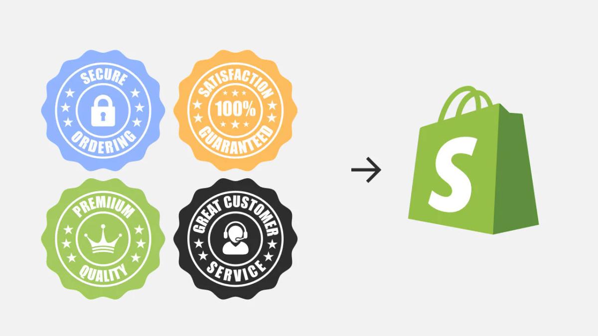
6 Best Trust Badges For Shopify (What Actually Works)
Not all trust badges work equally. The ones that drive conversions are not the most decorative or the most numerous. They are the ones that directly remove a specific hesitation in the buyer's mind at the exact moment it appears.
The difference between a badge that converts and one that clutters comes down to recognition and relevance. If a shopper does not instantly understand what a badge means, it becomes visual noise. If it does not address a real concern they have at that moment in the buying process, it gets ignored. Below are the trust badges that consistently perform, and why they work.
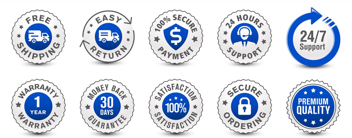
1. Payment Security Badges
Some of the most effective trust signals you can add to payment logos are:
- Visa
- Mastercard
- American Express
- PayPal
- Apple Pay
- Google Pay
They work because they are instantly recognizable. Shoppers do not need to evaluate them. They already trust them. This matters more than it seems. When users see familiar payment brands, it reduces cognitive load. They know how the process works and what protections are in place. This is not just about payment. It is about removing uncertainty at the point of purchase.
The best placement is near the checkout button or in the footer of your product page. Users scan for these logos when they are deciding whether to commit. If they do not see them, the absence creates doubt.
2. SSL And Security Badges
Badges like Norton Secured, McAfee Secure, or SSL Secure Checkout are designed to answer a very specific question: "Is my data safe here?" That question is a major conversion blocker. Baymard Institute reports that 48% of shoppers abandon their cart due to security concerns, making it one of the most common reasons for drop-off.
Security badges work when they are recognizable and placed near high-risk moments, especially around forms and checkout areas. They signal that encryption and protection are in place without requiring users to investigate further. However, recognition matters. A well-known badge like Norton performs significantly better than a generic "secure" icon.
If your store is new or unfamiliar to shoppers, security badges become even more critical. They compensate for the lack of brand trust by borrowing credibility from a known security provider.
3. Money-Back Guarantee Badges
Badges like "30-Day Money Back Guarantee" or "100% Satisfaction Guarantee" reduce perceived risk. For first-time buyers, the biggest hesitation is not always trust in the store. It is fear of making the wrong purchase.
A guarantee reframes the decision. Instead of "What if this does not work?", the question becomes "What do I lose if it doesn't?" That shift has a measurable impact. This is especially effective for higher-ticket items or unfamiliar brands.
The key is clarity. Vague guarantees like "Satisfaction Guaranteed" are less effective than specific ones like "30-Day Money Back, No Questions Asked." Shoppers want to know exactly what they are protected against and how long they have to decide.
4. Free Shipping And Returns Badges
Shipping and returns are two of the biggest friction points in ecommerce. Badges like "Free Shipping" or "Easy Returns" directly address this concern before it becomes a reason to leave.
They are most effective when placed near pricing or the add-to-cart button, where users are actively evaluating total cost and risk. If a shopper has to hunt for shipping information or scroll to the footer to find your return policy, you have already lost momentum.
For dropshippers testing new products, free shipping badges can be the difference between a scroll and a sale. They signal that you are removing barriers, not adding hidden costs. That psychological shift matters more than the actual shipping fee in many cases.
AI-Optimized Trust Badge Placement
Tools like PagePilot's AI page builder automatically position these badges in conversion-critical areas based on product type and buyer behavior patterns, so you don't have to guess where to place them or test layouts manually. The system analyzes your product and builds pages with trust signals already optimized for speed and clarity.
5. Customer Review And Social Proof Badges
Badges like "Trusted by 10,000+ Customers" or visible star ratings work because they reduce uncertainty through validation. Instead of relying on your claims, users rely on other buyers.
This is critical in ecommerce. According to Baymard Institute, 81% of consumers say trust badges increase their confidence in making a purchase, and social proof is one of the most powerful forms of that confidence. The effect is even stronger for newer brands, where trust has not yet been established.
Social proof works because it answers the question, "Has this worked for someone like me?" The more specific the proof, the better. A badge that says "4.8 stars from 2,300 verified buyers" is more persuasive than a generic "Highly Rated" seal.
6. Secure Checkout Icons
Simple visual cues like lock icons or "Secure Checkout" labels are often overlooked, but they play an important role. They reinforce safety at the exact moment users are about to enter sensitive information.
This aligns with user behavior. Shoppers scan for quick visual reassurance rather than reading detailed explanations. A small lock icon can communicate security faster than a paragraph ever could. When placed near the checkout button or payment fields, these icons reduce hesitation in the final step.
The mistake most stores make is assuming these icons are redundant if they already have SSL or security badges elsewhere. They are not. Shoppers look for confirmation at multiple points, and a lock icon at checkout serves a different psychological function than a Norton badge on the product page.
What This Actually Means
Each of these badges serves a different purpose. Payment badges reduce unfamiliarity. Security badges reduce fear. Guarantees reduce risk. Shipping badges reduce cost concerns. Reviews reduce uncertainty. Checkout icons reinforce safety.
When used together, selectively, they address the main objections that keep users from buying. The best trust badges are not the most visually impressive. They are the ones that remove a specific doubt at the exact moment a customer is about to leave.
Why Most Trust Badges Fail To Increase Conversions

By now, it's clear that trust badges can work. The problem is that most stores implement them in ways that cancel out their impact. The failure is not in the concept. It is in the execution.
Generic Badges That Customers Do Not Recognize
Trust is tied to recognition. When shoppers see familiar signals like Visa or PayPal, they instantly associate them with systems they already trust. But when badges are generic, poorly designed, or completely unknown, that association disappears.
Instead of reinforcing credibility, they raise questions. "Is this real?" "Why haven't I seen this before?" This hesitation is enough to break momentum, especially near checkout. A badge that requires evaluation creates friction.
Overloading Product Pages With Too Many Icons
More is not better. In fact, more is often worse. When multiple badges compete for attention, none of them stand out. The page becomes visually noisy, and users stop processing them altogether.
This ties directly to how people scan pages. Users do not read every element. They skim. When there are too many competing signals, the brain filters them out. Trust badges can increase conversions by up to 42% when used strategically. Cluttered pages with excessive badges often see the opposite effect.
Placing Badges In Low-Impact Areas
Even the right badge can fail if it is placed incorrectly. Trust badges work when they appear at the moment of hesitation (near the Add to Cart button, around pricing, or at checkout). When they are buried in the footer or scattered randomly across the page, they lose relevance.
Users are not looking for trust signals everywhere. They are looking for reassurance when making a decision. If the badge is not there at that moment, it might as well not exist. Placement is not decoration. It is a strategy.
Data-Driven Badge Placement
Many dropshippers test products quickly but lose conversions because they guess at badge placement instead of using data-driven layouts. Tools like PagePilot's AI page builder analyze product type and buyer behavior to position trust signals exactly where hesitation occurs, eliminating the guesswork and getting pages live faster without manual A/B testing or design iteration.
Using Badges That Do Not Match The Product Or Audience
Not all trust concerns are the same. A high-ticket product may require strong guarantees and security signals. A low-cost impulse product may rely more on social proof. International audiences may care more about payment methods and trust in currencies. When badges do not match the context, they feel disconnected.
For example, adding enterprise-level security badges to a low-cost impulse product page can feel excessive, even though it doesn't address the actual concern: "Will this product meet expectations?" The badge answers a question no one is asking.
When Trust Badges Backfire
The result is predictable. Credibility decreases instead of increasing. The page feels cluttered and less trustworthy. Attention is pulled away from the call to action. Add-to-cart and checkout rates drop. Trust badges do not fail because they are ineffective. They fail because they are used without context. When they are not recognizable, not relevant, or not placed at the right moment, they stop building trust and start creating doubt.
Related Reading
- Shopify Variants vs Options
- Product Recommendations Shopify
- Shopify Websites Examples
- Best Shopify Themes For Conversion
- Best One Product Shopify Theme
- High Converting Product Pages
- How To Add Frequently Bought Together On Shopify
- How to Add a Pop Up on Shopify
- Shopify Order Confirmation Page
- How To Choose A Shopify Theme
Where Trust Badges Actually Impact Conversions

Placement determines whether a trust badge converts or gets ignored. The highest-performing locations share one trait: they appear exactly when a user is evaluating risk. This is not about decorating a page. It is about intercepting doubt at the precise moment it forms, before the user clicks away.
Near The Add To Cart Button
This is where hesitation peaks. The user has scrolled through images, read the description, and now faces a binary choice: commit or leave. Questions surface fast. "Is this safe?" "What if it arrives damaged?" "Can I trust this store with my card details?"
A small cluster of relevant badges (secure payment icons, a money-back guarantee) positioned directly beside the CTA answers these doubts without requiring extra clicks or scrolling. 75% of online shoppers look for trust signals before making a purchase. When those signals appear at the decision point, friction drops. When they are buried elsewhere, the user is left to find a safer store.
At Checkout
Risk perception shifts again when users enter payment details. Earlier trust-building matters less if this moment feels exposed. Cart abandonment spikes here not because users changed their minds about the product, but because the environment feels uncertain.
Security badges, payment logos, and "secure checkout" indicators belong in this space. They do not need to be large. They need to be visible and recognizable. A Norton seal or SSL lock icon communicates safety faster than any paragraph of text. If these signals are missing, every previous trust element loses impact. The user closes the tab.
Around Pricing And Guarantees
Pricing triggers a different type of doubt. Users are not questioning safety. They are questioning value. "What if this is not worth it?" "What if I need to return it?" This is where guarantees reframe the decision from risk to reassurance.
Placing "30-Day Money Back Guarantee" or "Free Returns" badges near the price links costs protection in a single visual scan. The purchase stops feeling like a gamble and starts feeling reversible. That psychological shift matters more than the actual return rate. Most users will not return the product, but knowing they can makes the initial purchase easier.
Faster Trust-Badge Placement
Dropshippers testing new products face this friction constantly. Users do not know your brand yet, so every objection feels amplified. Tools like PagePilot's AI page builder analyze product type and buyer behavior to position trust badges exactly where hesitation occurs, eliminating manual guesswork and getting pages live faster without endless layout testing or design revisions.
Trust badges do not work because they exist. They work because they show up where doubt occurs and remove it before the user leaves. Every other placement is secondary.
What A High-Converting Shopify Product Page Actually Requires
A high-converting product page is not built by adding more elements. It is built by removing friction at every point where a buyer might hesitate. Trust badges are one tool in that system, but they only work when everything around them reinforces the same decision. The page needs to feel clear, credible, and easy to act on from the first scroll to checkout.
Trust Badges Aligned With Real Buyer Concerns
The role of trust badges is surgical, not decorative. Each one should answer a specific objection the buyer already has. If your customer is concerned about payment security, display recognized payment icons and SSL badges. If they question product quality, position guarantees and verified reviews near the add-to-cart button. Anything outside that direct line of concern becomes noise.
This is why three focused badges outperform ten generic ones. Shoppers are not counting trust signals. They are scanning for reassurance on the specific doubt holding them back. When badges address unasked questions or repeat the same reassurance in different forms, the page feels cluttered rather than credible. Precision beats volume.
Clean, Non-Cluttered Layout
Trust is shaped by how a page feels, not just what it says. According to Stanford's Web Credibility Research, 75% of users judge a company's credibility based on website design alone. That means spacing, structure, and visual hierarchy directly affect whether users trust your store, regardless of the trust badges you include.
When pages are overloaded with competing icons, banners, and stacked elements, they feel less professional. The brain interprets clutter as uncertainty. A clean layout with focused sections and a clear visual flow builds trust more than adding more signals ever could. White space is not wasted space. It is breathing room that lets each element do its job without competing for attention.
Strong Product Positioning And Messaging
No amount of trust badges compensates for weak messaging. Users need to understand what the product is, who it is for, and why it is better than alternatives within seconds of landing on the page. If this is unclear, trust badges become irrelevant because the user is not convinced in the first place.
High-converting pages make the value proposition obvious immediately. The headline, the first image, and the opening description work together to answer the buyer's core question: "Is this for me?" When that answer is delayed or vague, users leave before trust signals even register. Clarity precedes credibility.
High-Quality Visuals That Reinforce Credibility
Visuals are one of the fastest ways users assess legitimacy. Low-quality images, inconsistent styles, or reused supplier photos instantly reduce perceived trust. Clean, high-quality product photography signals that the brand is established and reliable, even if the store is new. High-quality product imagery can increase conversions 3-5x, especially for first-time buyers evaluating unfamiliar brands.
This is not about perfection. It is about consistency and professionalism. When images look polished and match across the page, users assume the same care extends to fulfillment, customer service, and product quality. When they look inconsistent or low-effort, every other trust element loses impact because the visual foundation feels unreliable.
Conversion Pages in Minutes
Many dropshippers struggle to balance all these elements while quickly testing products. They know what a high-converting page should include, but building one from scratch means choosing layouts, positioning trust signals, writing copy, and sourcing visuals before a single sale happens. Tools like PagePilot's AI page builder eliminate that bottleneck by generating conversion-optimized layouts with trust badges already positioned where buyer hesitation occurs, so pages go live in minutes instead of days without sacrificing clarity or credibility.
How PagePilot Helps You Build High-Converting Pages With The Right Trust Signals

Once you understand why most trust badges fail, the solution is not to add more of them. It is to stop treating trust as an afterthought. High-converting pages are built by structuring trust into the page from the start, not by stacking elements after the layout is already set.
That is exactly where PagePilot changes the workflow. Instead of guessing which badges to use, where to place them, or how to structure your page, PagePilot generates product pages based on what is already working in the market. You start with a competitor or supplier URL.
From there, PagePilot's AI builds a complete product page, pulling in proven layouts, positioning, and structure. This matters because trust is not just about badges. It is about how everything on the page works together.
Trust Signals Are Placed Intentionally, Not Randomly
Payment icons appear where users are deciding how to pay. Guarantees are positioned near the call to action. Social proof is integrated where users evaluate credibility. The page is structured so each element supports the next step in the buying decision. 75% of online shoppers say that trust signals like reviews and testimonials influence their purchasing decisions, but only when those signals appear at the exact moment of hesitation.
At the same time, PagePilot upgrades your visuals. One of the fastest ways to lose trust is to look like every other store using the same supplier images. PagePilot's AI product image function improves the visual quality of your page, helping your store feel more credible and differentiated. This addresses the recognition problem directly: when pages look polished and consistent, users assume the same care extends to fulfillment and service.
Testing Without Starting Over
It also lets you test quickly. Instead of rebuilding pages manually, you can generate and iterate on multiple versions (different angles, layouts, and positioning) without starting from scratch each time. This makes it easier to find what actually converts, rather than relying on assumptions. The speed matters because dropshippers testing new products cannot afford to spend days on layout revisions before seeing whether a product has potential.
The key difference is how trust is handled. Most stores add trust badges after the page is already built. PagePilot builds pages where trust signals are part of the foundation, aligned with layout, messaging, and visuals from the beginning. Where most stores treat trust badges as isolated elements, PagePilot's AI page builder integrates them into a structured, conversion-focused page, so every trust signal appears exactly where it has the most impact.
Start a FREE Trial and Generate 3 Product Pages with Our AI Page Builder today
You can test this without spending anything. PagePilot offers a free trial that lets you generate 3 full product pages with its AI page builder. That means you can see how trust signals, layout, and visuals align in a conversion-focused structure before committing time or budget. If the pages convert better than what you have now, you know the system works. If they don't, you learned something without risking a redesign.
Faster Testing With Built-In Trust
The trial removes the guesswork that usually slows down product testing. Instead of manually positioning badges, writing copy, and testing layouts one variable at a time, you start with a page structure built from proven patterns. Trust badges appear where hesitation occurs. Guarantees sit near pricing. Payment icons align with the checkout flow. You see the difference between randomly adding trust elements and structuring them into the buying decision from the start.
Speed Up Product Validation
This matters most when you are testing new products quickly. Every day spent building pages manually is a day you are not validating demand or scaling what works. The stores that move fastest are not skipping quality. They are eliminating the steps that do not directly contribute to learning, whether or not a product converts. PagePilot's AI page builder compresses that cycle by generating pages in minutes, so you can focus on traffic and offers instead of layout revisions.
Why the 3-Page Limit Works
The three-page limit is intentional. It gives you enough room to test different product types or angles without overwhelming your workflow. You can compare how trust signals perform on a high-ticket item versus an impulse buy, or test two variations of the same product with different positioning. That comparison teaches you more than any guide or template ever could.
Test, Learn, and Scale
If the pages perform, you already have a system that works. If they need adjustment, you have a foundation to iterate from instead of starting over. Either way, you move forward with data instead of assumptions. Start your free trial, generate your first three pages, and see what happens when trust signals stop being decoration and start being strategy.